
Expressing joy and movement for an Alberta Based Dance Festival.
Branding
Graphic Design
Applications
Client: Vivid Dance
Scope: Brand Identity, Graphic Design, Brand Applications
Additional Credits: N/A
Description
Vivid Dance Festival brings together a diverse community of dancers each year to celebrate creativity, expression, and connection through movement. Designed as a supportive and inclusive festival experience, Vivid gives dancers the opportunity to share their stories on stage, build confidence, and connect with others who share a love of dance.
With a focus on creating an organized, uplifting, and memorable event, Vivid is committed to making every dancer, studio, teacher, and family feel welcomed and supported. The festival reflects a bright and energetic spirit while maintaining a professional, polished experience that encourages growth, celebrates artistry, and leaves a lasting impression both on and off the stage.
Problem:
After a year away from the festival season, Vivid Dance Festival was preparing to return with one of its strongest registration years yet. The business had a meaningful name and a clear vision, but lacked a cohesive visual identity that reflected the bright, energetic, and memorable experience they wanted to create for dancers, studios, teachers, and families.
Process
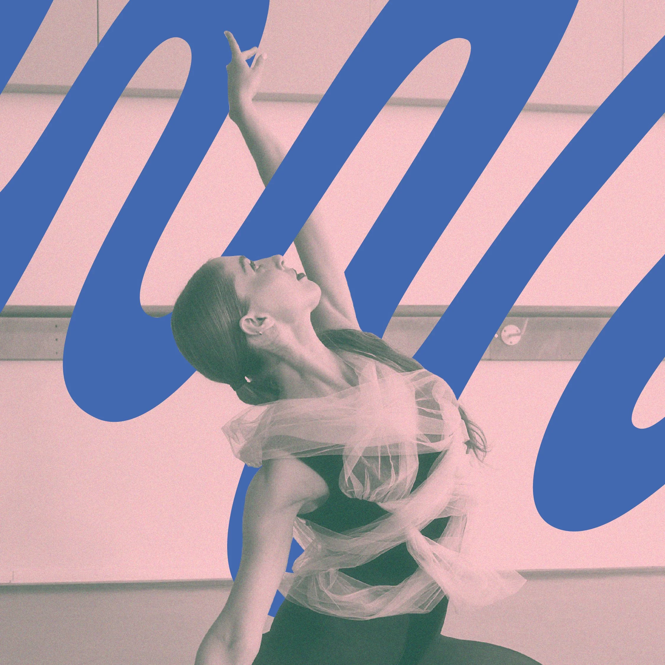
We knew the brand needed to feel expressive, welcoming, and full of movement. Through the creative process, we focused on capturing the emotional connection at the heart of the festival: a diverse community of dancers coming together to perform, grow, and share their stories on stage.
Solution:
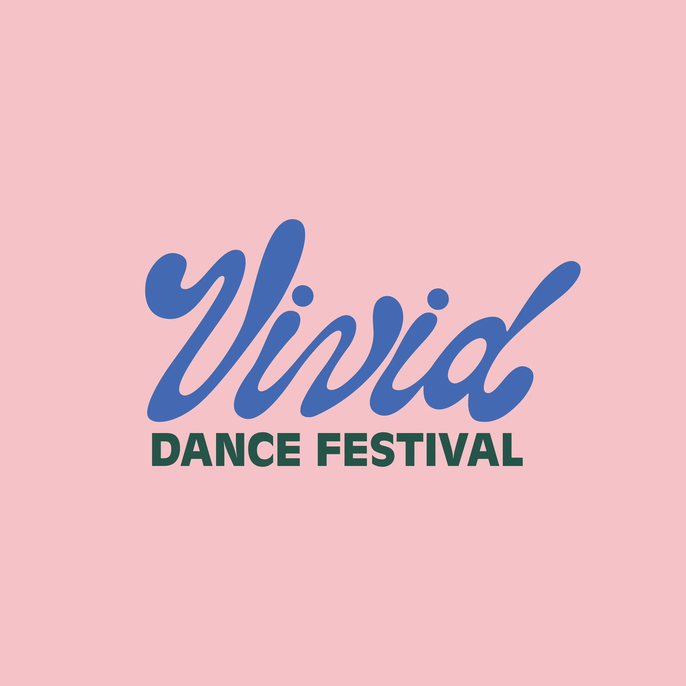
We created a bold and vibrant brand identity that brings the meaning of Vivid to life. The final direction includes a custom hand-lettered wordmark, icon, and monogram. It feels energetic, polished, and expressive, giving the festival a recognizable visual system that can grow with them season after season.


-
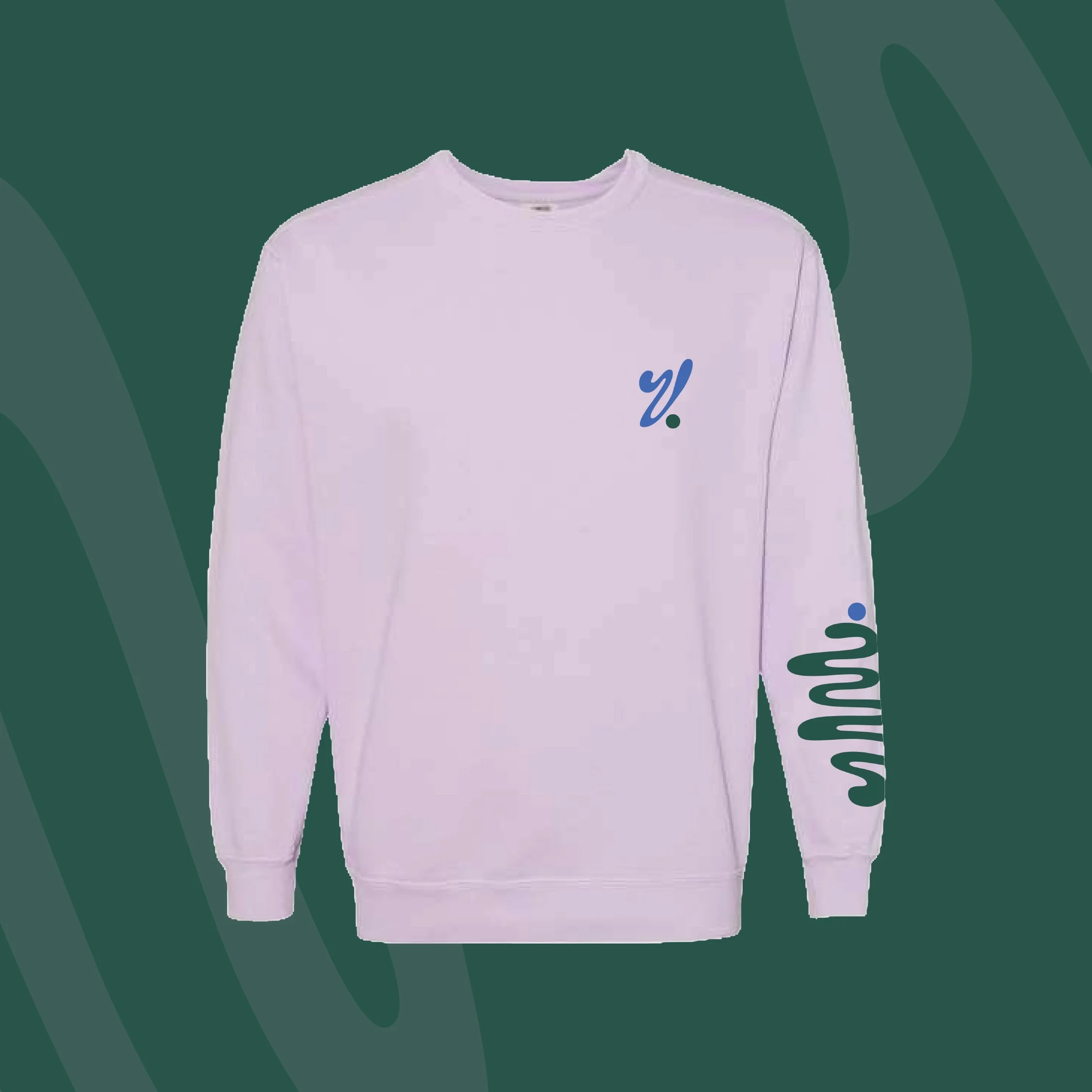
The Vivid Dance Festival identity was built around movement, expression, and connection. The custom hand-lettered wordmark gives the brand a distinct and personal feel, with flowing forms that reflect the energy and artistry of dance. The lettering feels modern, playful, and approachable while still maintaining a professional presence suitable for studios, dancers, and families.
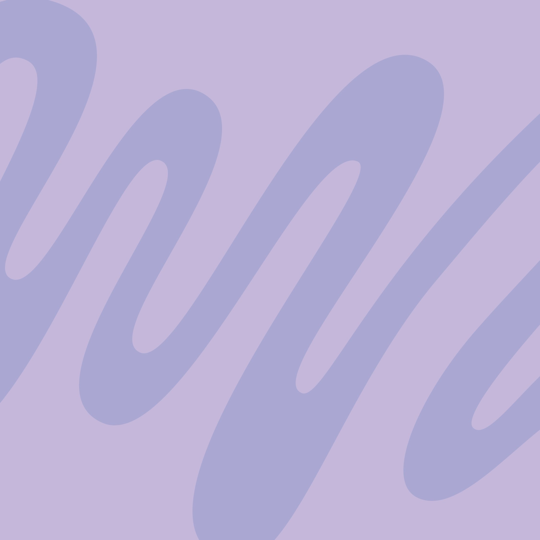
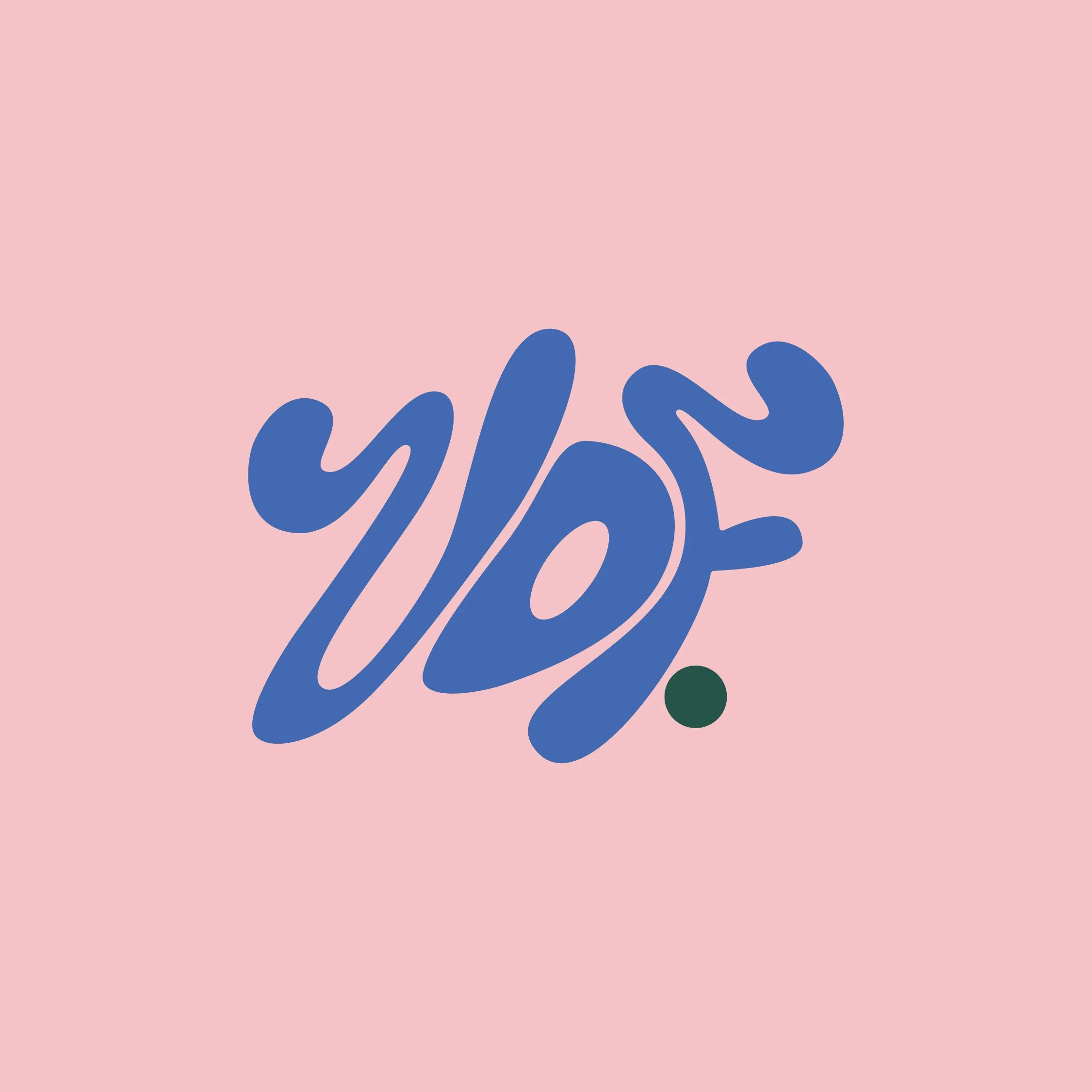
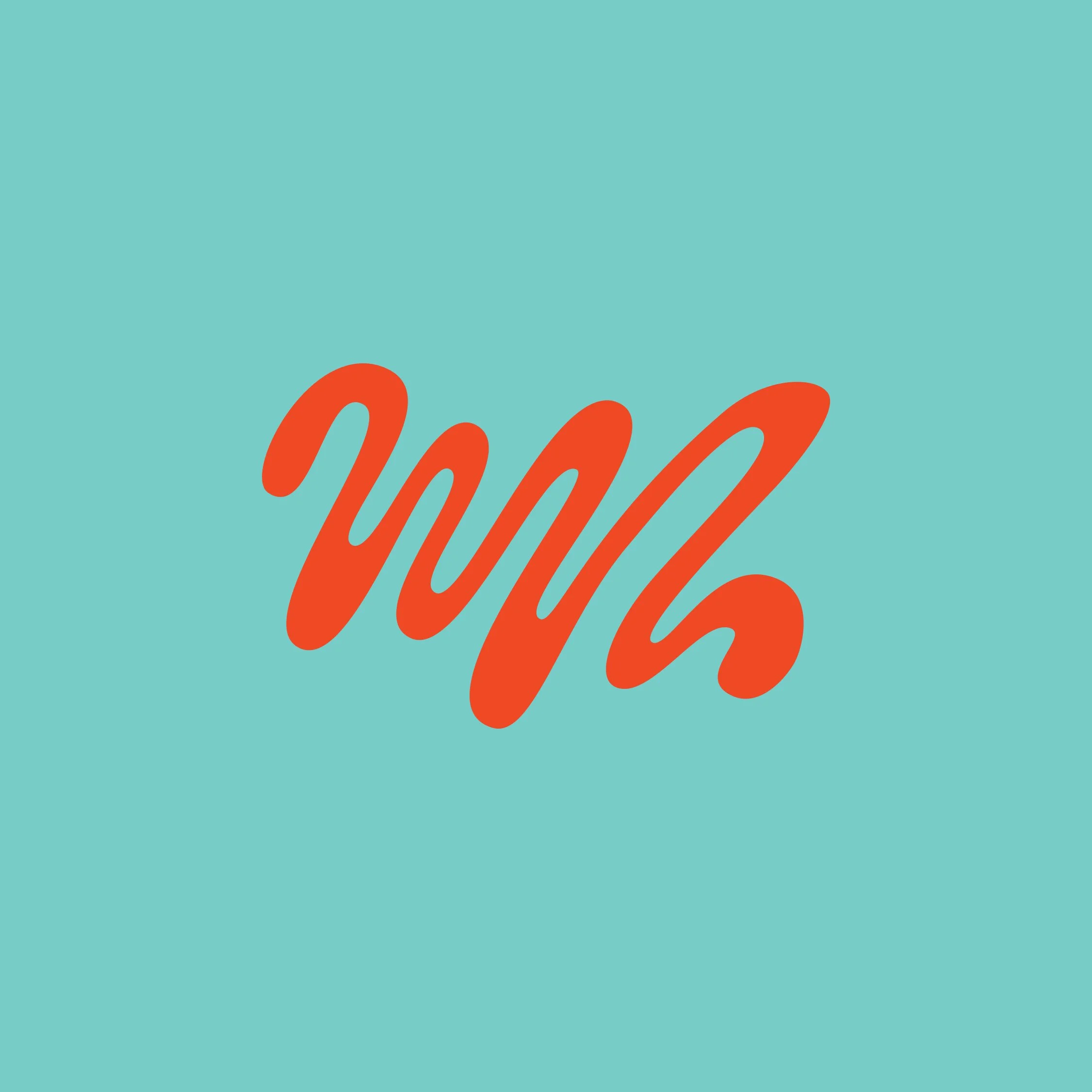
The supporting graphics are fluid and interconnected, representing the passionate heart of the festival and the relationships formed between dancers, teachers, studios, and families. Each shape carries a sense of implied movement, creating a visual language that feels alive, expressive, and full of rhythm. A custom “V” icon was also created as a flexible brand mark, giving the festival a recognizable symbol that can be used across digital, print, and event materials.
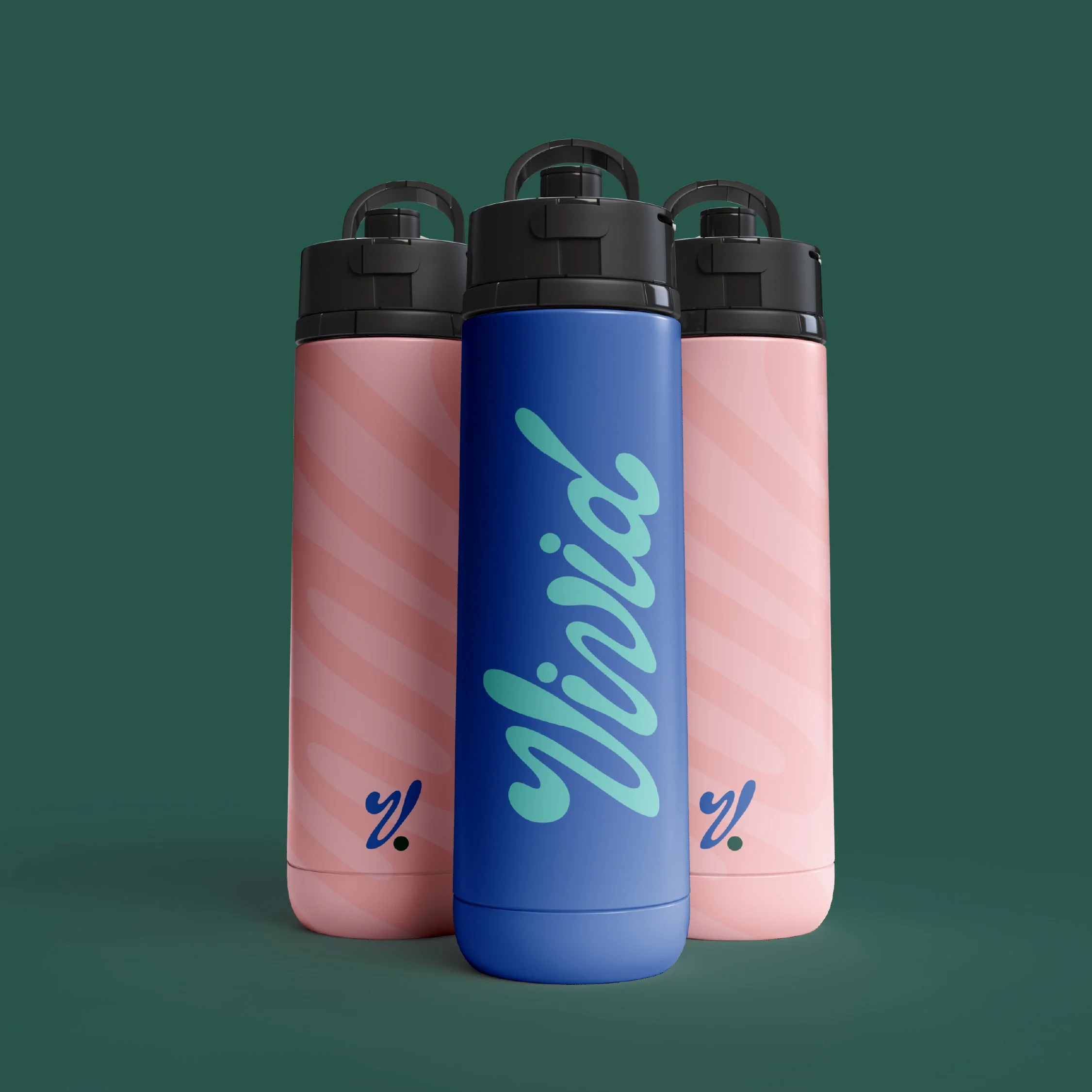
The colour palette was designed to feel youthful, bright, and full of life. Saturated tones of teal, green, blue, orange, and pink work together to create a vivid and energetic system that reflects creativity, community, and celebration. The result is a brand identity that feels memorable, versatile, and built to support the festival as it continues to grow.
-
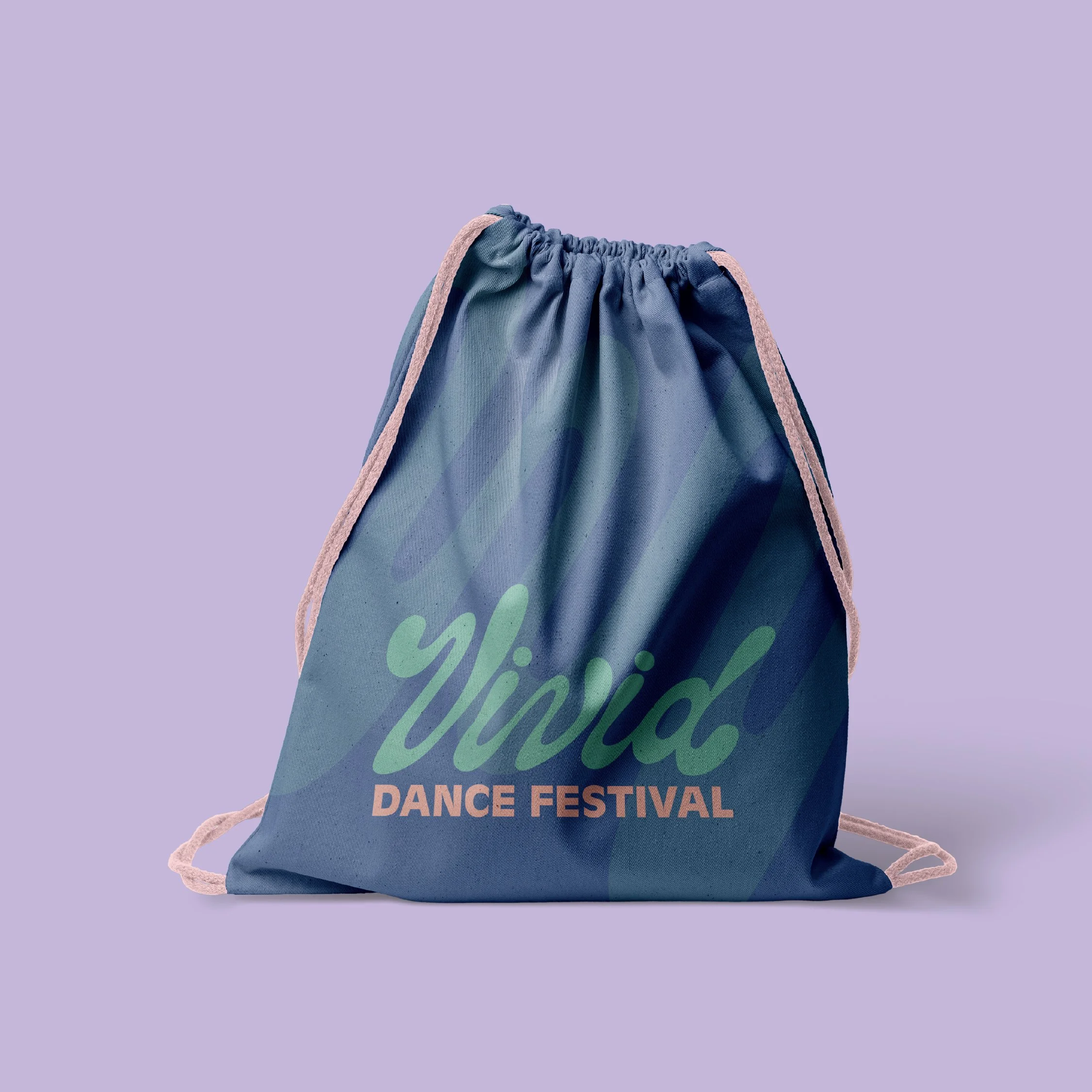
To extend the identity beyond the logo, we created a secondary graphic system that doubles as a dynamic brand pattern. Inspired by sound waves, music, rhythm, and movement, the pattern adds energy and flexibility to the visual identity while reinforcing the expressive nature of the festival.
This pattern was applied across a range of festival merchandise and event materials, including apparel, water bottles, medals, and banners. On apparel, the bold colours and movement-inspired graphics create pieces that dancers would be excited to wear both during and after the festival. On water bottles and promotional items, the pattern adds a bright, recognizable touch that keeps the brand visible throughout the event experience.
For medals and banners, the identity was designed to feel polished and celebratory. The vivid colour palette and flowing graphics help create a strong visual presence on stage, in photos, and throughout the venue. Together, these applications build a cohesive festival experience that feels energetic, professional, and memorable from registration to performance day.