

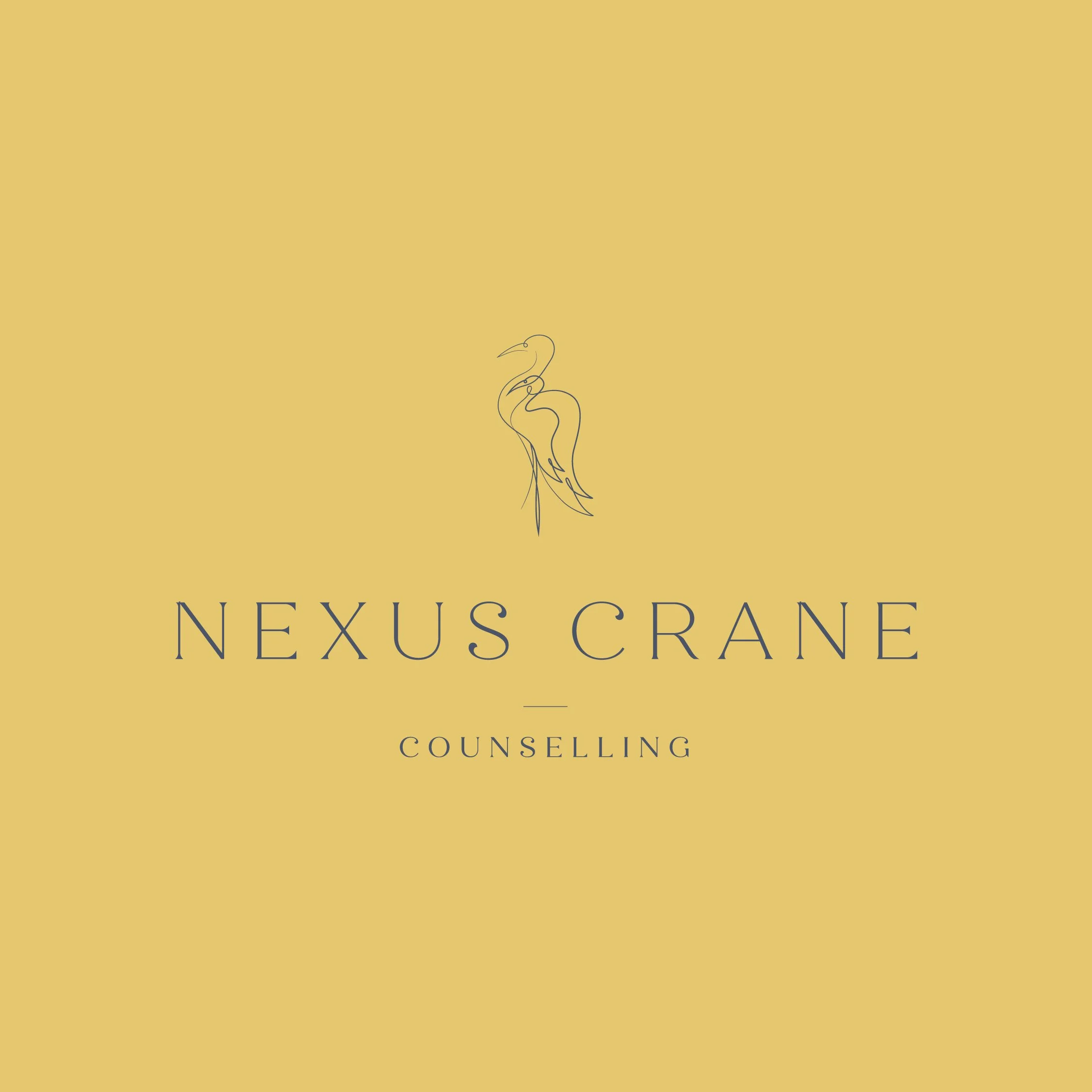
Providing safe and support therapy for Kids, Families and Individuals.
Branding
Illustration
Web Design
Client: Nexus Crane
Scope: Brand Identity, Graphic Design, Illustration, Website Design
Additional Credits: N/A
Description
Nexus Crane Counselling is a private counselling practice offering compassionate, trauma-informed care for children, teens, young adults, parents, families, and individuals. With a focus on connection, emotional safety, and evidence-based therapeutic approaches, Nexus Crane supports clients through every stage of their healing journey.
The practice was built from a deeply meaningful vision: to create a safe, supportive space where clients feel heard, understood, and able to reconnect with themselves and others. When Nexus Crane came to us, the name and purpose were already in place. What was needed was a visual identity and website that could translate that vision into a brand experience that felt professional, personal, and distinct within the counselling space.
Problem:
Nexus Crane Counselling needed a brand identity that could stand apart from the more clinical or generic visual language often seen in the therapy industry. The brand had to feel warm and approachable, while still carrying the professionalism and trust required for a counselling practice.
The challenge was to create an identity that honoured the meaning behind the name while clearly communicating the practice’s unique approach. Nexus Crane needed to reflect connection, safety, healing, and transformation. It also needed to speak to the relationships at the heart of the work: the connection between therapist and client, parent and child, siblings, mentors, families, and the relationship each client has with their past and present self.
Process
Our creative direction was built around the idea of A Safe Space to Connect. This strategy focused on the supportive space Nexus Crane creates with clients, where healing can happen through connection, vulnerability, and trust.
We explored the meaning behind the name as the foundation for the brand. Nexus represents a central point of connection: the intersection between mind, body, relationships, past, present, self, and others. Crane symbolizes wisdom, renewal, longevity, hope, and transformation from hardship.
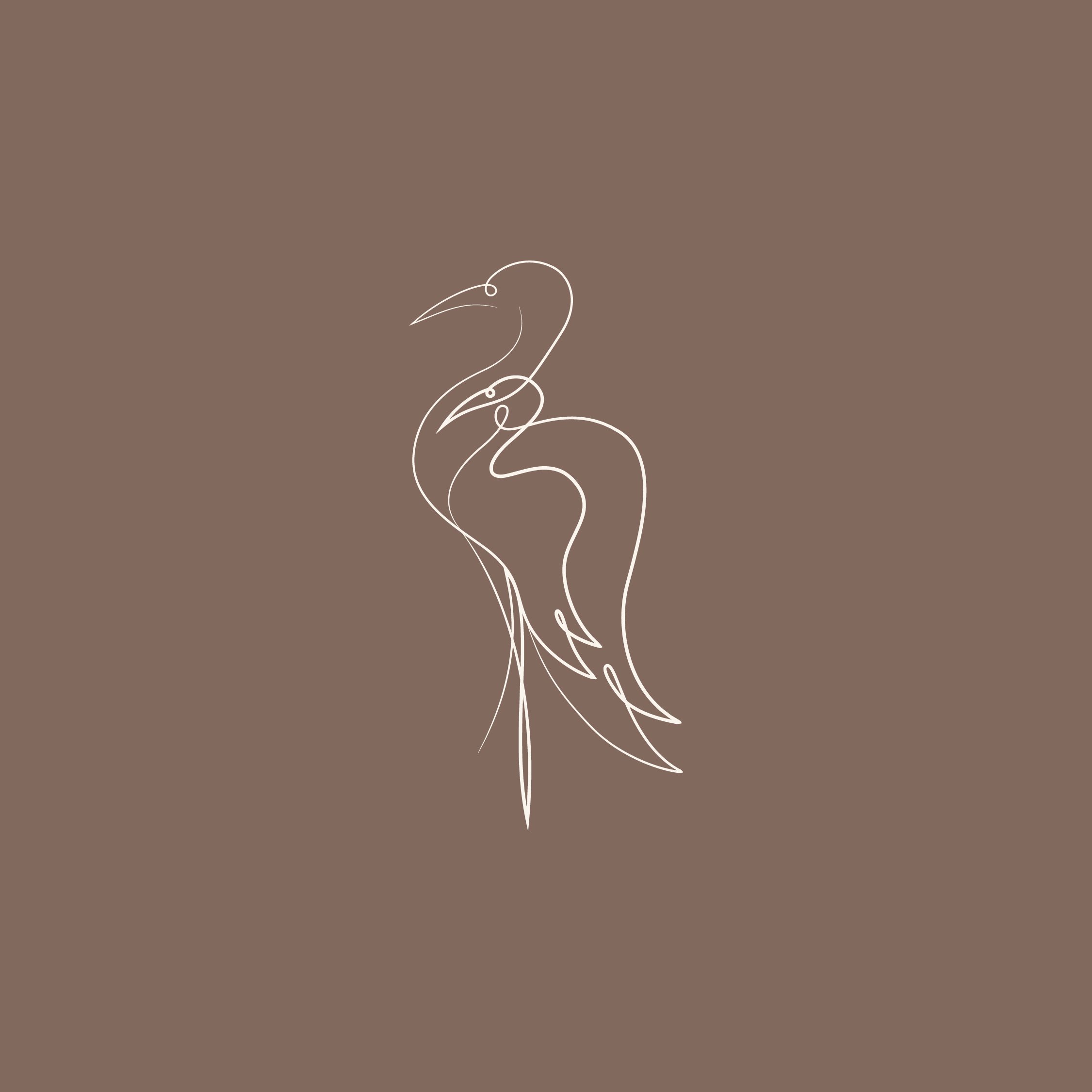
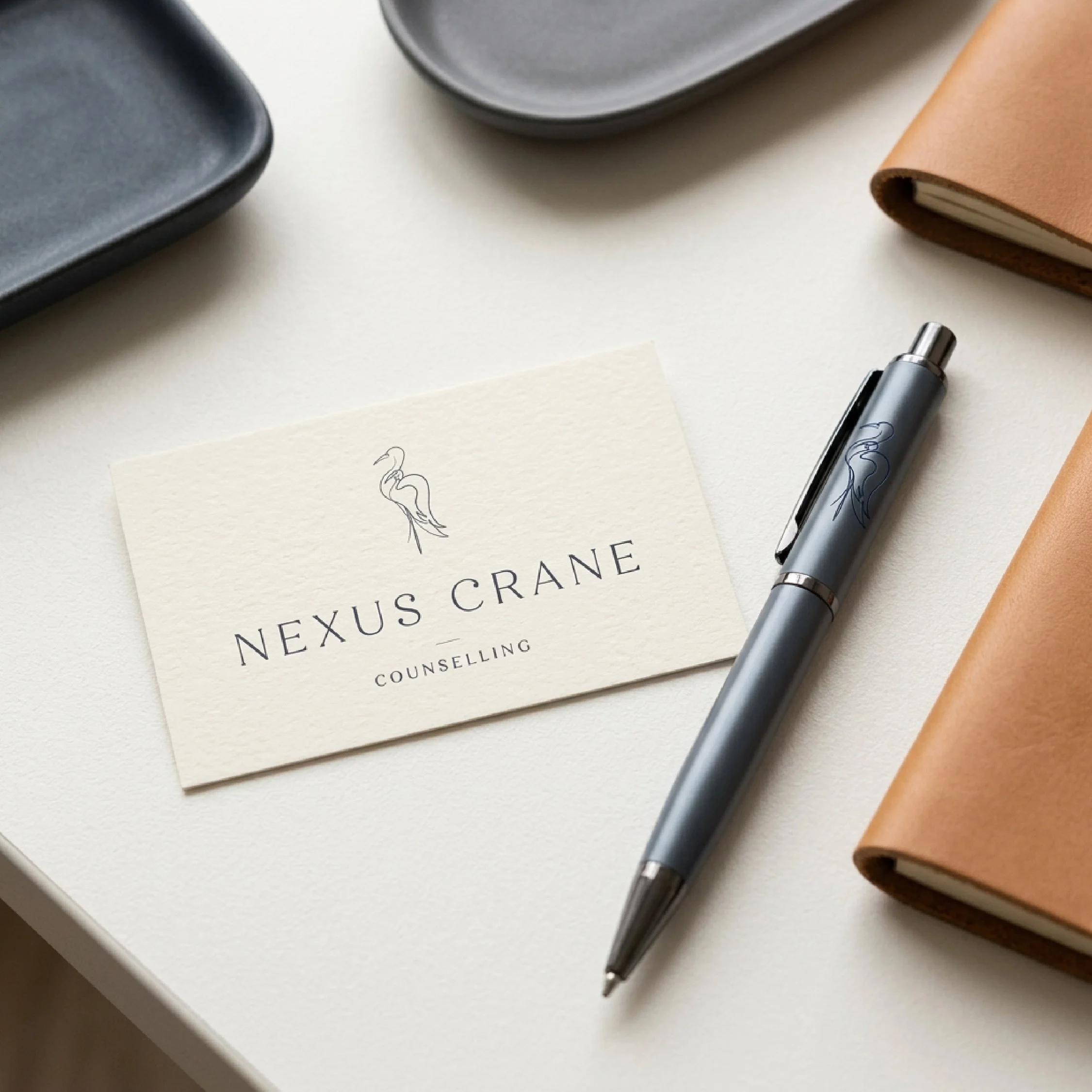
From there, we developed a visual identity centred around a continuous line drawing of a crane standing with quiet strength. Within the larger crane is a smaller, second crane interwoven into the wing shape, creating a layered symbol of care, support, and transformation. This two-crane concept can represent a parent and child, siblings, a mentor relationship, the bond between therapist and client, or the connection between a client’s past and present self.
Solution:
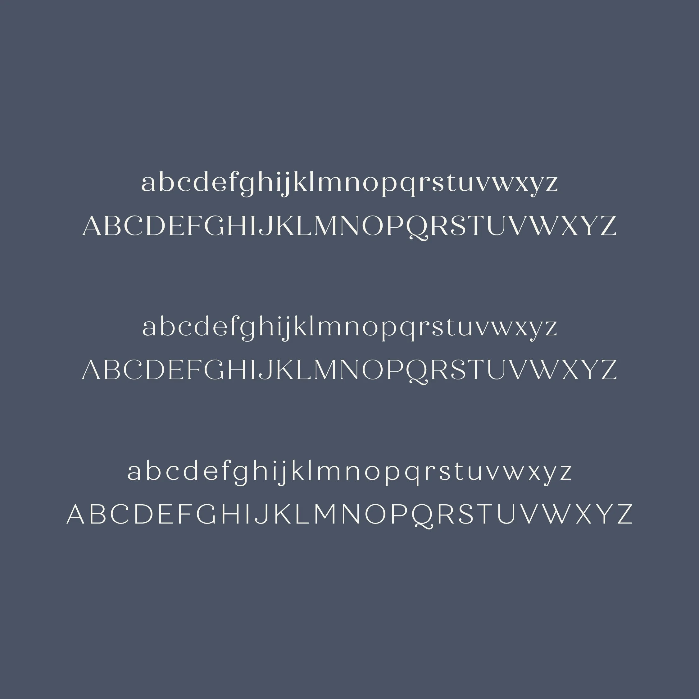
The final brand identity gives Nexus Crane Counselling a distinct and meaningful presence rooted in care, connection, and emotional safety. The logo tells the story of the practice in a simple but layered way, while the structured typography, organic linework, and grounded colour palette create a balance of warmth, professionalism, and trust.
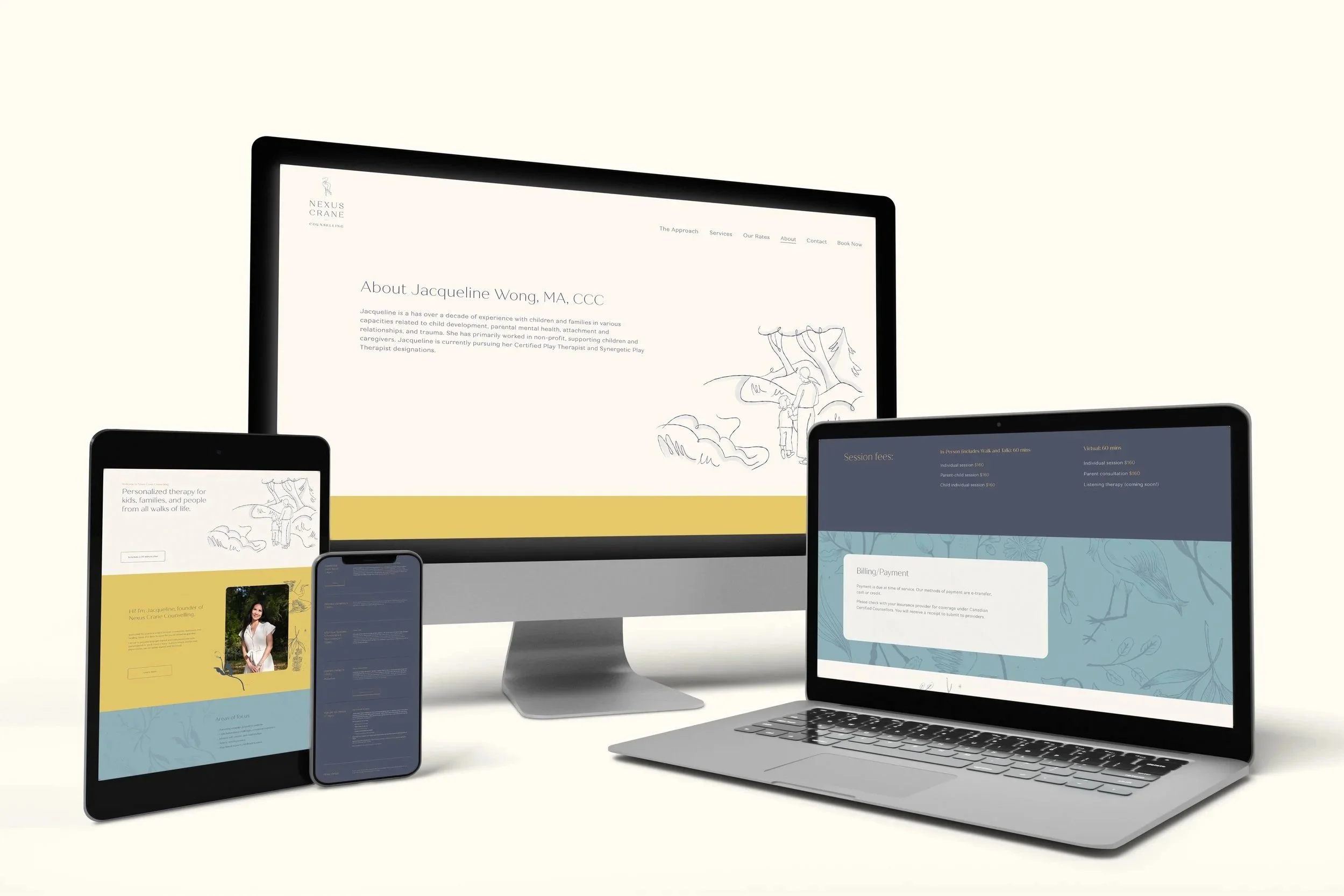
We carried this identity into a calm, spacious website designed to feel supportive and easy to navigate. Thoughtful pacing, approachable content sections, crane imagery, and nature-inspired illustrations help guide visitors through the practice’s services, approach, and story without feeling overwhelmed.
Together, the brand identity and website position Nexus Crane Counselling as a compassionate and credible practice built on trust, transformation, and the belief that healing begins when people feel seen, supported, and worthy of care.


-
We created an approachable yet elevated visual identity that reflects the intention behind Nexus Crane’s origins. The brand needed to stand apart from more clinical counselling visuals, while still feeling grounded, credible, and safe for families, children, teens, young adults, and individuals seeking support.
At the centre of the identity is a continuous line icon of a crane standing with quiet strength. Within the larger crane is a smaller, second crane interwoven into the wing shape. This layered symbolism represents the “nexus,” or the safe space created between therapist and client. It also speaks to the many relationships that shape healing: parent and child, siblings, mentors, past and present selves, and the connection between the physical world and our inner emotional world.
The two cranes create a visual metaphor for support, transformation, and connection. The larger crane feels protective and grounded, while the smaller crane represents vulnerability, growth, and the parts of ourselves that are being cared for through the counselling process. Together, they reflect the way therapy helps clients strengthen their relationship with themselves and others, while moving toward a fuller, more connected version of who they are.
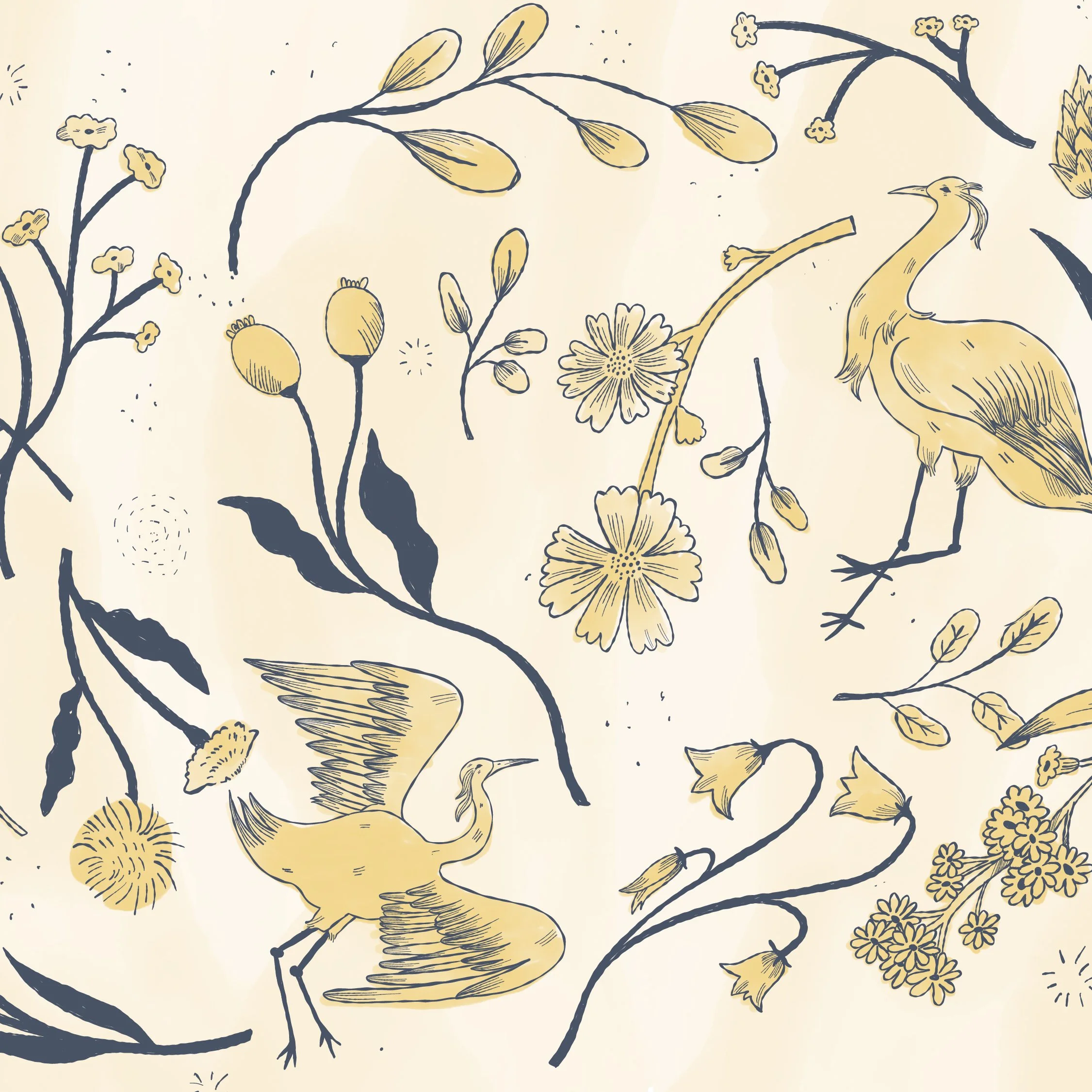
The visual system extends this sense of connection through sketch-like illustrations, organic linework, and a calm, refined aesthetic. Nature-inspired graphics bring in warmth, curiosity, and approachability without relying on generic counselling imagery. The colour palette balances grounded slate blue and deep navy with soft cream and more playful secondary tones, creating a brand that feels both stable and hopeful. The result is a visual identity that is personable, genuine, encouraging, and confident.
-
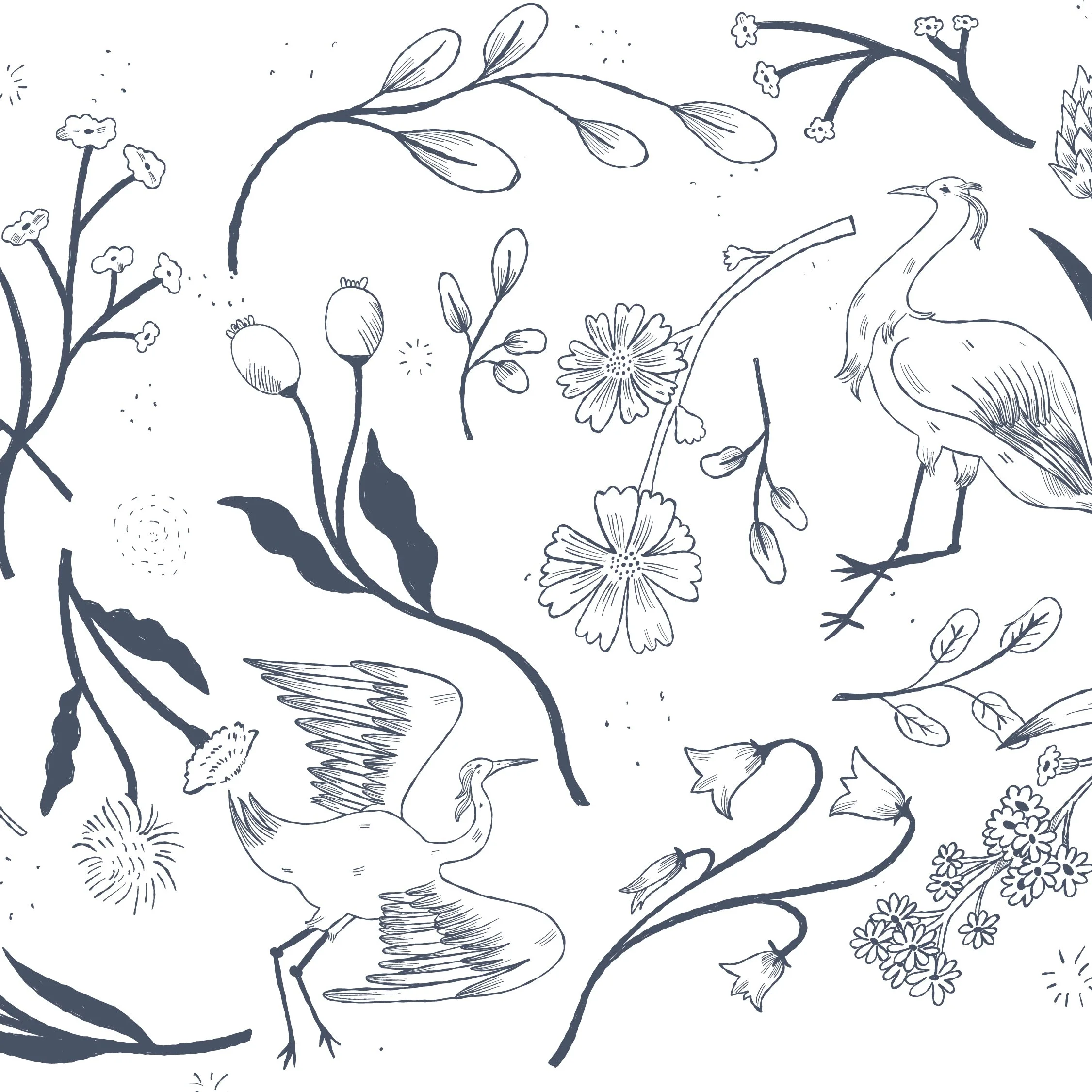
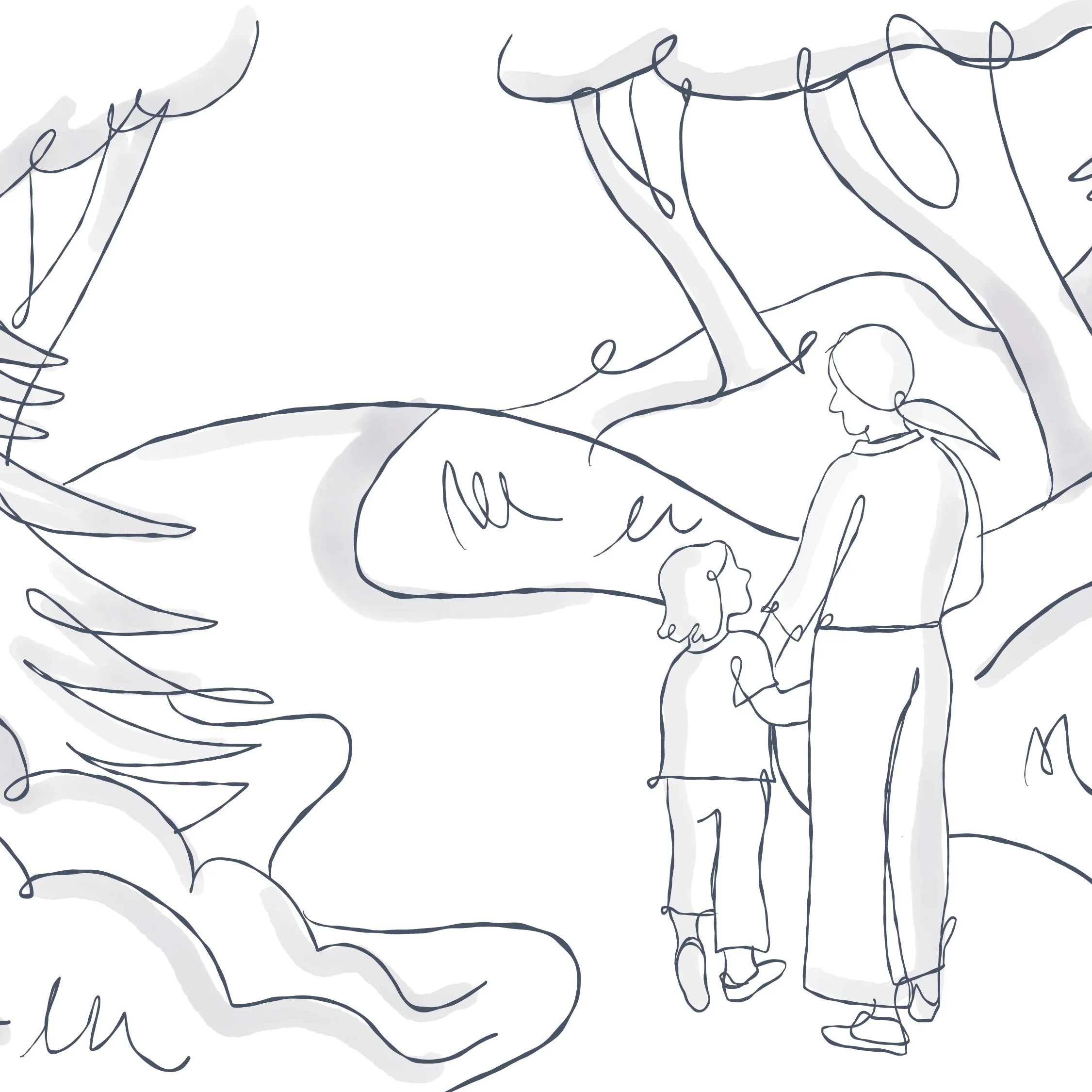
To extend the Nexus Crane identity beyond the logo, we created a nature-inspired illustration system with soft watercolour texture and organic linework. These illustrations were designed to feel calm, human, and reflective, supporting the brand’s themes of connection, safety, growth, and transformation.
The illustrative style brings warmth and softness to the overall identity, helping the brand feel approachable without losing its professional tone. The watercolour texture adds a natural, tactile quality that reflects the non-linear nature of healing, while the delicate linework reinforces the idea of connection: between people, experiences, emotions, and the different parts of ourselves.
We used these illustrations to create a flexible brand pattern that could be applied across both digital and print touchpoints. On the website, the pattern adds visual depth and creates a gentle sense of movement throughout the user experience. Across marketing materials, it gives Nexus Crane a recognizable and cohesive visual language that can be used for social graphics, printed collateral, business cards, signage, and other branded applications.
This illustration system allows the brand to feel more personal, layered, and memorable. It creates a strong connection between the visual identity and the emotional experience of the practice, giving Nexus Crane a brand application that feels grounded, thoughtful, and uniquely its own.
-
The website was designed to create a calm, welcoming first impression for people who may be arriving in a vulnerable moment. Every part of the experience was built to support clarity, emotional safety, and connection, helping visitors understand who Nexus Crane Counselling is, what support is available, and how the practice approaches healing.
We carried the visual identity into a website experience that feels soft, spacious, and easy to move through. The design uses gentle pacing, clear navigation, and thoughtful content sections to help visitors learn about Jacqueline’s services, approach, background, and areas of focus without feeling overwhelmed. The site balances warmth with professionalism, giving prospective clients the information they need while reinforcing a sense of care and trust.
Illustration plays an important role throughout the website, adding emotional depth , gentle movement, and visual continuity while reinforcing the brand’s themes of connection, healing, and growth. The crane, nature-inspired linework, and relationship-centred visual language help create a sense of safety across the experience. Together, the identity and website position Nexus Crane Counselling as a compassionate, professional practice rooted in connection, resilience, and the belief that healing can begin when people feel seen, supported, and worthy of care.