

Your granny's ice cream shop, scooped into one nostalgic brand experience.
Brand Identity
Packaging
Brand Experience
Client: Annie Rue Ice Cream
Scope: Brand Identity, Packaging, In-Store Experience, Print Materials
Additional Credits: Printing supplied by NexGen Graphix
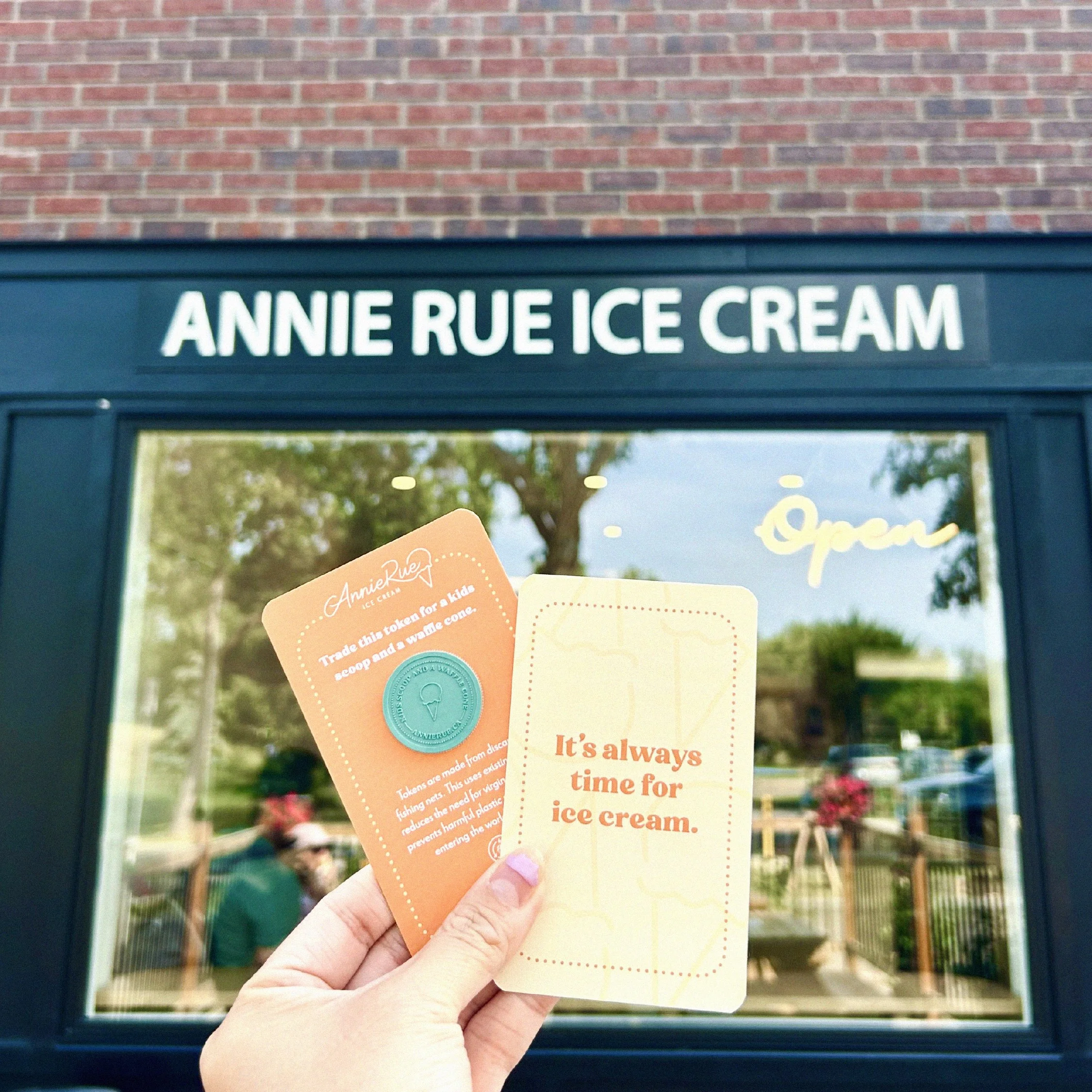
Annie Rue is a small-batch ice cream shop nestled in the heart of Edmonton’s Parkallen neighborhood. Their handcrafted ice cream is made with real ingredients and fresh, nostalgic flavours; a nod to simpler times that feels both adventurous and comforting.
We had the pleasure of developing the name, brand identity, packaging, and in-store experience, creating a cohesive brand that captures the warmth and whimsy of Annie Rue.
Description:
Problem:
Annie Rue came to us as a brand-new business—with no name, no identity, and only a vision. The owner shared a hand-drawn sketch of an ice cream shop she’d dreamt about, a glimpse into what she hoped to create. From the start, she knew the brand needed to reflect her story and the deep connection to her family.
Process
We began with the name. “Annie” was shared by both of her grandmothers, and “Rue” is a nod to her own last name. It felt only fitting that the brand be rooted in something so personal and meaningful. From her hand-drawn sketch and dream of creating a space that celebrates family and nostalgia, we developed a visual identity that brought her vision to life. Alongside the branding, we also provided creative direction and recommendations for a cohesive in-store experience.
Solution:
The final brand is a modern homage to her grandmother’s homemade ice cream—nostalgic, whimsical, and full of heart. We extended the brand into every touchpoint, from signage and interior design to packaging and print materials, creating a cohesive experience that feels both familiar and delightfully fresh.


-
We designed the brand identity to capture the nostalgia of her grandmothers and the whimsical sketch of the shop born from her dream. Subtle patterns and scalloped edges evoke vintage wallpaper and delicate doilies, while the hand-lettered logo feels like a personal signature from her grandmothers. A bright yet slightly vintage color palette brings warmth and playfulness, and the organic wordmark is paired with a modern serif and bold display typeface, creating a cohesive and versatile system across all branding materials.
-
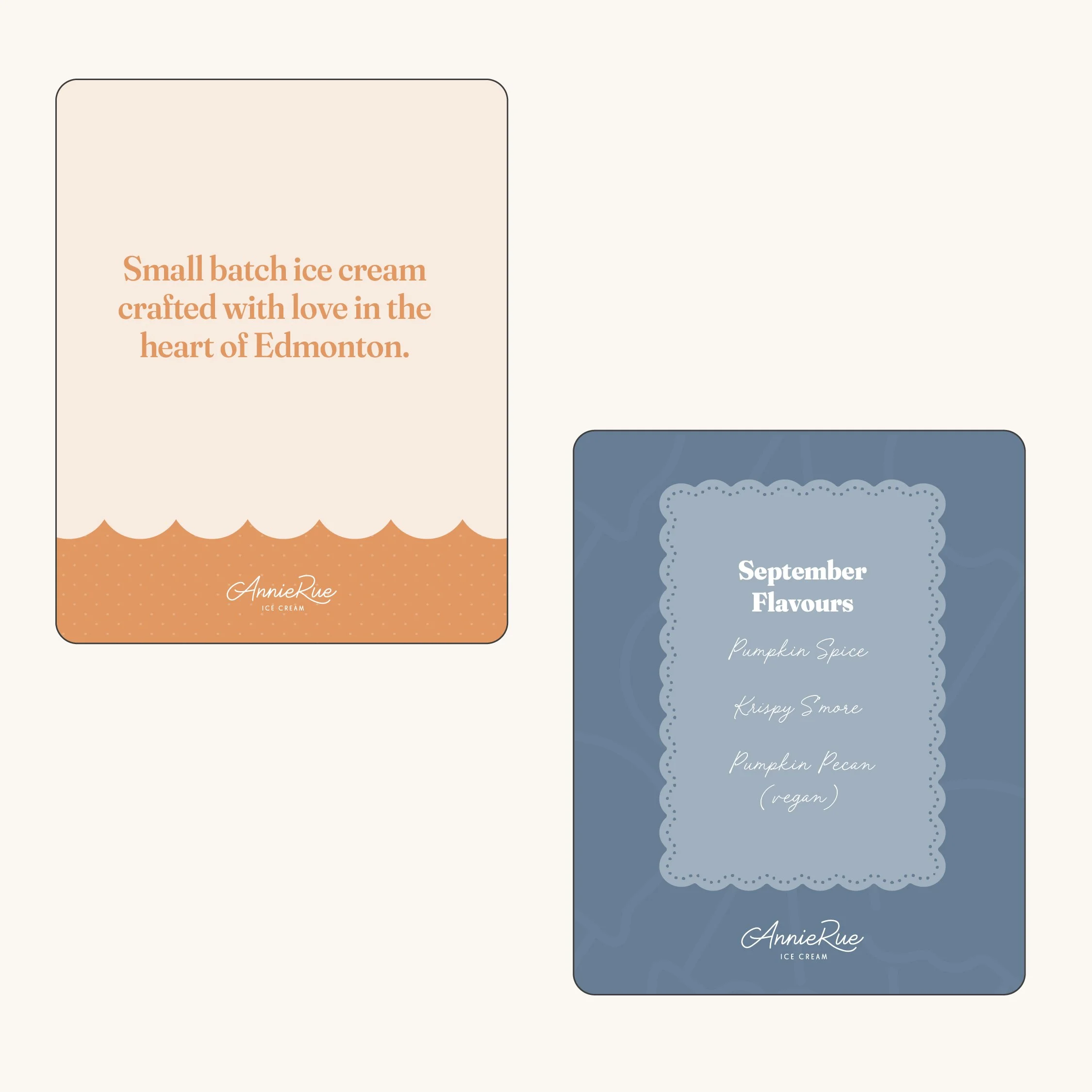
We designed large and small pint labels as part of the product packaging, incorporating the dotted pattern from her visual identity. Each label includes a space for the handwritten ice cream flavor of the month, adding a personal, artisanal touch. The color palette shifts with the seasonal flavors, keeping the packaging fresh, playful, and aligned with the brand’s whimsical personality.
-
As part of the brand identity, we ensured that the interior customer experience aligned seamlessly with the visual design. We provided inspiration and recommendations for finishes such as marble countertops, gold accents, wainscoting, and scalloped tiles, all evoking the warm nostalgia of her grandmother’s home.
To further extend the brand experience, we designed loyalty punch cards, kids’ tokens that could be used or gifted, social media templates, and door and window decals, creating a cohesive and memorable experience at every touchpoint.