

Creating legacy and wealth through high-end branding.
Strategy
Branding
Pattern Design
Client: The Private Wealth House
Scope: Brand Strategy, Brand Identity, Pattern Design
The Private Wealth House is an independent financial consultancy led by Kim MacDonald, operating under Raymond James. She serves high-net-worth clients ($750K–$3M) and ultra-high-net-worth clients ($3M–$15M) with complex planning needs, offering sophisticated investment strategies. Her services also extend to niche areas such as divorce and estate financial planning.
Description:
Problem:
Kim takes a holistic, client-centered approach, helping individuals focus on living their lives rather than worrying about their financial future. Her offerings are structured around the “house” metaphor—First Floor: Financial Planning (Divorce, Estate, Education, Retirement); Second Floor: Insurance (Life, Disability, Critical Illness, Travel); Third Floor: Investment Management (Discretionary and Non-Discretionary).
When Kim approached us, she had only a business name and no visual identity. The challenge was to create a brand identity that reflects the breadth and complexity of her services while capturing the approachable, interactive nature of her planning process.
Process
We began with an in-depth discovery to define the project objectives, audience, and brand requirements. From this, we developed a brand strategy and vision boards to guide the creative direction. Key insights from our research informed a design that conveys luxury and polish, while also highlighting Kim’s personalized, client-focused approach.
Solution:
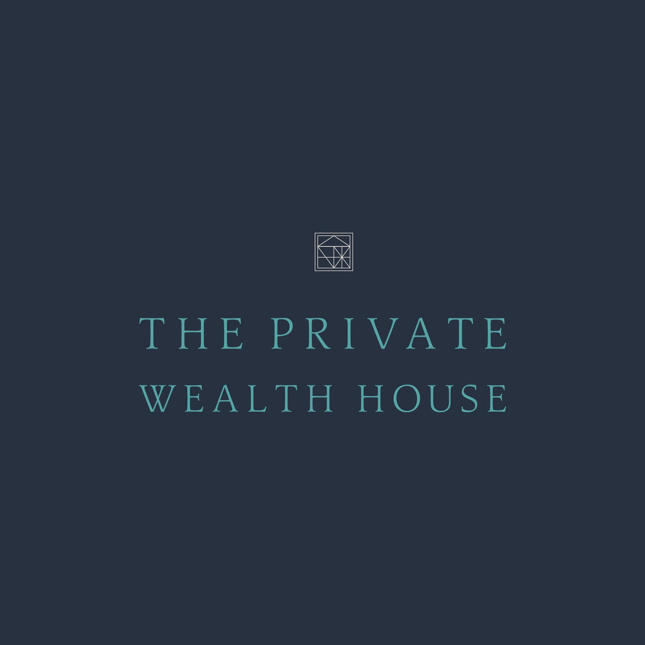
We developed a refined brand identity for The Private Wealth House that resonates with a high-net-worth audience while reflecting the business’s structured, house-based service model.
Using the house metaphor, we designed a primary logo symbolizing a multi-level home, complemented by four secondary icons incorporated into brand patterns to represent each individual service. The sophisticated logo, rich color palette, and custom graphics combine to create a high-end, cohesive visual identity that reflects the values, expertise, and clientele of The Private Wealth House.


-
Kim takes a holistic, client-centered approach, helping individuals focus on living their lives rather than worrying about their financial future. The “house” metaphor structures her offerings:
First Floor: Financial Planning (Divorce, Estate, Education, Retirement)
Second Floor: Insurance (Life, Disability, Critical Illness, Travel)
Third Floor: Investment Management (Discretionary and Non-Discretionary)
Interactive planning is central to her process. She approached us with only a business name and no existing brand or visual identity.
We began with an in-depth discovery to clarify the project objectives, audience, and brand requirements. From this, we developed a brand strategy and vision boards to guide the creative direction. Key insights from our research included:
Her clients value luxury and polished presentation.
Unlike bank-based competitors, she is personally involved in every step of the planning process.
She offers comprehensive financial and insurance planning in-house, avoiding the need to outsource.
Clients appreciate her fast service, clear communication, and ability to address key financial needs early, reducing long-term stress.
Competitors such as RBC Dominion Securities, BMO Nesbitt Burns, TD Wealth, CIBC Wood Gundy, and Scotia Wealth present a corporate, institutional brand feel—creating an opportunity for a more personalized and approachable identity.
-
We developed a refined brand identity for The Private Wealth House that resonates with a high-net-worth audience while reflecting the business’s structured, house-based service model.
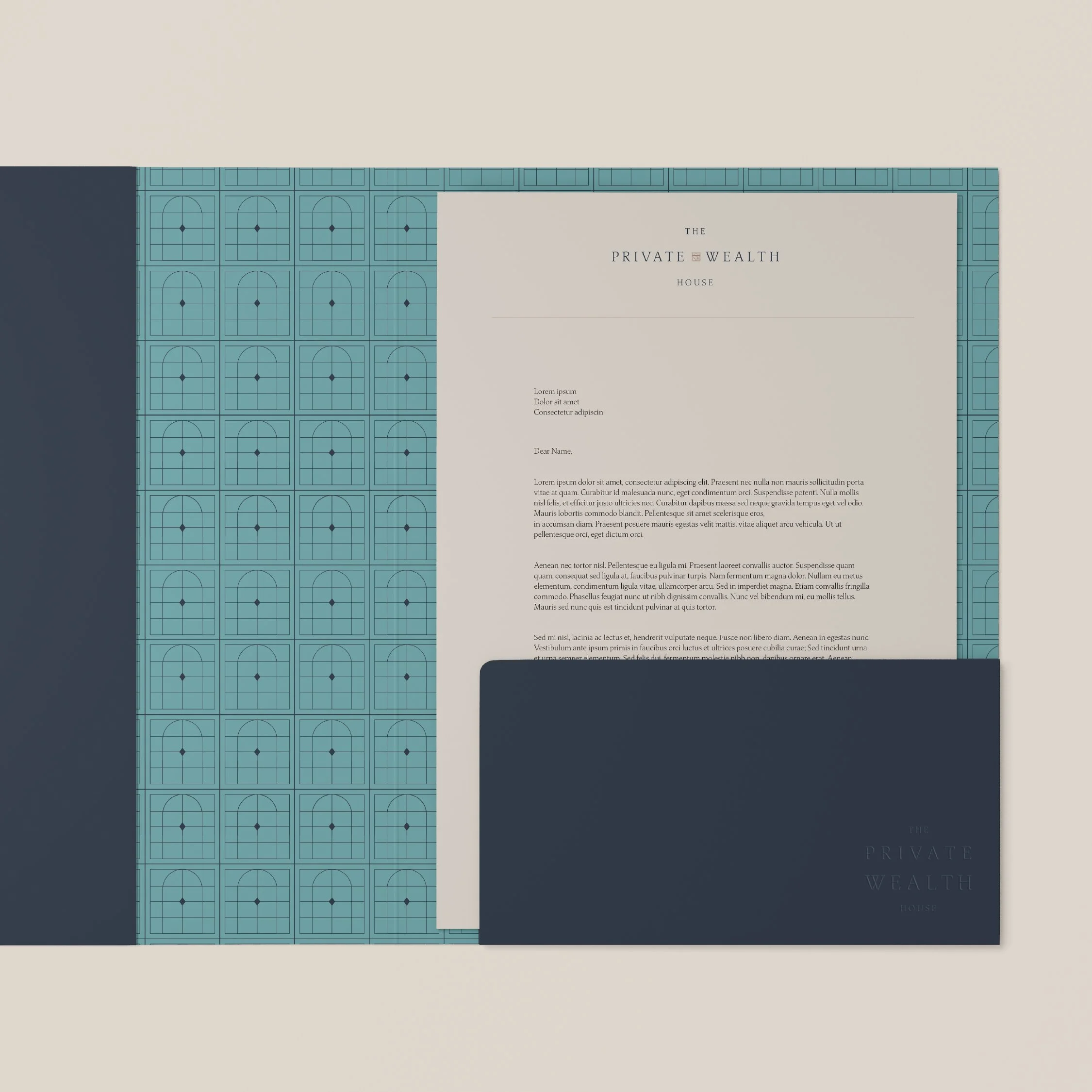
The primary logo symbolizes a multi-level house, representing the range of services offered. We also created four secondary icons used in brand patterns:
Doorway – Opportunity
Floor Tile – Investments and growth
Window Pane – Planning and wealth
Scaffolding – Insurance
The color palette combines rich greens and blues with warm terracotta, balancing sophistication with an approachable, grounded tone—appealing to an affluent, mature audience without resembling traditional bank branding. A serif typeface was chosen for its elevated yet approachable feel, setting the brand apart from competitors’ modern sans serifs.
-
Using the icons from the visual identity, we created a pattern that represents how The Private Wealth House helps clients build and expand their financial future, with a nod to the decorative details found in luxury home design. A simplified version of the pattern also integrates into the wordmark as a distinctive brand element.