
How We Transformed Upbeat Energy into a Vibrant Brand Identity.
Branding
Graphic Design
Apparel
Client: Overdrive Dance Force
Scope: Brand Identity, Graphic Design, Brand Applications
Additional Credits: N/A
Description
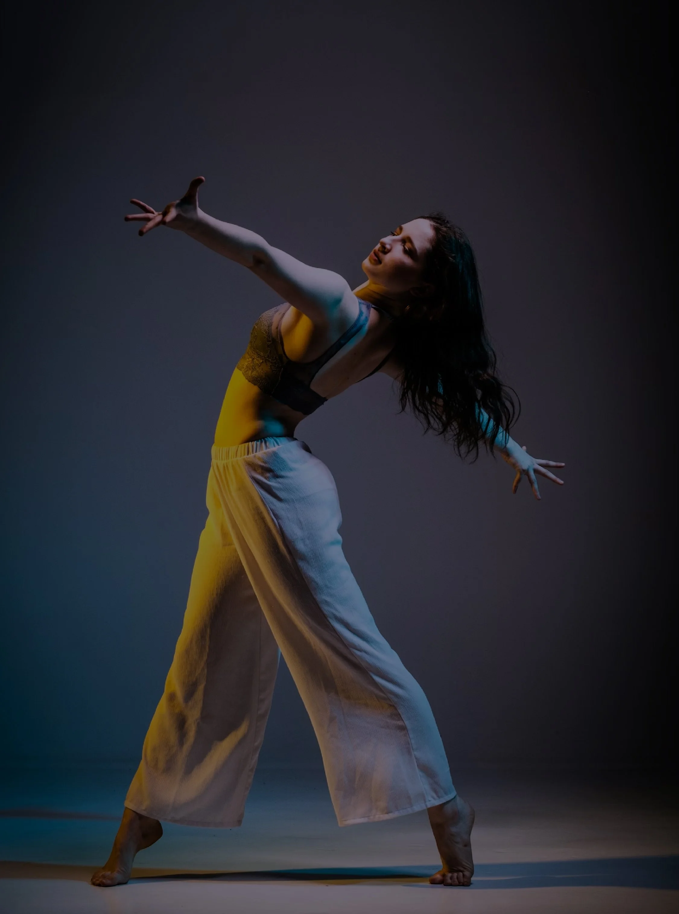
Overdrive Dance Force is a studio that has created an environment where all dancers can thrive and feel seen. This studio focuses on creating a space where dancers who danced once a week felt just as important as the dancers doing 8+ hours a week.
They came to us as they approached their 10-year anniversary, ready for a brand refresh that matched their evolution. They were looking for an identity that would make a strong, lasting impression while still feeling warm and inviting. The goal was to create something fresh, modern, and versatile, with a sense of energy that truly reflects the spirit of their studio.
Problem:
After a decade in business, Overdrive Dance had outgrown its existing visual identity. While the studio had built a strong community, its brand lacked the consistency and clarity needed to support its continued growth and connect with both current and prospective dancers.
The existing identity did not fully reflect Overdrive’s core values, inclusive approach, or the welcoming energy that makes the studio unique. The challenge was to create a brand that felt energetic and modern while still preserving the warmth, personality, and sense of belonging at the heart of the studio.
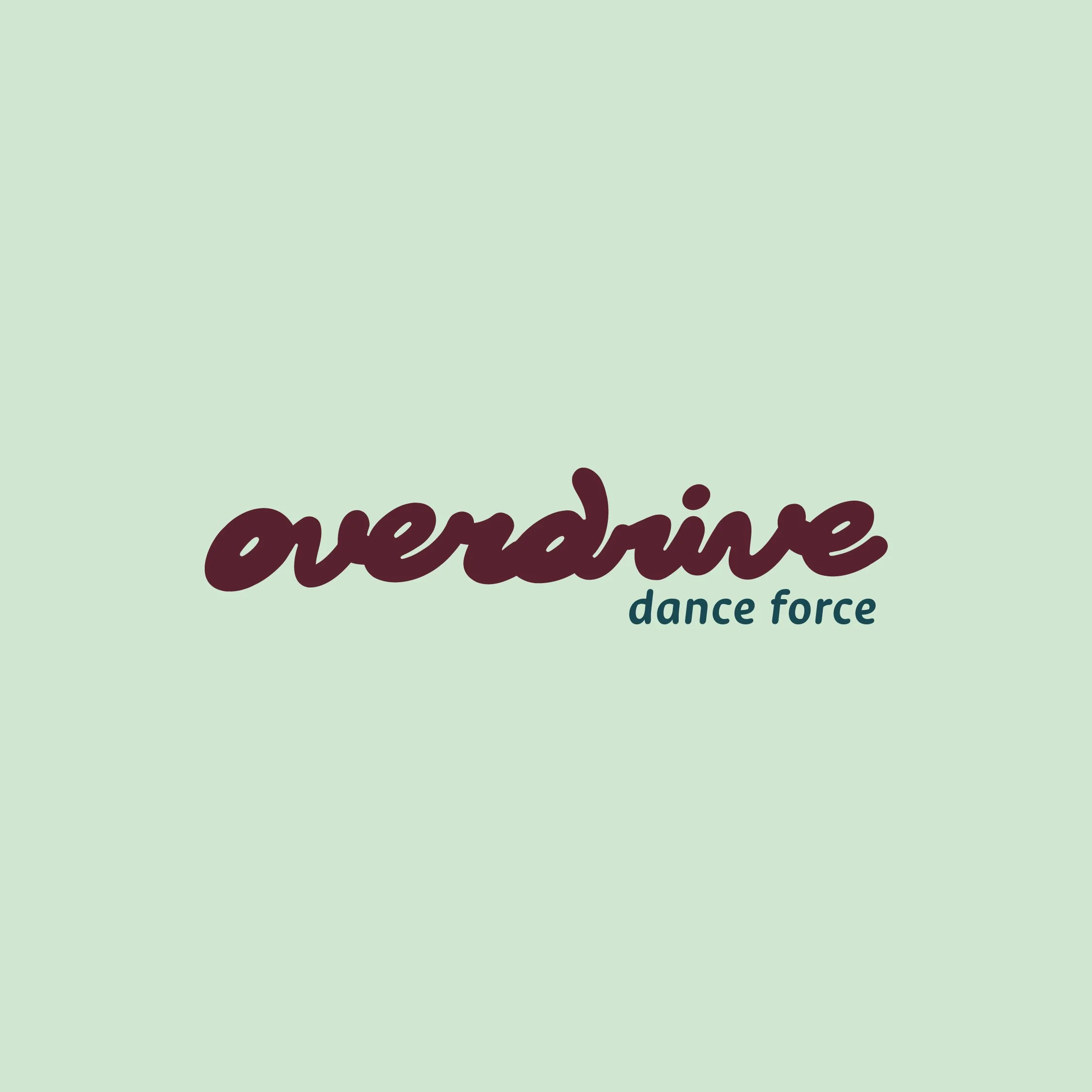
Overdrive came to us with one key visual request: to maintain the burgundy from their existing brand colours. From there, the opportunity was to build a more cohesive and expressive identity that could grow with them.
Process
Through our discovery process, we learned that Overdrive is more than a dance studio. It is a home for dancers of all ages, abilities, and commitment levels to feel supported, empowered, and seen.
At ODF, dance is treated as a form of joyful expression. It is playful, accessible, and deeply personal. Whether someone is exploring movement for the first time or pursuing dance with greater commitment, Overdrive creates space for every dancer to thrive.
We wanted the brand identity to capture that feeling: movement, encouragement, individuality, and the joy of expressing yourself in a positive and welcoming environment.
Solution:
We created a vibrant, bubbly, and energetic visual identity that positions Overdrive as a safe and empowering space for movement.
The typography feels fluid and expressive, giving the brand a sense of motion and play. Dynamic, abstract shapes radiate across the wordmarks and monograms, representing the energy, adaptability, and inclusivity of the studio.
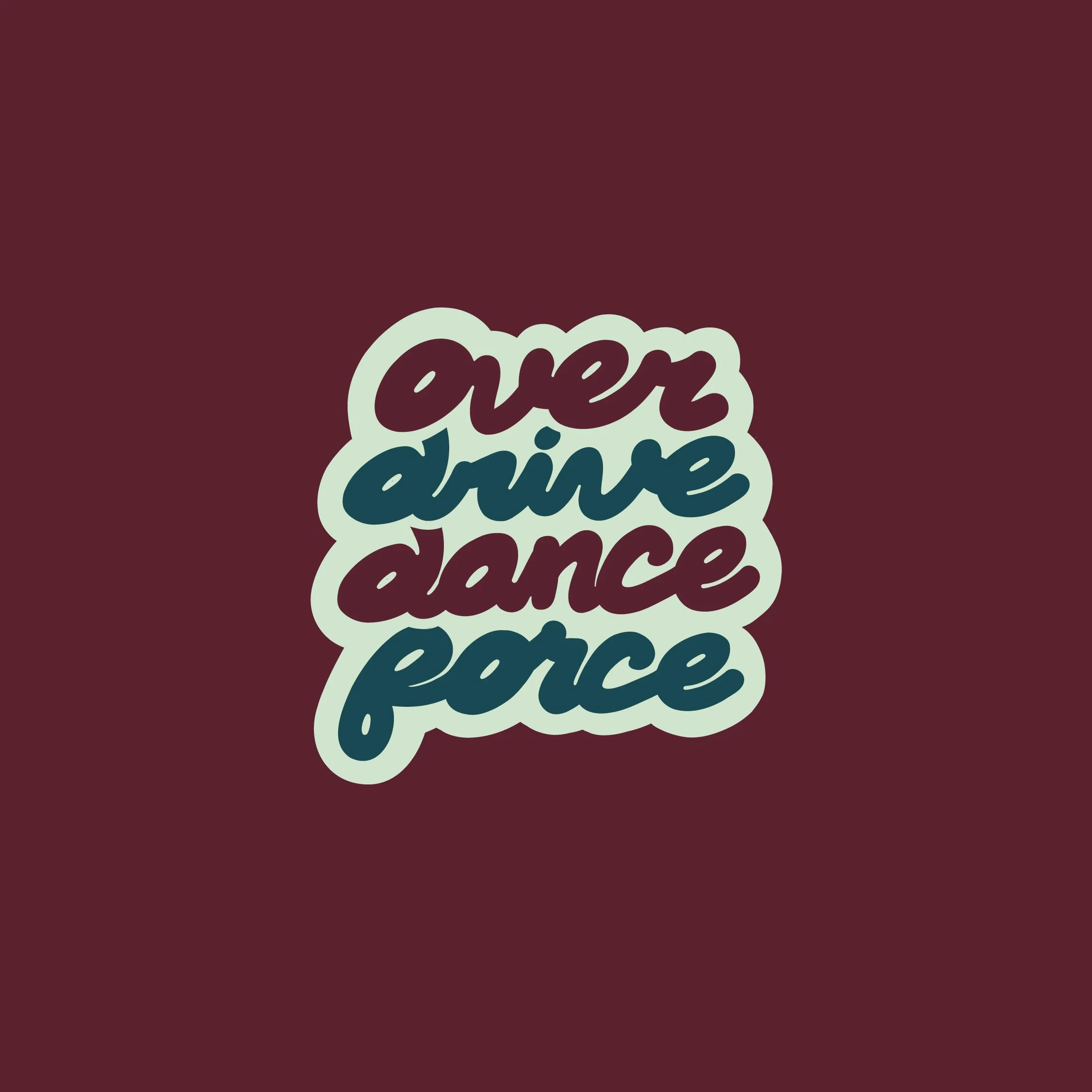
These visual elements reflect Overdrive’s belief that every dancer deserves thoughtful teaching, meaningful encouragement, and room to grow. The colour palette builds from their original burgundy and expands into an upbeat system full of warmth, rhythm, and energy.
The result is a brand identity that feels joyful, expressive, and alive, just like the community Overdrive Dance has created.
-
We built a vibrant and expressive brand identity for Overdrive Dance that captures the energy, movement, and joy at the heart of their studio. The visual direction balances playfulness with polish, creating a brand that feels welcoming, modern, and full of personality.
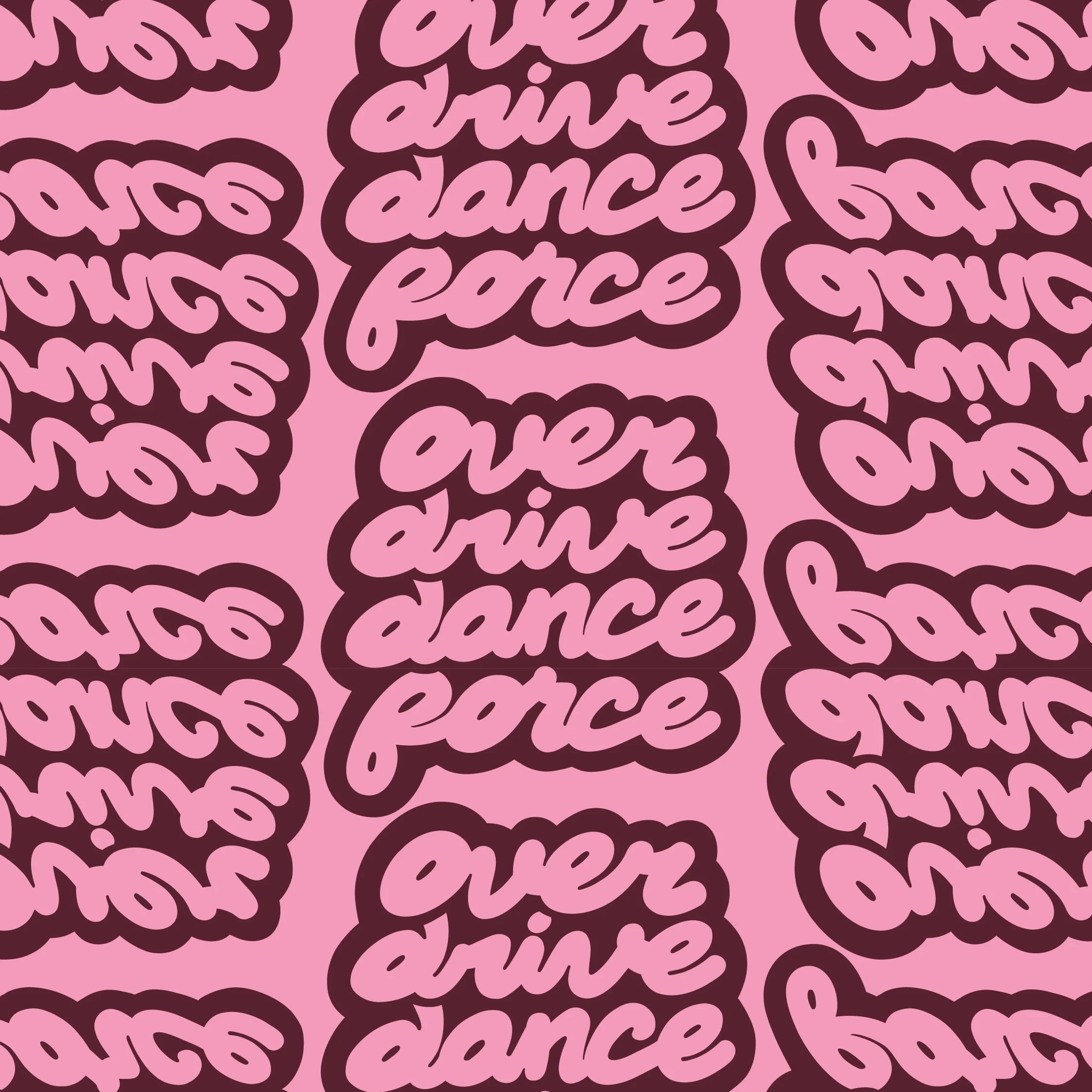
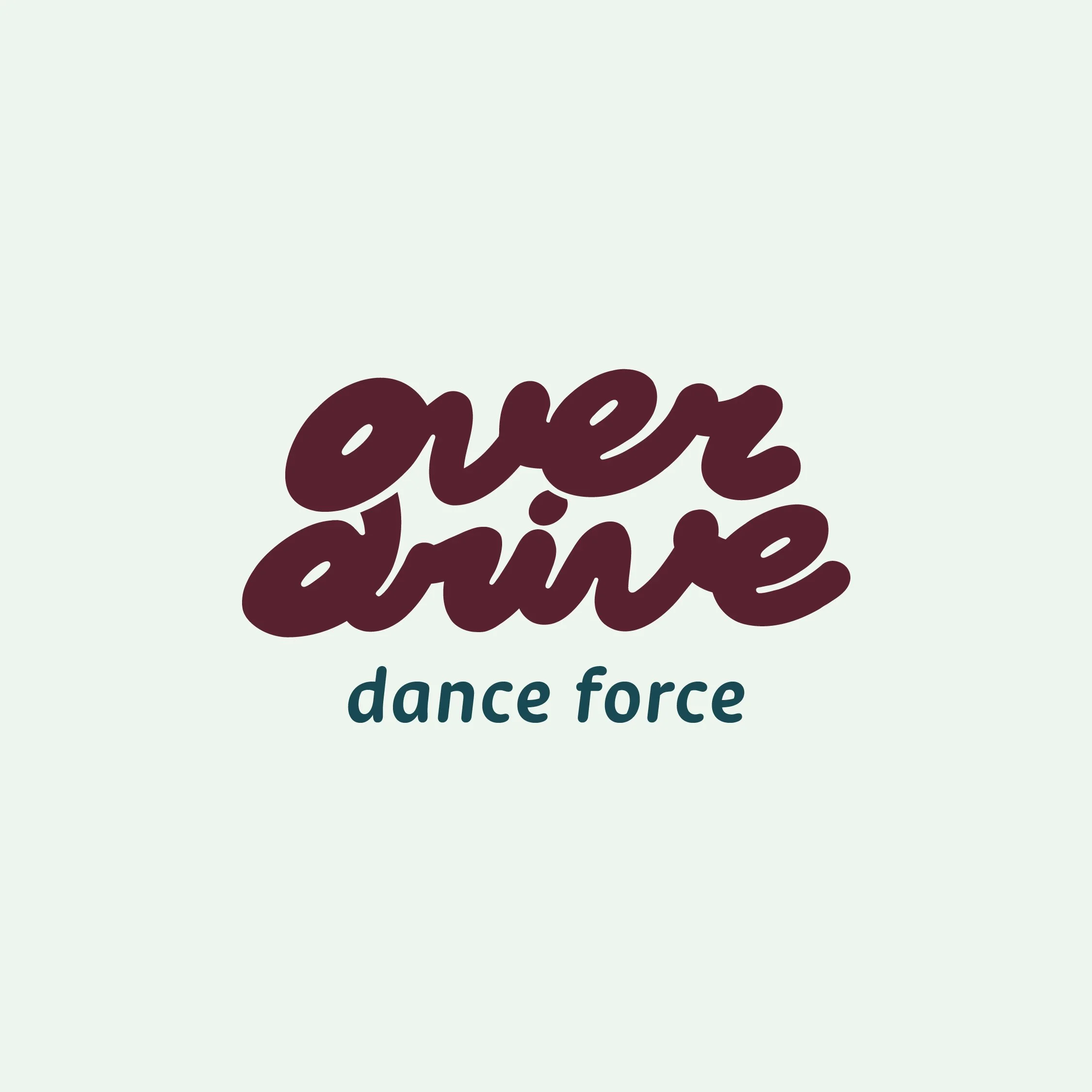
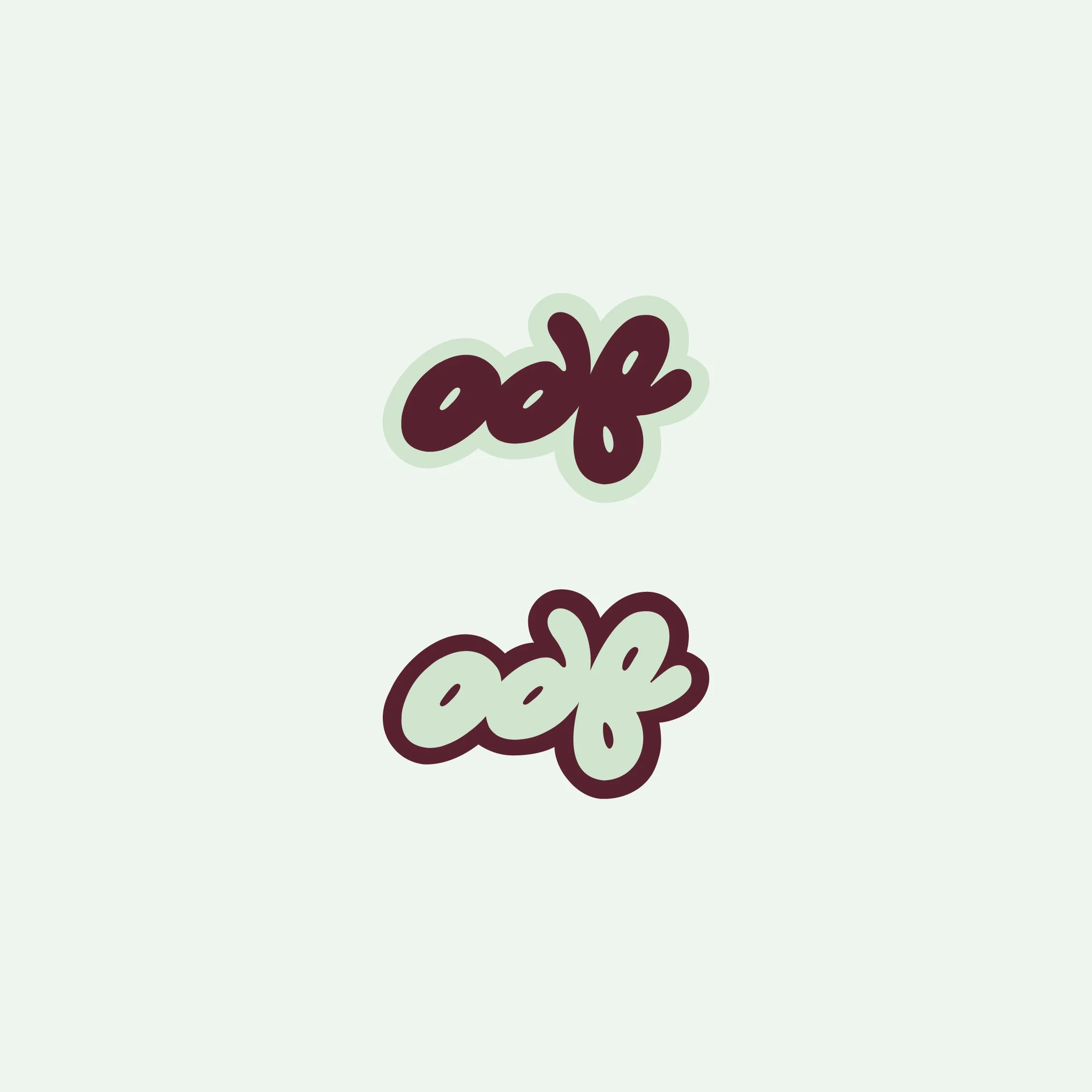
A key part of the identity is the custom hand-lettering. Rather than relying on a standard typeface, the wordmark was developed to feel fluid, approachable, and full of motion. The letterforms have a rhythmic quality that reflects the movement of dance itself. They feel expressive without being overly polished, giving the brand a human, personal quality that mirrors the supportive environment Overdrive creates for its dancers.
The colour palette expands on the studio’s existing burgundy and introduces a brighter, more energetic system. Bold, joyful colours bring warmth and excitement to the identity, helping the brand feel fresh, youthful, and engaging. The palette gives Overdrive more flexibility across digital, print, apparel, and studio applications while still maintaining a strong connection to the colour equity they had already built.
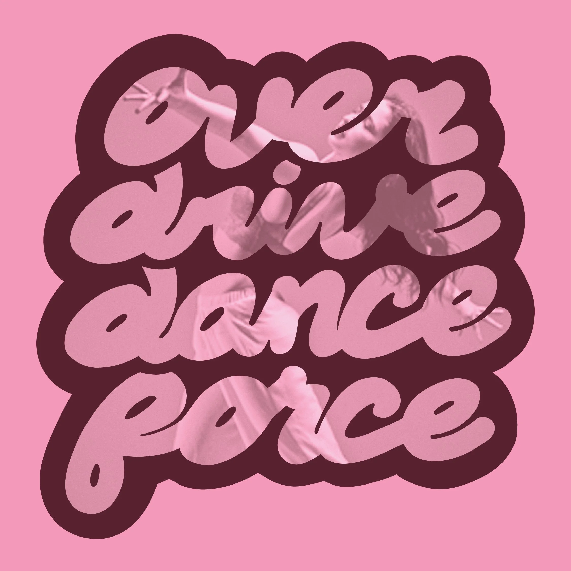
The overall aesthetic is bubbly, dynamic, and full of life. Abstract radiating shapes, playful compositions, and expressive graphic elements were created to visually represent movement, confidence, and individuality. These elements give the identity a flexible visual language that can shift from bold and high-energy to warm and community-focused, depending on the application.
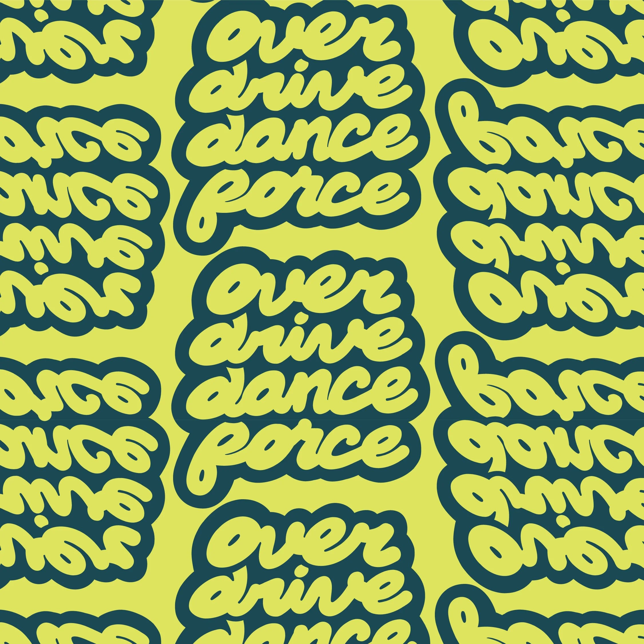
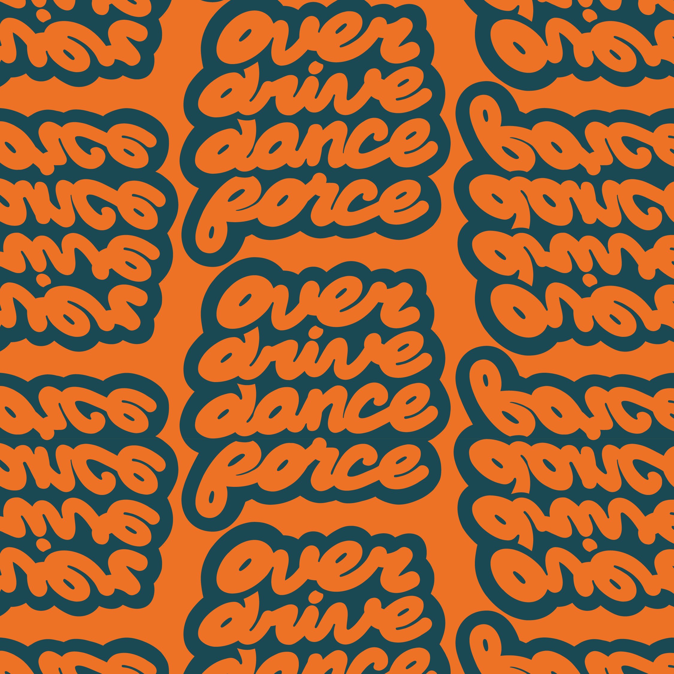
We also used the stacked wordmark as the foundation for a dynamic brand pattern. By repeating and shifting the mark in different directions, the pattern creates a sense of rhythm, motion, and momentum; similar to the way dancers move through space. This gave the identity another flexible graphic tool that could be applied across apparel, merchandise, social content, and print materials while reinforcing the expressive movement at the core of the Overdrive brand.
Together, the identity creates a more cohesive and ownable brand for Overdrive Dance; one that reflects their inclusive spirit, celebrates joyful movement, and gives them the tools to grow with confidence.
-
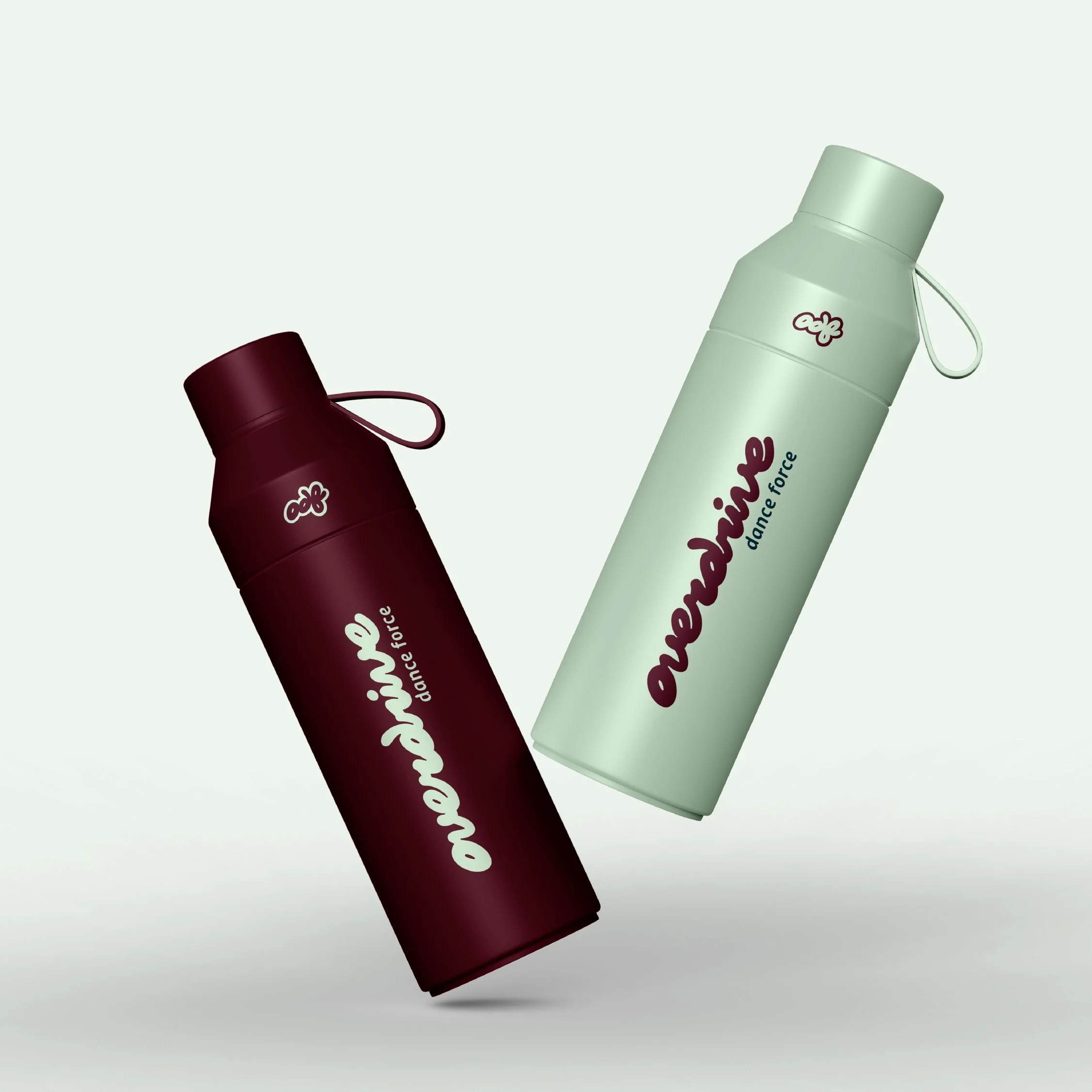
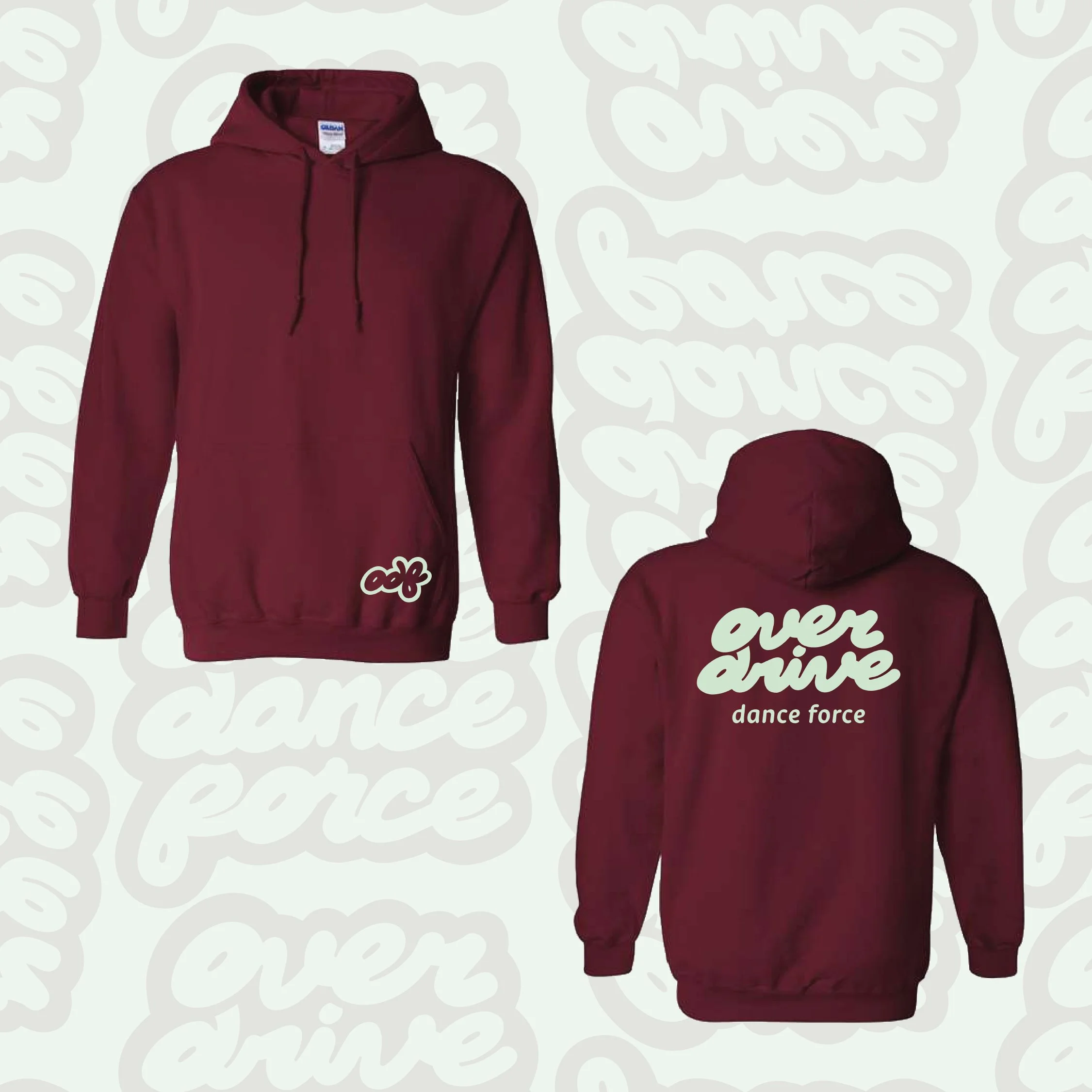
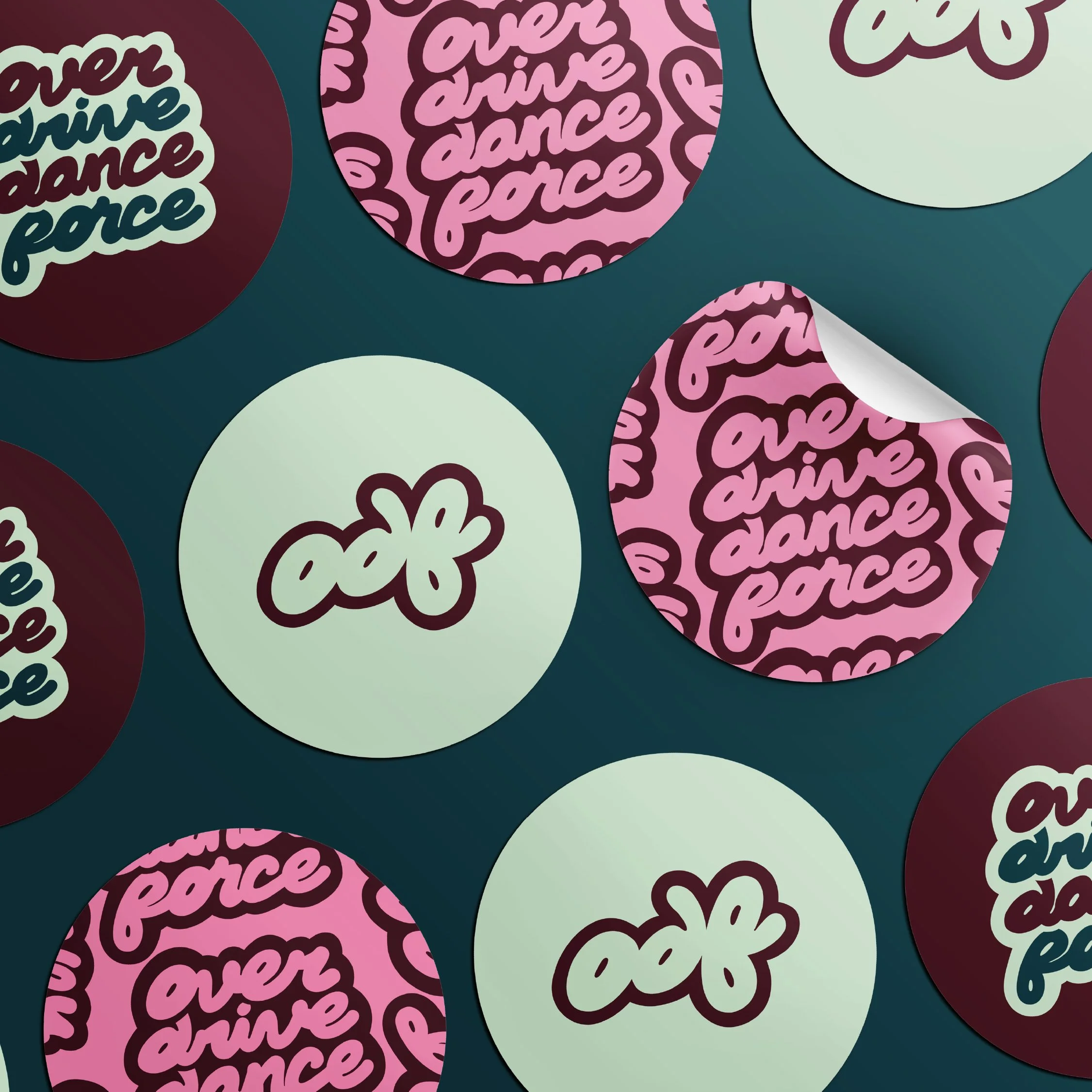
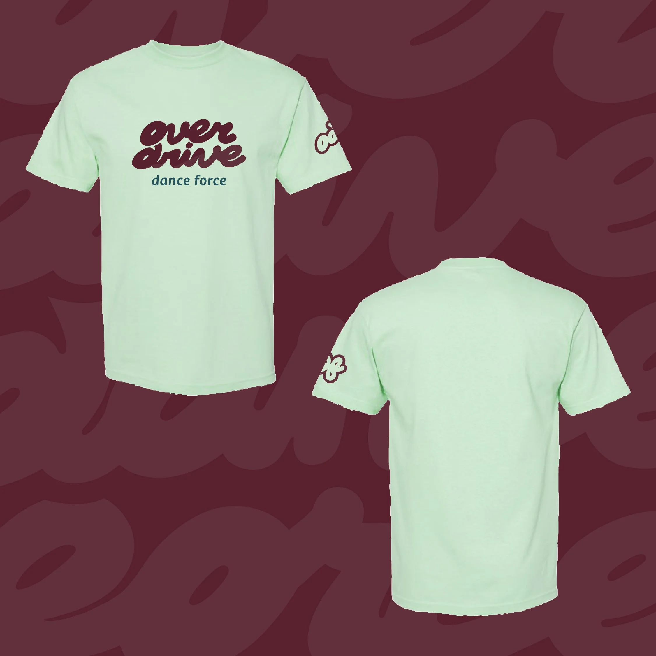
We also extended the brand identity into apparel and merchandise concepts, giving Overdrive a stronger foundation for studio-branded pieces their dancers would actually want to wear. Using the custom lettering, monogram, bright colour palette, and graphic shapes, we explored applications across items such as t-shirts, hoodies, crewnecks, water bottles, and other studio merchandise.
These concepts were designed to feel less like generic branded apparel and more like expressive pieces connected to the Overdrive community. The result is a brand system that can live beyond the studio walls, giving dancers, families, and staff a way to proudly represent the studio in a way that feels fun, modern, and full of energy.