
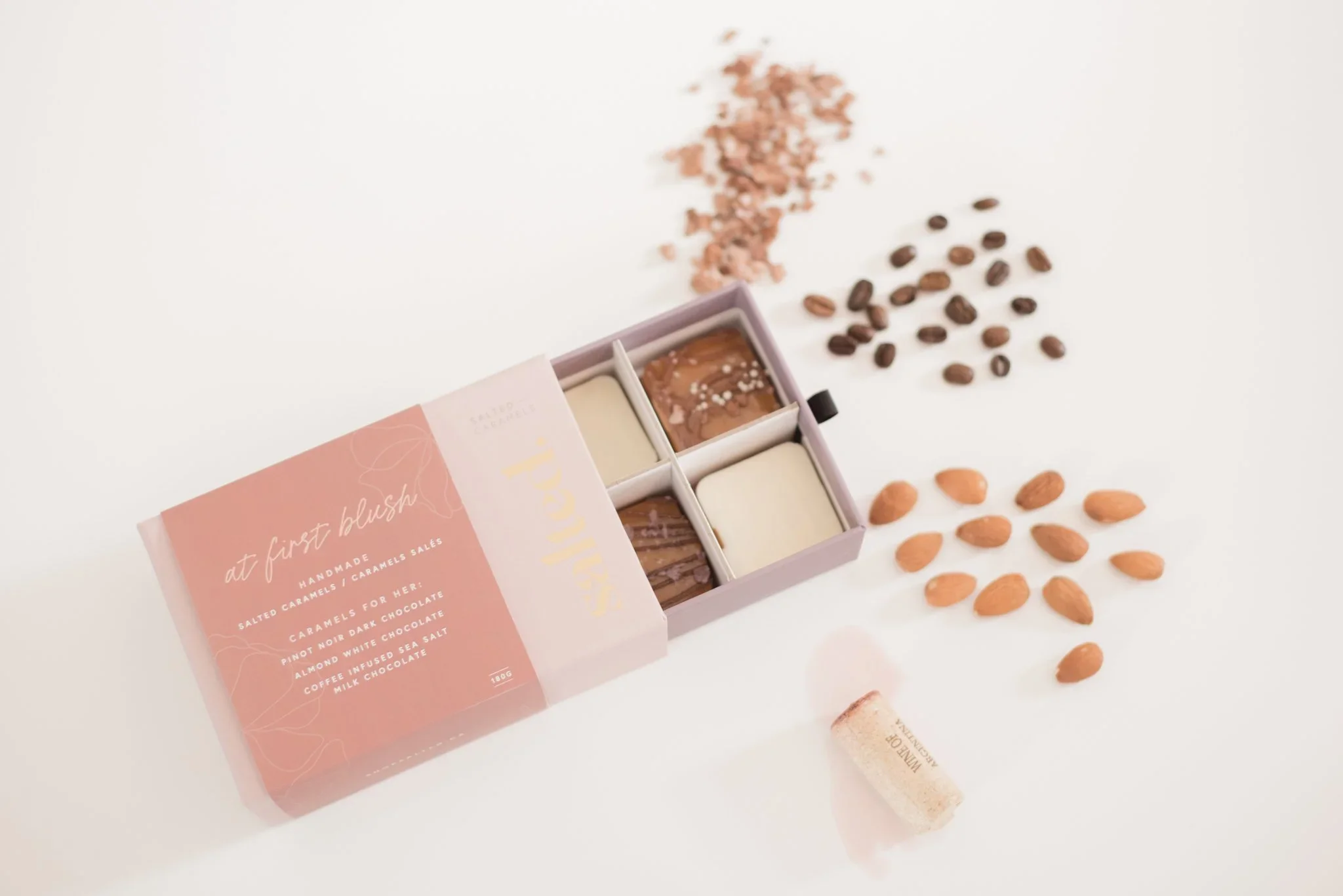
A luxury moment for women, found in salted caramels.
Branding
Packaging
E-Commerce
Client: Salted
Scope: Brand Identity, Website Design, Packaging, Stationery
Additional Credits: Inserts printed by Zoum, Sleeve printed by NexGen Graphics, Stickers by Jukebox Print, Gift Box printed by PackMojo
Description
Salted is a luxury salted caramel brand crafted in Flagstaff, Alberta, by three moms with a shared love for baking, creative thinking, and a well-balanced spreadsheet. Born from a moms’ day out and an unexpected encounter with salted caramels, the brand was inspired by the idea that women deserve a small moment of indulgence at the end of a full day. More than a treat, Salted represents a pause; a quiet, elevated moment away from responsibility, routine, and the demands of everyday life. Created for women who give so much of themselves, Salted offers a luxurious way to slow down, savour, and reclaim a little time for themselves.
With a luxury aesthetic, we designed their visual identity to represent the ooziness and folds of caramel. Along with the logo and full visual identity, we designed a full e-commerce website as well as a suite of packaging. We launched their brand with their 12 Days of Caramels advent calendar.
Problem:
The client approached us without any existing brand identity in place. Their initial direction was based on inspiration gathered online, with a preference for the popular gold foil and watercolour aesthetic. They wanted the brand to feel professional, feminine, and approachable, with an overall look that would resonate with a wide range of women.
Process
Through the discovery process, we uncovered the story behind Salted and the deeper reason the business was created. Inspired by the founders’ moms’ day out, we developed a brand identity that captured the feeling of a small luxury moment at the end of the day. The visual direction was designed to reflect both the emotional experience of slowing down and indulging, as well as the tactile qualities of caramel itself; its softness, richness, texture, and the handcrafted nature of the cooking process.
Solution:
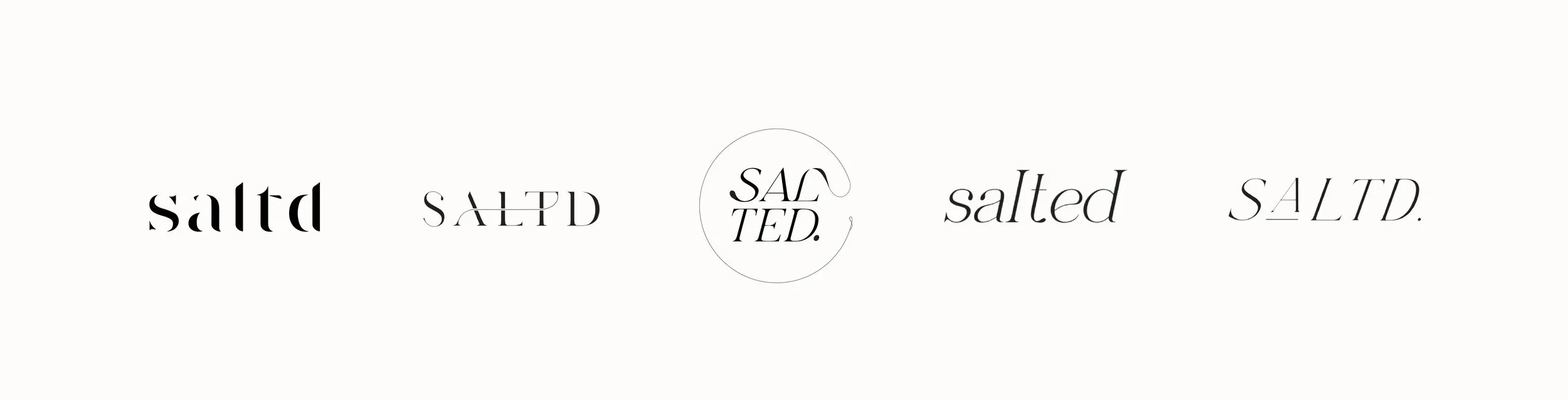
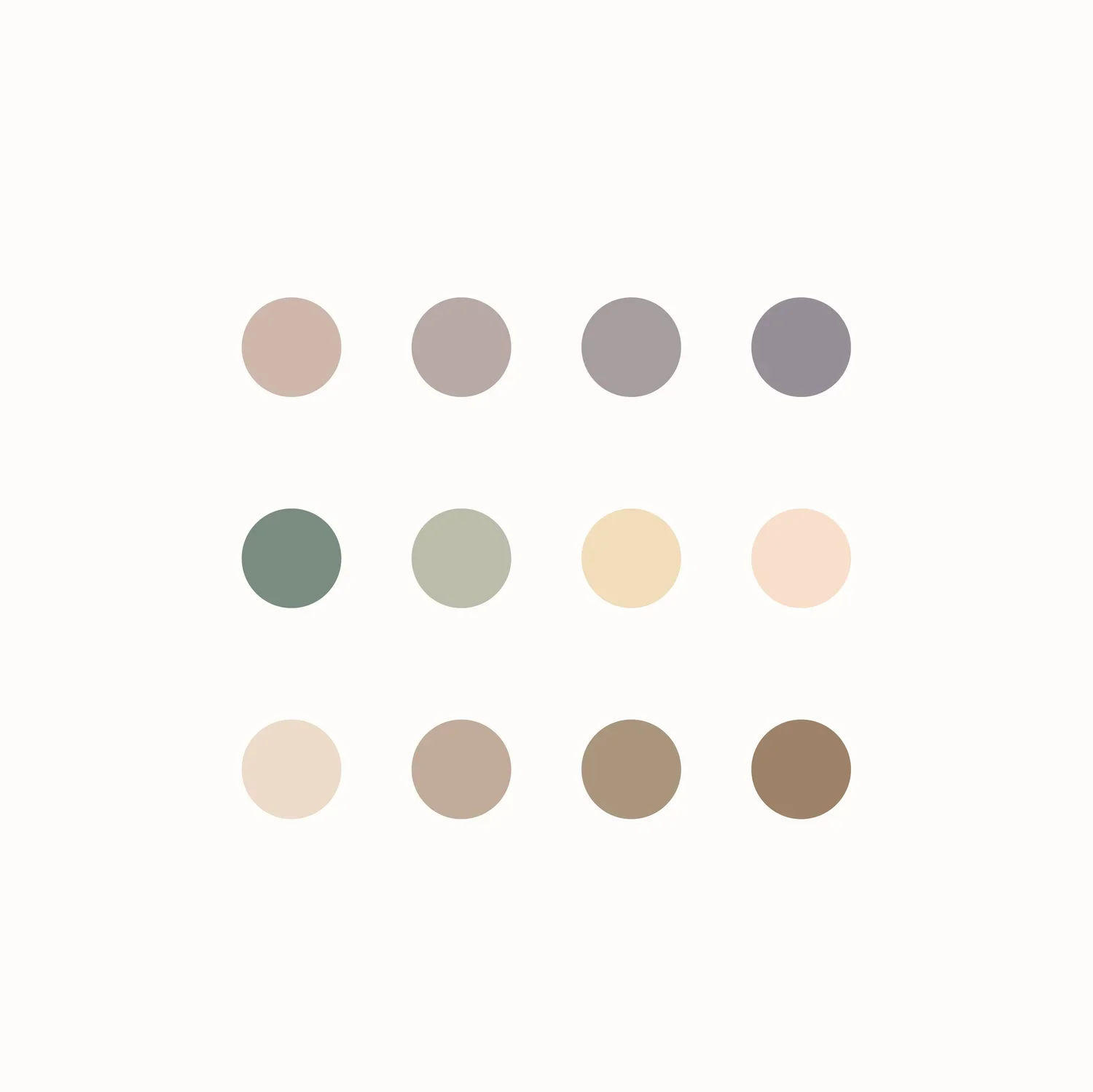
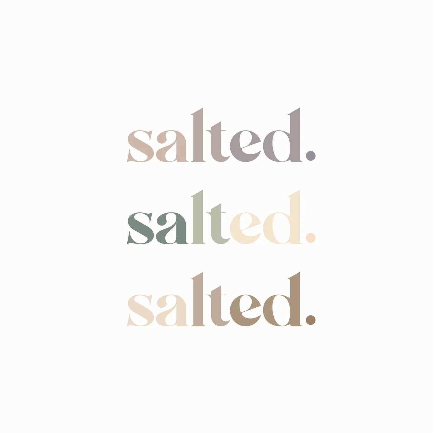
The logo was designed to reflect the soft, oozing texture of caramel, while the colour palette was inspired by the rich colour changes that happen throughout the cooking process. A period was added to the logo as a subtle symbol of pause; a quiet moment at the end of the day.
The identity was extended through secondary typefaces, a flexible seasonal colour palette, custom packaging for key gifting moments, and a full e-commerce website to showcase the brand story and product line. Today, the brand also supports custom gifting for women founders, events, and retreats.

-
We created the brand identity by taking the clients’ initial trend inspiration and translating it into something more ownable, refined, and strategically connected to the Salted story. Rather than relying on the expected watercolour and gold foil aesthetic in a generic way, we used those references as a starting point and built a more intentional visual system around the feeling of caramel, indulgence, and pause.
The logo was designed to reflect the soft, oozing texture of caramel, creating a visual connection to the product itself. We added a period at the end of the wordmark as a subtle symbol of pause, reinforcing the brand idea of Salted as a small luxury moment at the end of the day.
The colour palette was inspired by the caramel-making process, pulling from the warm, shifting tones that appear as sugar cooks, deepens, and transforms. To bring in the clients’ original love of watercolour texture, we developed a custom brand graphic device that could be used across the website, packaging, and supporting materials. This gave the identity a soft, feminine, tactile quality while still feeling elevated and distinct.
Gold foil was incorporated into the packaging to preserve the sense of luxury the clients were drawn to from the beginning. Paired with the custom graphic textures, seasonal colour palette, and refined typography system, the result was a brand identity that felt polished, approachable, and giftable, with enough flexibility to support seasonal collections, custom event gifting, and a full e-commerce experience.
-
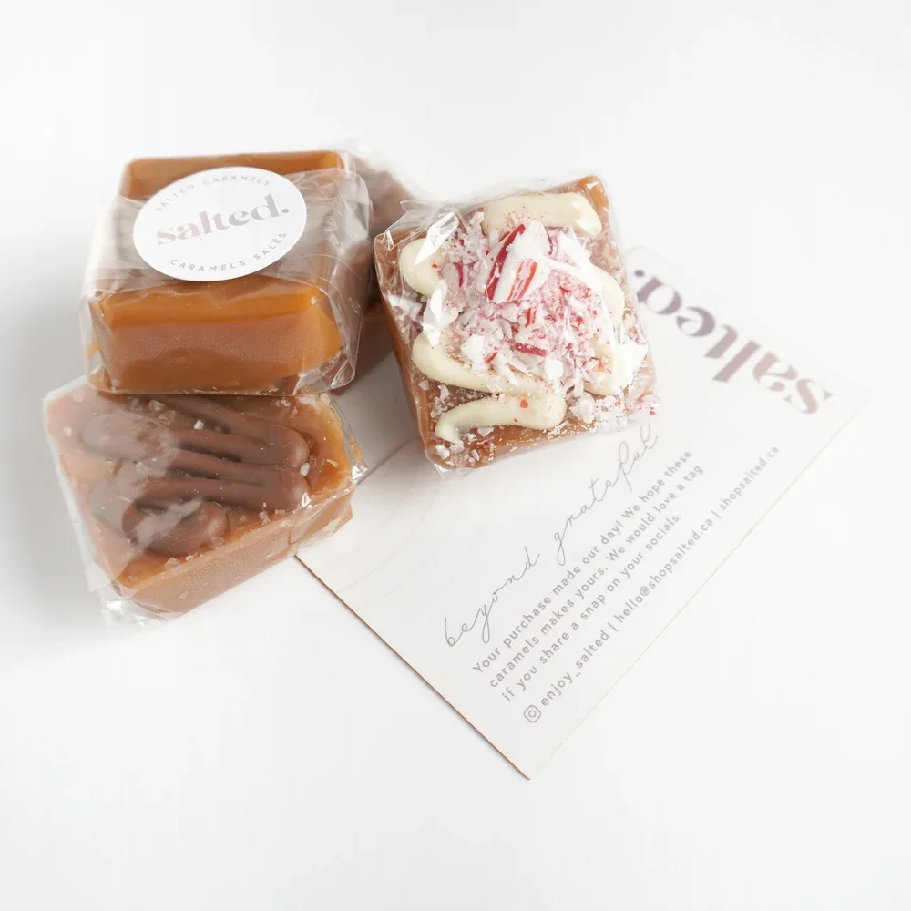
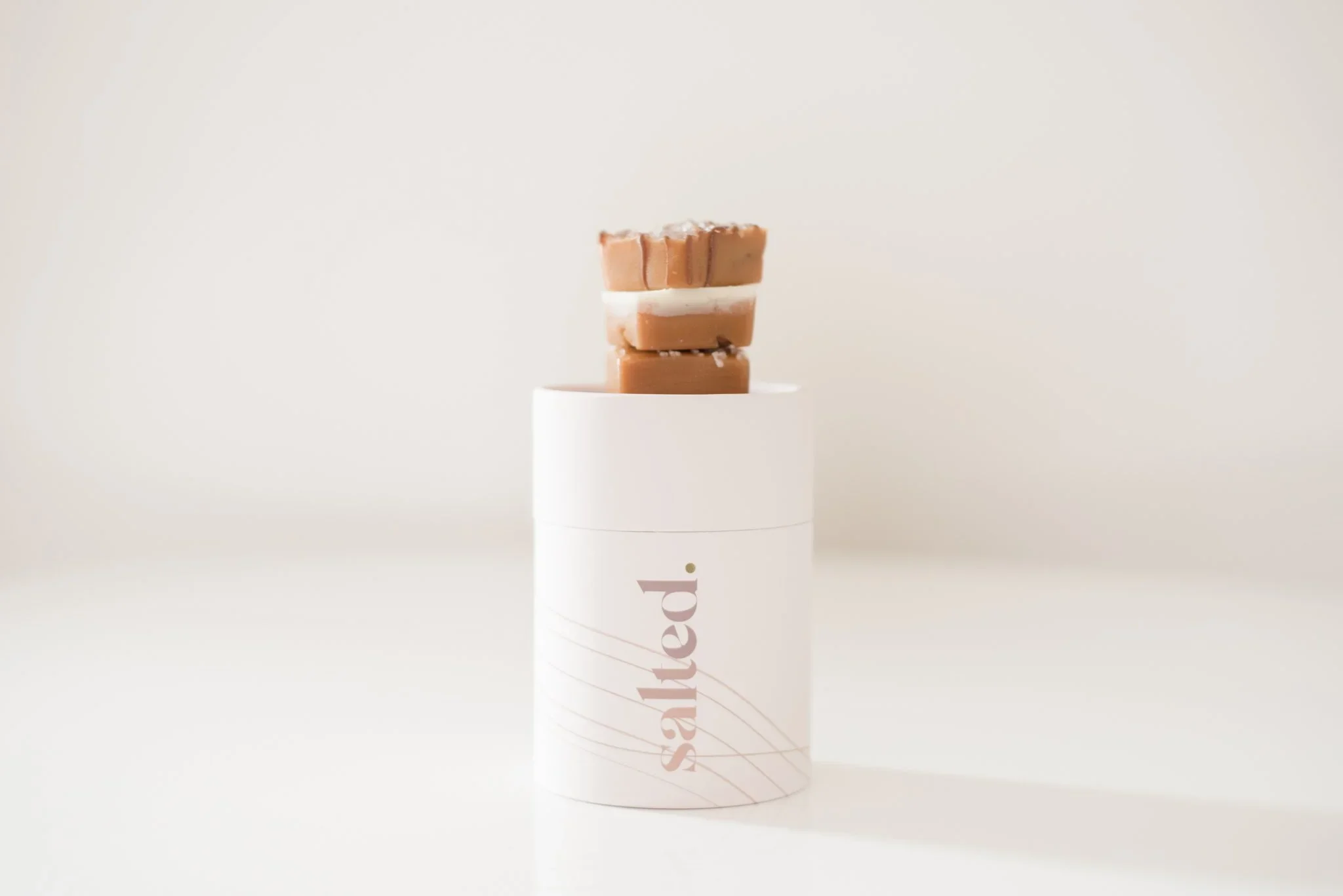
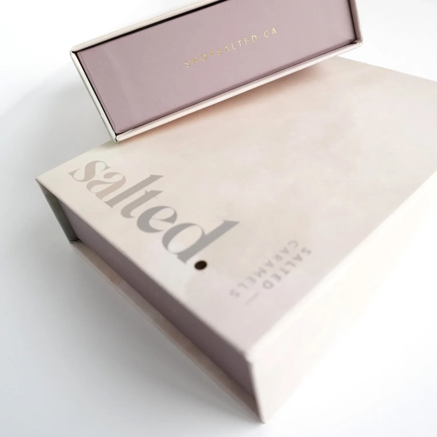
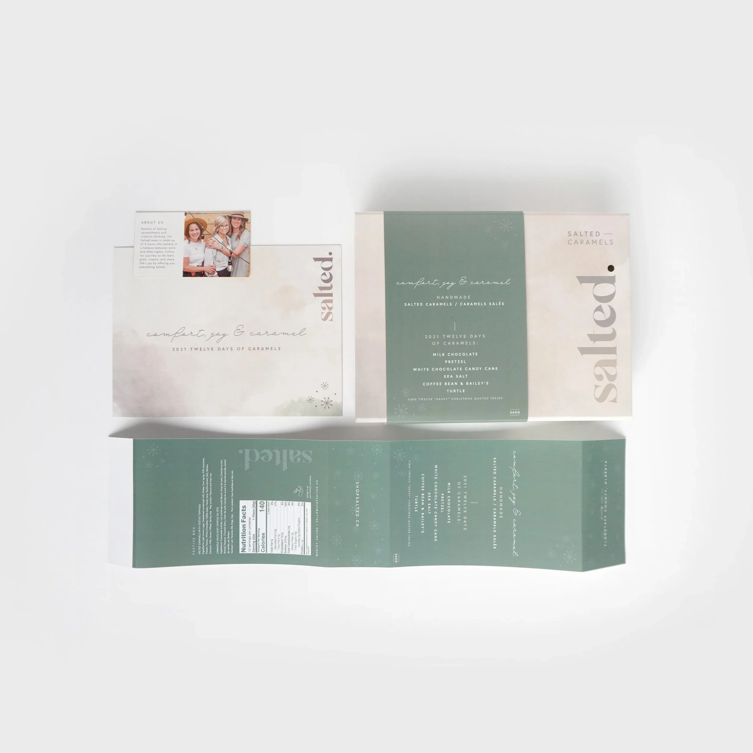
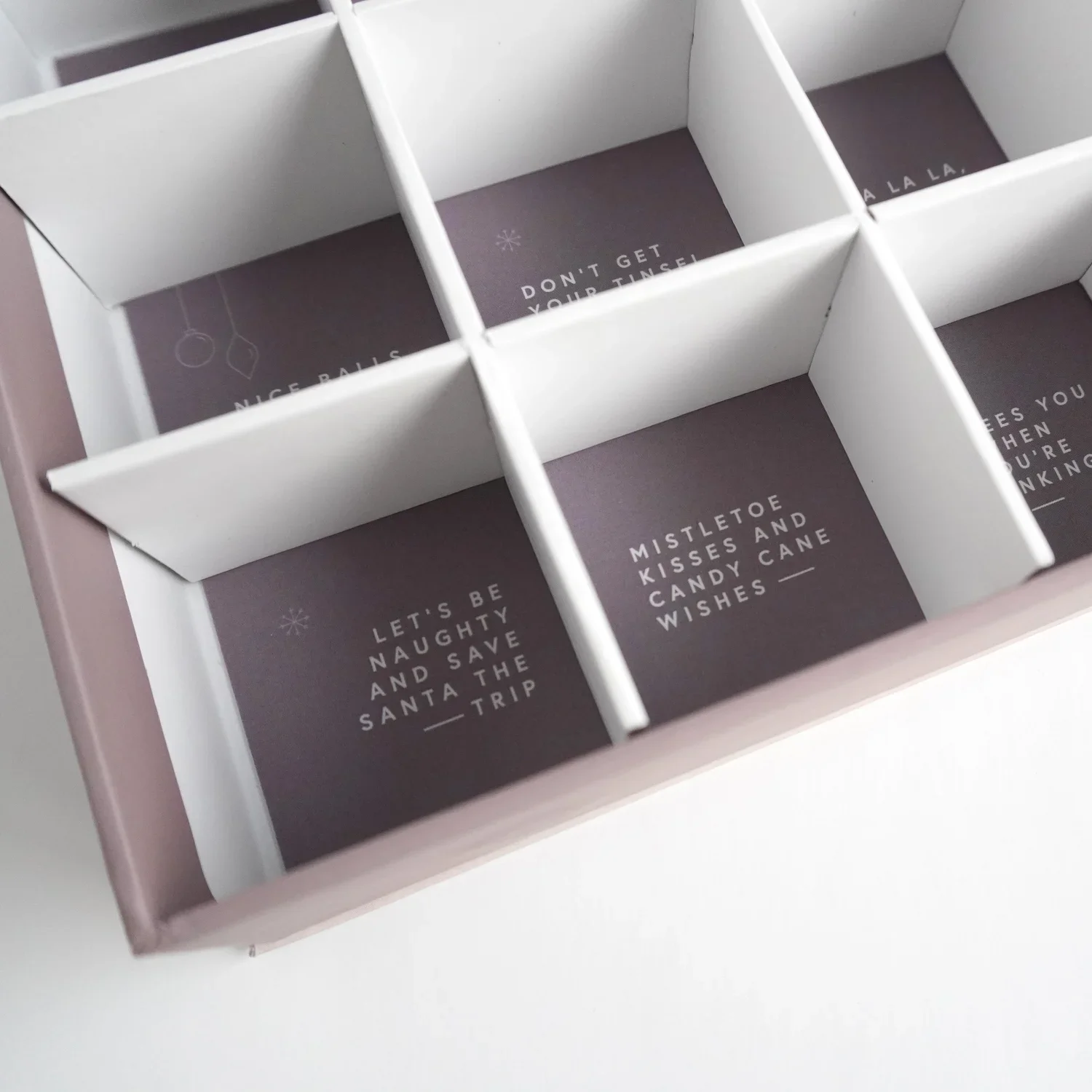
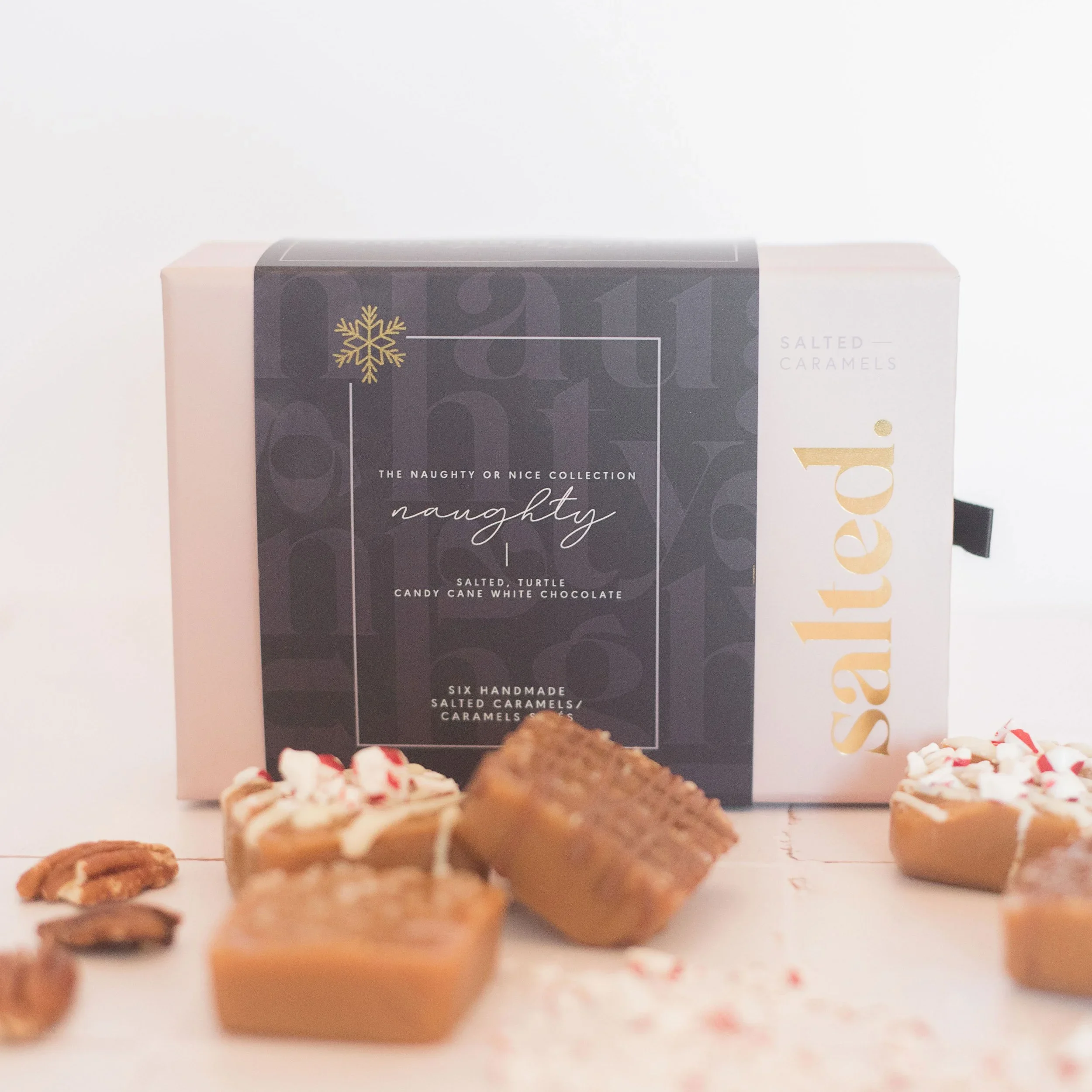
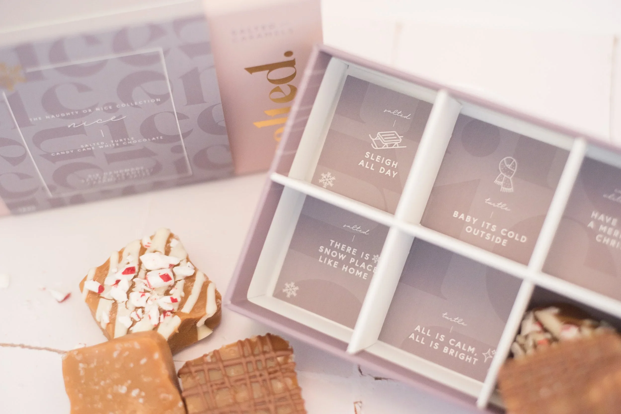
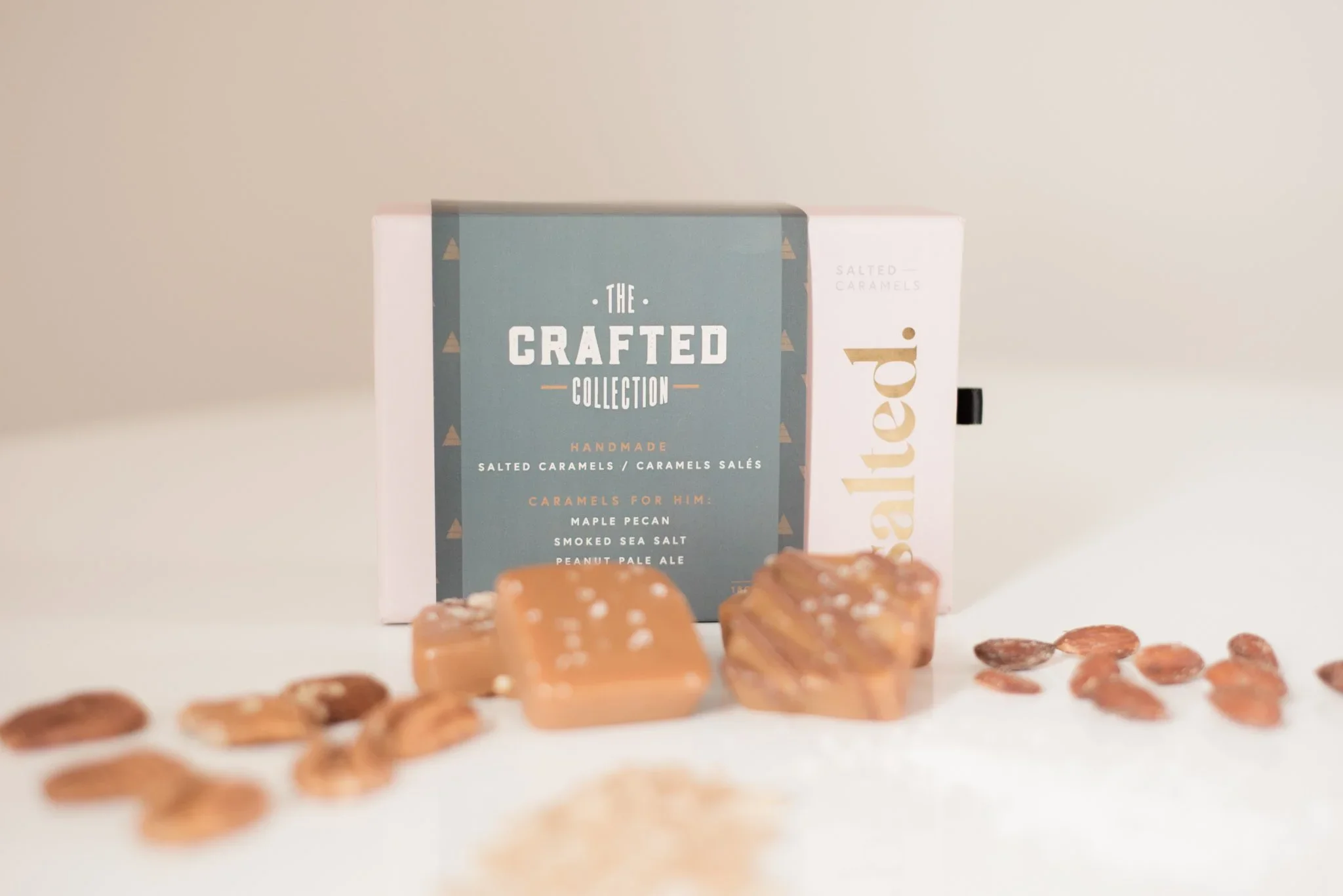
We designed the packaging to extend the Salted brand experience beyond the logo and into the physical act of gifting, opening, and enjoying the product. Because salted caramels are small, indulgent, and often purchased as gifts, the packaging needed to feel elevated enough for special occasions while still feeling warm, approachable, and personal.
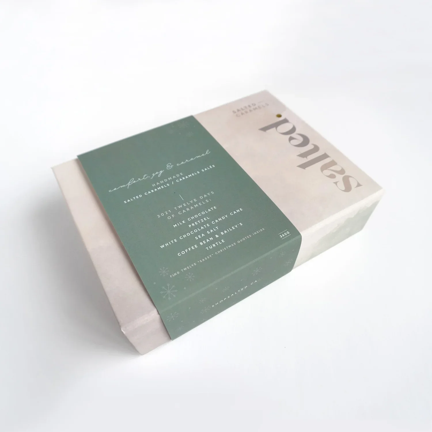
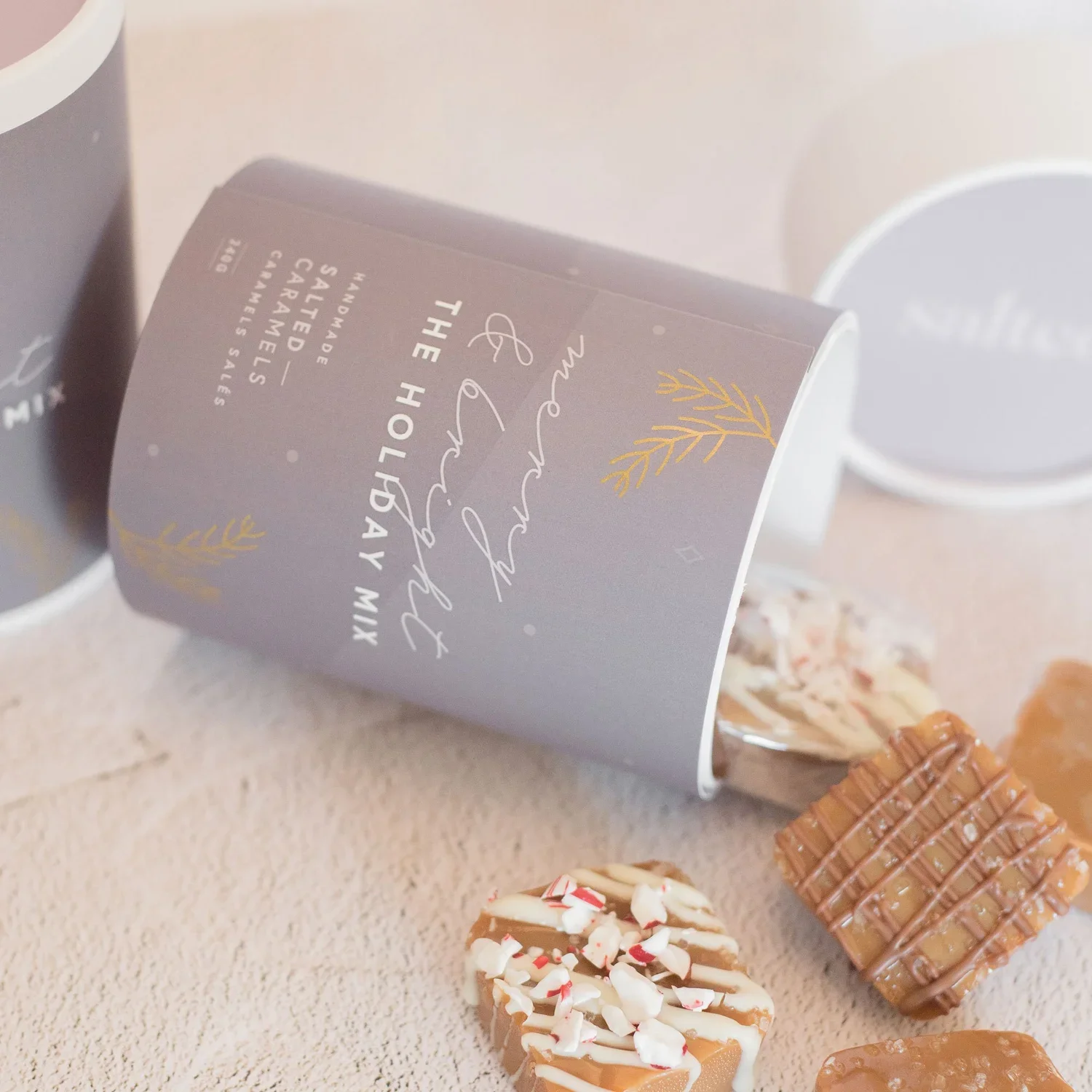
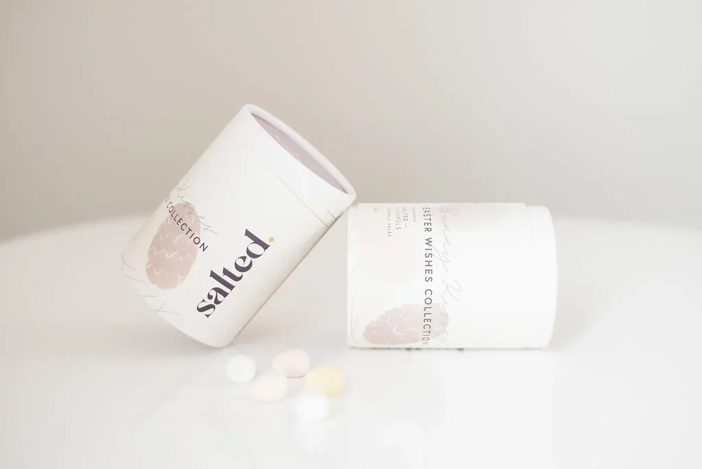
The packaging system was built around the brand’s core idea: a luxury pause at the end of the day. We carried this through refined typography, soft graphic textures, and a warm colour palette inspired by the caramel-making process. The custom watercolour-inspired graphic device was used as a background element across packaging pieces, giving each product a tactile, handcrafted quality without making the design feel overly trendy or generic.
Gold foil was incorporated to create a sense of polish and luxury. This detail helped elevate the packaging while still connecting back to the clients’ original inspiration. Used intentionally, the foil added a premium finish that made the product feel giftable, memorable, and worthy of display.
We also designed the packaging system to be flexible across seasons and gifting moments. The broader colour palette allowed Salted to create packaging for Christmas, Mother’s Day, Father’s Day, Easter, teacher gifts, advent calendars, stocking stuffers, events, and retreats while still maintaining a consistent brand presence. Each variation could feel fresh and occasion-specific, while remaining clearly recognizable as Salted.
The final packaging system balanced beauty, function, and brand storytelling. It helped position Salted as more than a caramel company. It became a thoughtful gifting brand built around small moments of luxury, care, and pause.
-
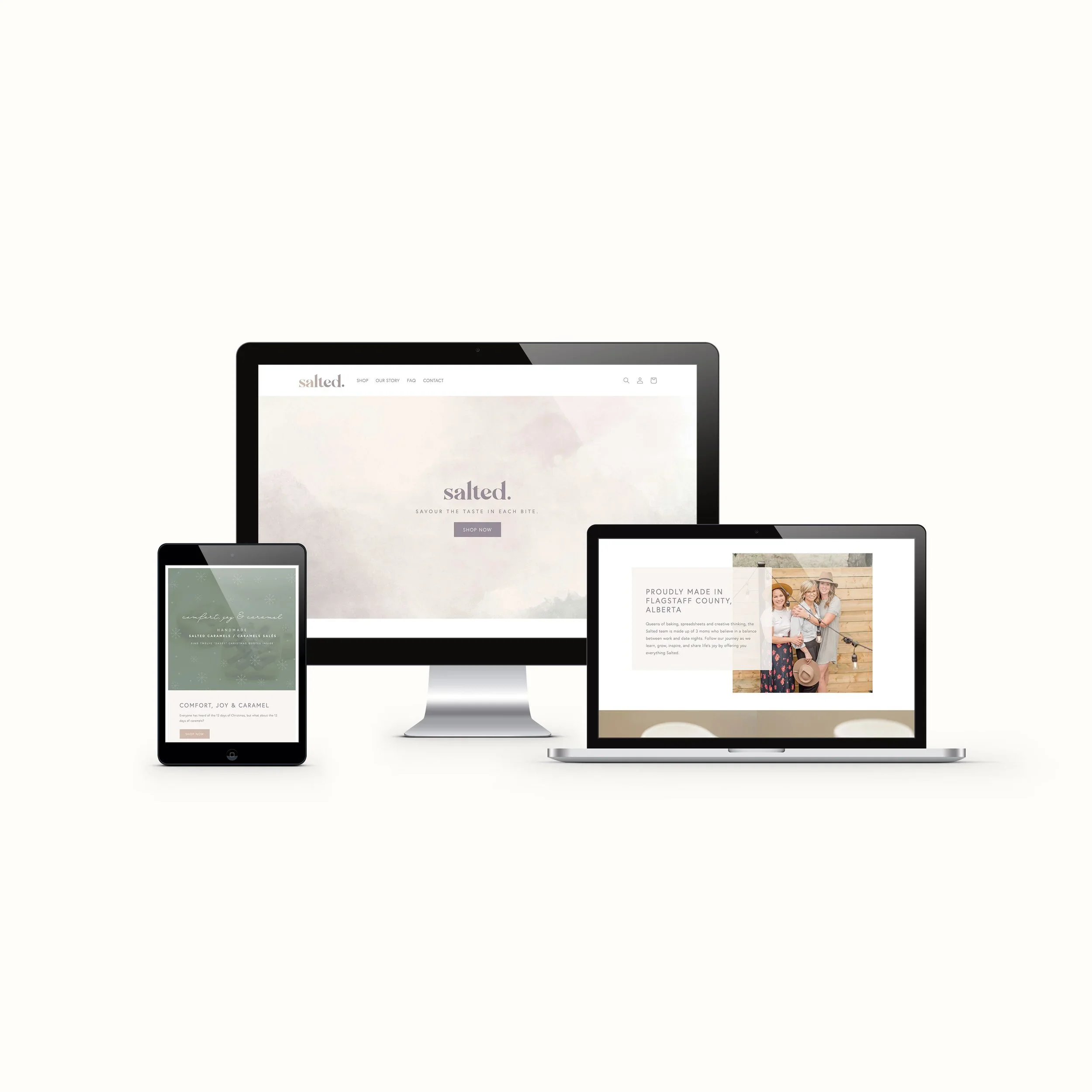
We designed the Shopify e-commerce website to bring the full Salted brand experience online, turning the site into both a storefront and a storytelling platform. The goal was to make the shopping experience feel polished, warm, and giftable while still being easy for customers to browse, purchase, and understand the product offering.
The homepage was structured to quickly communicate what Salted offers and why it feels special. We led with a strong brand statement, paired with a clear shop call-to-action so customers could immediately move into the product experience. From there, we highlighted featured caramels, seasonal, everyday, and corporate gifting, and the story behind the women who founded the brand. This created a site flow that supports both direct sales and deeper brand connection.
Visually, we carried the brand identity across the website through refined typography, warm product photography, soft graphic textures, and the custom watercolour-inspired background device. This helped connect the digital experience back to the packaging system and gave the website the same feminine, tactile, elevated feeling as the physical product. Rather than making the site feel purely transactional, these visual details helped reinforce the idea of Salted as a small luxury moment.
The Shopify product experience was designed to support simple, intuitive shopping. We organized the site around clear product categories, featured products, pricing, and product photography so customers could understand the offering quickly.
We also built the website to support the brand’s growth beyond individual caramel boxes.
Overall, the website was designed to make Salted feel premium, personal, and easy to shop. It translated the brand story, packaging details, and product experience into a cohesive Shopify site that supports online sales while positioning Salted as a thoughtful Canadian gifting brand.