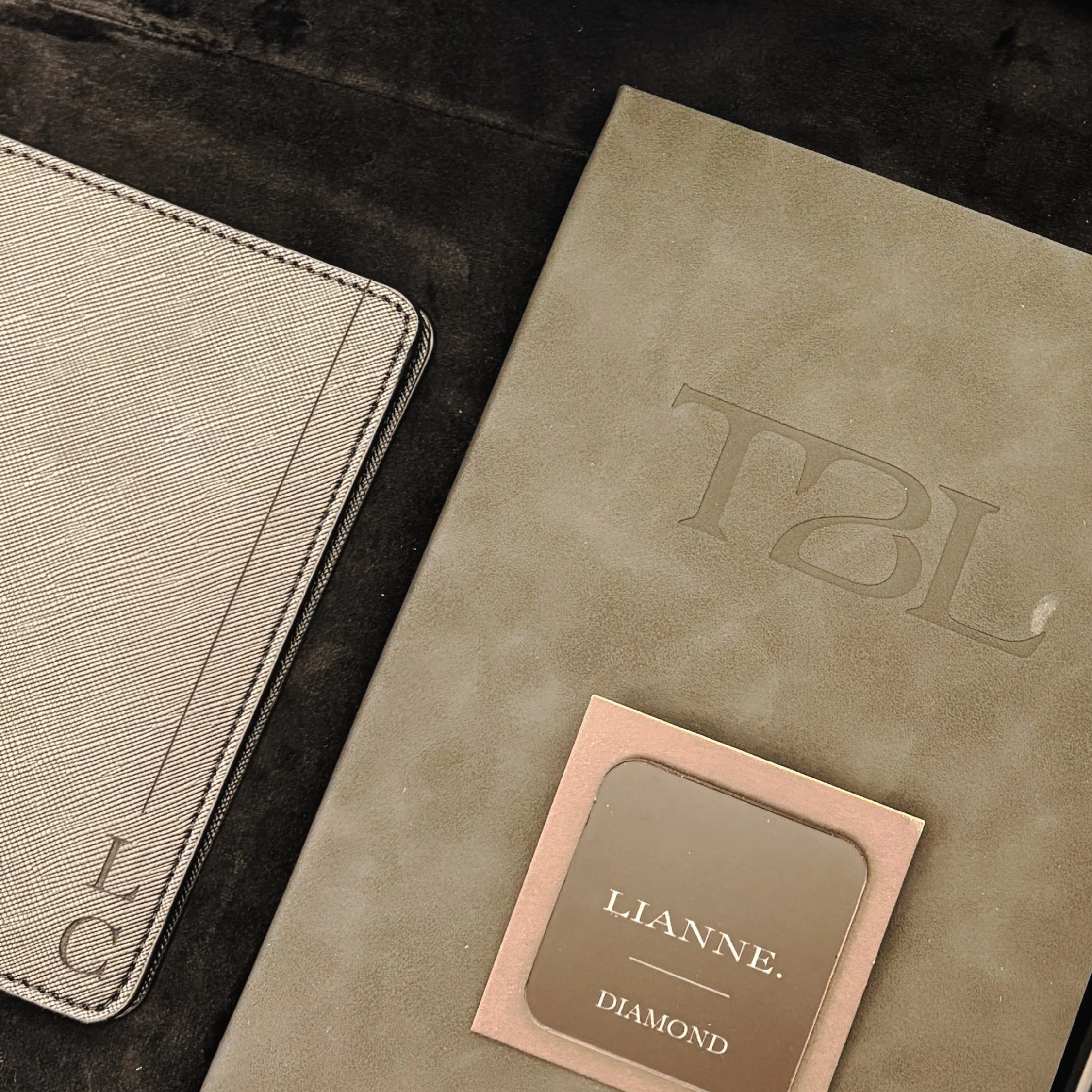
Transcending trailblazing fire into thin air and a comprehensive visual identity.
Branding
Stationery
Website
Consulting
Client: Selina Gray & Trailblazer Live
Scope: Creative Strategy, Brand Identity, Stationery, Website Design, Event Brand Experience Consulting
Additional Credits: Event Signage by Engravables Design, Stationery Printing by NexGen Grafix
No one fully understands the core essence of Trailblazer or the Selina Gray brand until they have had the opportunity to attend or work with her directly. The power of her work lies in its expansive, transformative nature and the transcendent experience she creates.
Our creative strategy repositioned her brand as one that is personally curated yet deeply transformative. Selina’s vision was to evolve Trailblazer to attract exceptional women founders who are ready to go deeper, uncover their inner richness, and lead from a more embodied place of clarity and strength. Women who are ready to walk into Thin Air.
Description:
Problem:
An evolving experience without a cohesive identity.
Trailblazer had spent years creating transformative experiences for ambitious women entrepreneurs, yet its visual identity hadn't evolved alongside its impact. Each year introduced a different creative direction, resulting in inconsistent branding, disconnected visual elements, and a lack of recognition across touchpoints. While the experience itself was powerful, the brand lacked a cohesive identity that communicated its depth, elevated positioning, and connection to founder Selina Gray. The challenge was to create a recognizable, lasting brand that could evolve without needing to reinvent itself each year.
Process
Finding alignment between the founder, the experience, and the brand.
We began by uncovering the beliefs, experiences, and vision behind both Trailblazer and Selina Gray. At the centre of our exploration was Selina's concept of THIN AIR, a space where extraordinary women founders are witnessed, challenged, and expanded. From this foundation, we established three defining creative attributes: Expansive, Transcendent, and Unfiltered. These guided the brand strategy and creative direction, informing everything from custom typography and meaningful symbolism to colour, composition, and the relationship between the two identities. Every decision was rooted in translating the emotional depth of Selina's work into a cohesive visual language.
Solution:
Two connected identities. One intentional brand experience.
The result is a refined, expressive brand system that brings Trailblazer and Selina Gray together through a shared story of transformation, expansion, and evolution. Custom wordmarks, thoughtful monograms, hidden symbolism, and an intentional colour palette create distinct yet interconnected identities that balance quiet authority with emotional depth. Beyond the visual identity, we extended the system across digital and physical touchpoints, creating consistency and recognition while allowing the brand to evolve with Selina's vision. What was once a collection of disconnected annual identities is now a cohesive brand built to grow, one that reflects not only the experience Selina creates, but the legacy she is building.




-
An identity shaped by evolution, grounded in connection, and designed to ignite transformation.
Trailblazer had spent years creating powerful, transformative experiences for women entrepreneurs, yet its visual identity had never fully captured the depth of its purpose or the evolution of its founder, Selina Gray. With each event came a new creative direction, creating a fragmented visual presence that lacked consistency and recognition. Our challenge was to build more than a recognizable identity. We needed to create a brand that embodied the emotional depth of the Trailblazer experience, honoured Selina's personal journey, and established a cohesive foundation for its next chapter.
The Strategy: Finding Clarity in THIN AIR
At the heart of our creative exploration was Selina's concept of THIN AIR, an elevated space where extraordinary women founders are witnessed, challenged, and expanded. A place where success is no longer measured solely by what you've built, but by how you feel, who you're becoming, and the legacy you're creating.
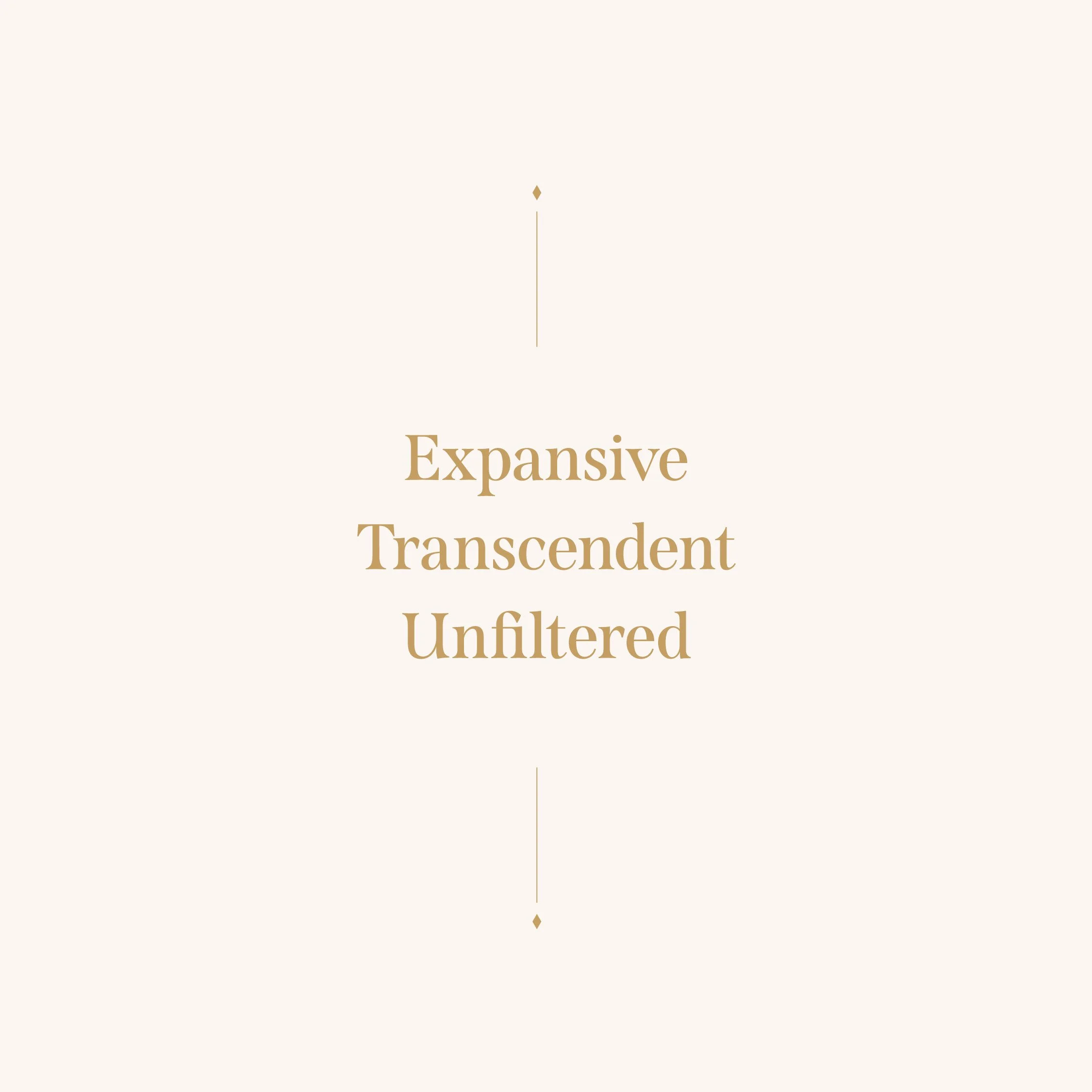
We translated this philosophy into three defining brand attributes: Expansive, Transcendent, and Unfiltered.
Expansive in its expression of possibility, movement, and continuous evolution, reflecting the nonlinear journey of entrepreneurship and the potential that emerges when we challenge our own limits. Transcendent in its emotional depth and ability to inspire transformation, creating a visual language that feels elevated, magnetic, and deeply personal. Unfiltered in its authenticity, expressing quiet confidence, vulnerability, and embodied truth without relying on conventional expressions of power or luxury.
These attributes became the strategic foundation for every creative decision, allowing us to build an identity that didn't simply communicate the Trailblazer experience, but reflected how it feels to be part of it.
-
The Identity: A Story of Movement, Fire, and Evolution
The Trailblazer wordmark was designed to embody the fluidity and transformative nature of fire. Inspired by winding pathways, story arcs, and the ripple effect of entrepreneurship, its custom letterforms express the movement between where we've been, where we are, and where we're going.
Four modified letterforms represent the four stages of Trailblazer's evolution, embedding the history and future of the business directly into its identity. The fluid forms symbolize the nonlinear nature of growth, while the subtle references to fire represent the ignition of purpose, conviction, and personal transformation that defines Selina's work.
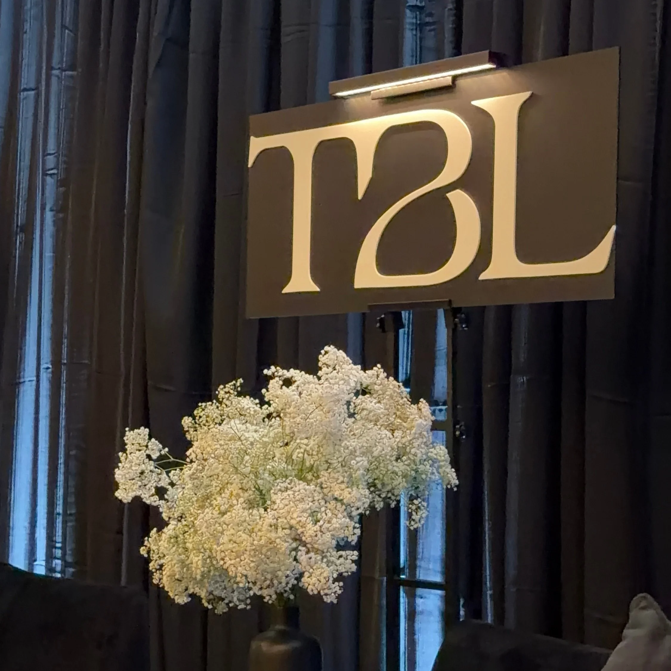
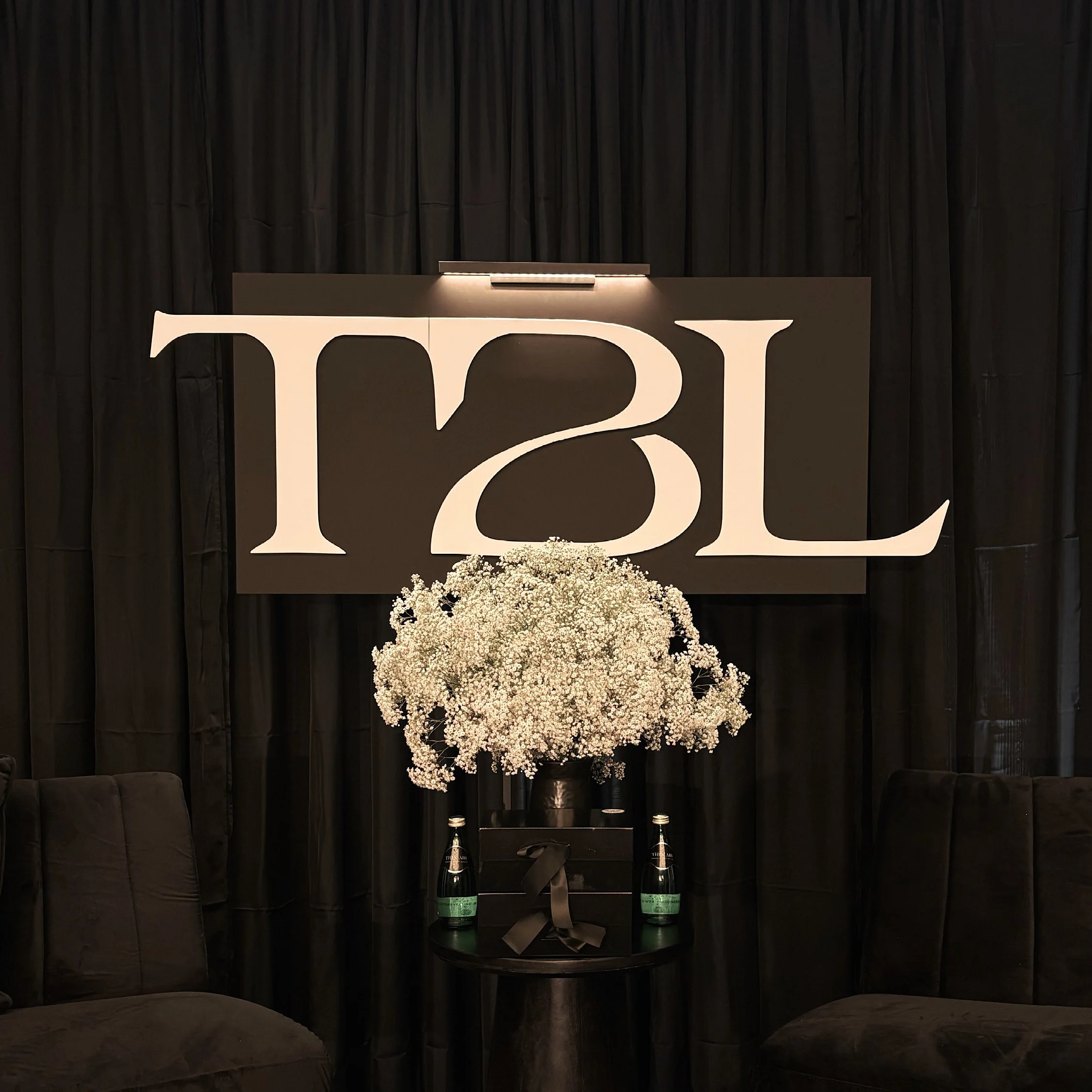
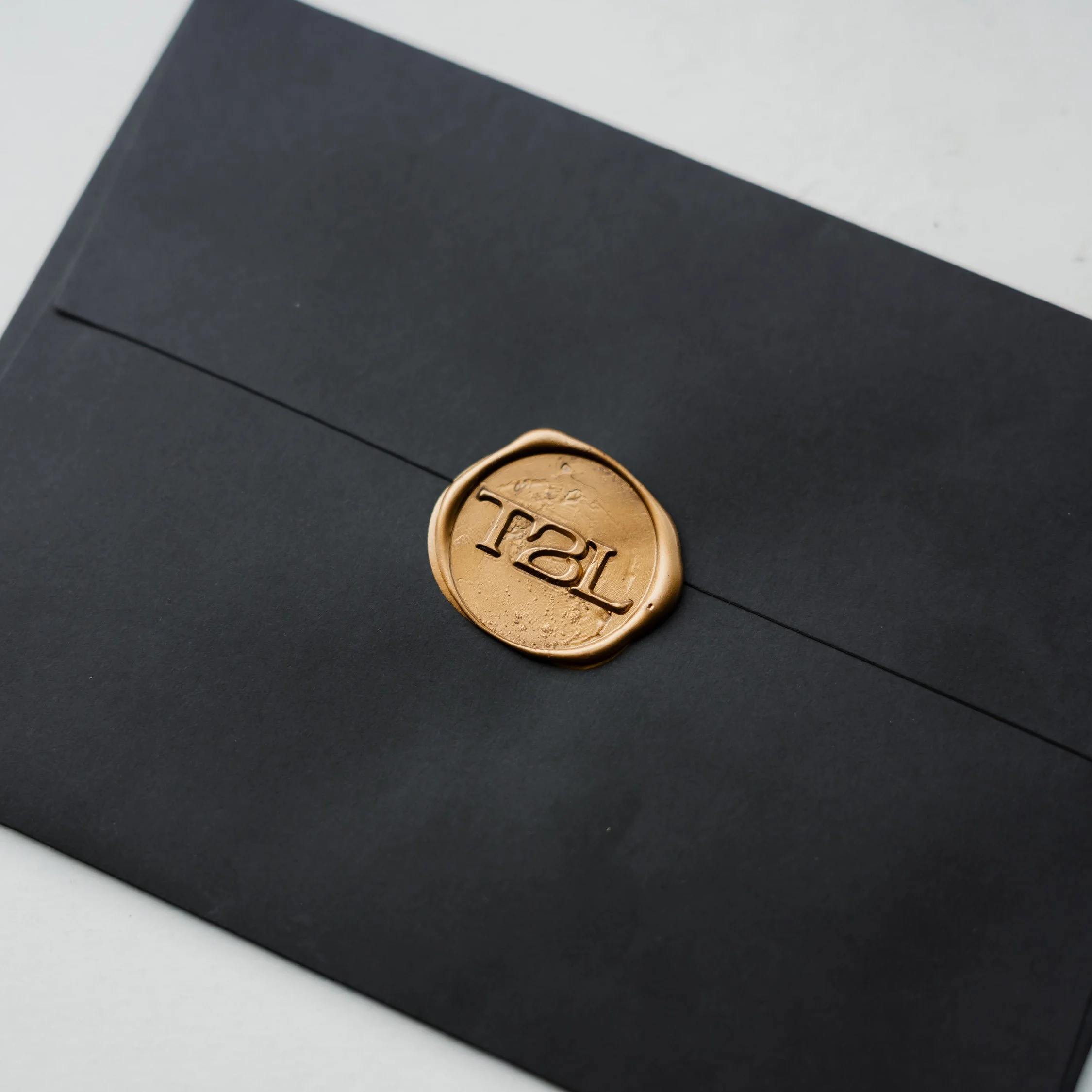
As part of the brand evolution, we introduced TBL as a simplified expression of Trailblazer. Where the full wordmark conveys movement and expansion, the TBL monogram brings the experience into a more grounded, intimate space, reflecting the essence of THIN AIR, where women can release the pressure to perform, reconnect with themselves, and discover that success can feel easier rather than harder.
Hidden within the "B" of the TBL monogram is a reversed "S," a subtle tribute to Selina Gray. This detail represents her role as a cycle breaker and the deeper truths uncovered through her work. It also serves as a reminder that the founder's lived experiences, beliefs, and personal evolution are inseparable from the brand she has built.
The Founder: Two Identities, One Connected Story
When a founder is integral to the experience, the personal brand must evolve alongside the business. Trailblazer would not exist without Selina Gray, and Selina's personal evolution is deeply connected to the growth of Trailblazer.
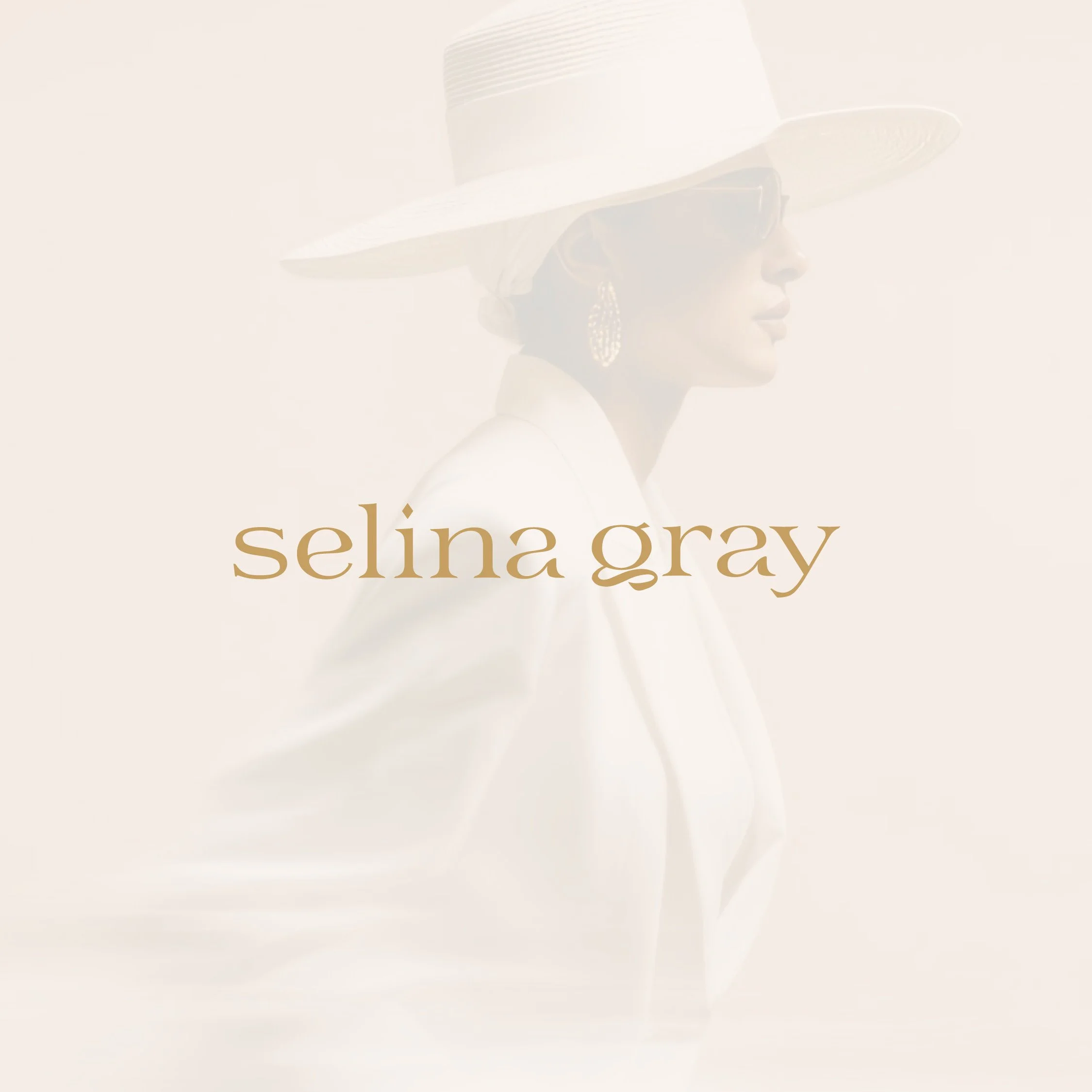
We developed a complementary identity for Selina that shares the movement and fluidity of TBL while expressing a more personal, humble, and grounded presence. The custom typography balances precision with softness, structure with adaptability, and quiet authority with authenticity, reflecting the way Selina leads and connects with the women she serves.
Embedded within the Selina Gray wordmark and SG monogram is a subtle diamond, representing the belief that connection is currency and diamond clients are the intention. Positioned within the "i" of her name, the diamond symbolizes the inner richness, clarity, and extraordinary potential that begin within ourselves before being reflected in the businesses and relationships we create.
Together, the two identities share a visual language while maintaining distinct personalities, creating a meaningful connection between the founder, her philosophy, and the experiences she brings to life.
The Colour Palette: Meaning in Every Detail
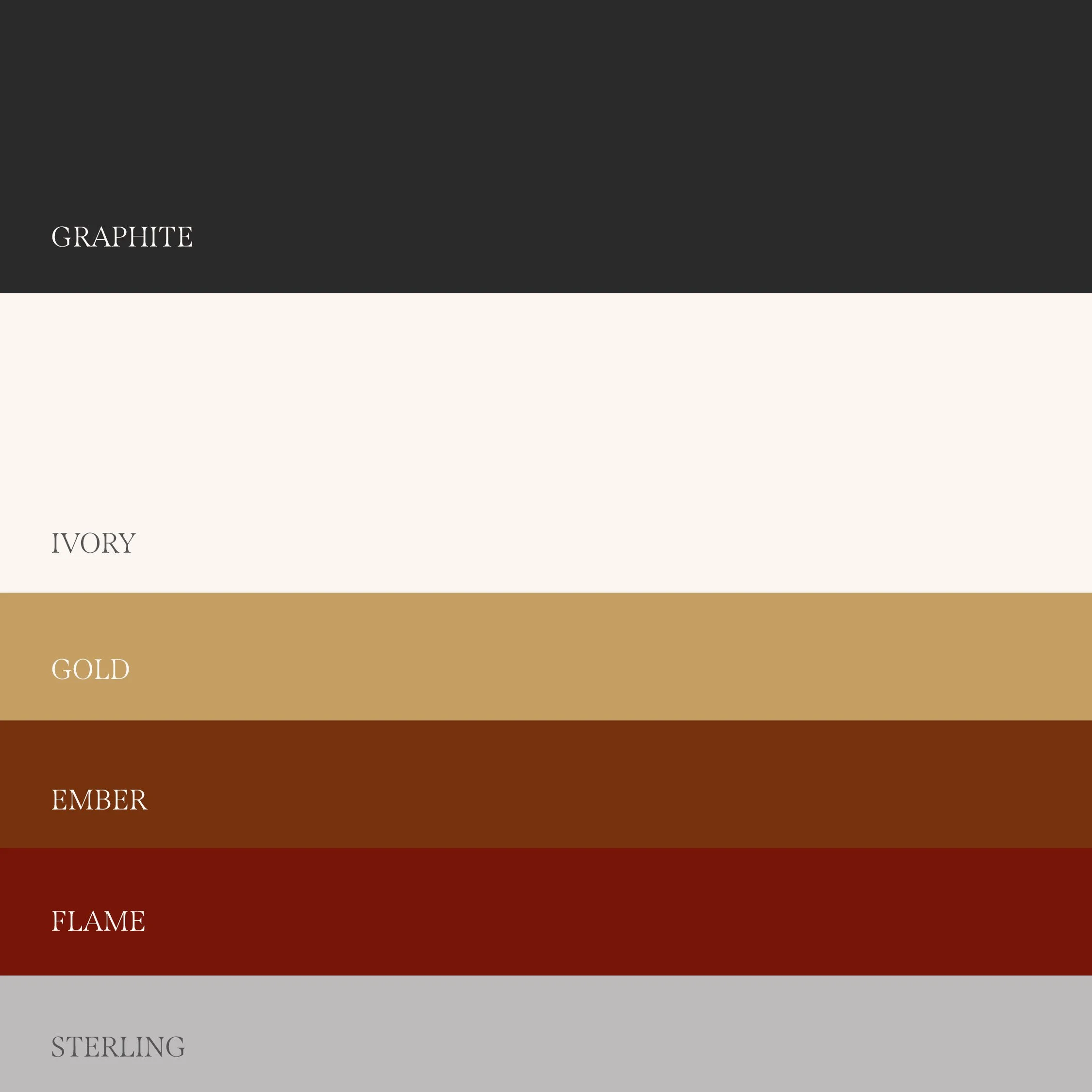
Colour was approached with the same level of intention as the typography and symbolism. Rather than creating a palette based solely on aesthetics, we selected each colour to represent an aspect of Selina's journey, philosophy, and the emotional experience of Trailblazer.
Graphite represents grounded strength, resilience, and the depth of the entrepreneurial journey.
Ivory embodies clarity, possibility, self-awareness, and the openness of THIN AIR.
Gold symbolizes connection, currency, and the inner richness discovered through meaningful relationships.
Ember represents the initial spark of potential and the beginning of transformation.
Flame expresses ignition, conviction, purpose, and the fire that exists within.
Sterling reflects wisdom, strength, and the perspective gained through lived experience.
Together, these colours create a visual language that moves between grounding and expansion, restraint and expression, softness and intensity. The palette allows both identities to feel elevated and cohesive while providing the flexibility to express the many dimensions of Selina's work.
The Result: An Identity Built for Becoming
The final result is two distinct yet intentionally connected brand identities, united through a shared story of transformation, expansion, and evolution.
What began as an effort to create consistency for Trailblazer became an opportunity to bring deeper alignment between the founder, the business, and the experience. Every detail, from the custom letterforms and hidden symbolism to the colour palette and relationship between the two brands, was created to honour Selina's past, reflect her present, and create space for her future.
More than a visual transformation, the new identities establish a foundation for long-term recognition, creative consistency, and continued growth. A brand system that can evolve without losing its essence, because it is rooted in something deeper than aesthetics.
An identity that doesn't simply represent who Selina and Trailblazer are today, but carries the intention of everything they're becoming.
-
Creating a tangible first impression of the Trailblazer experience.
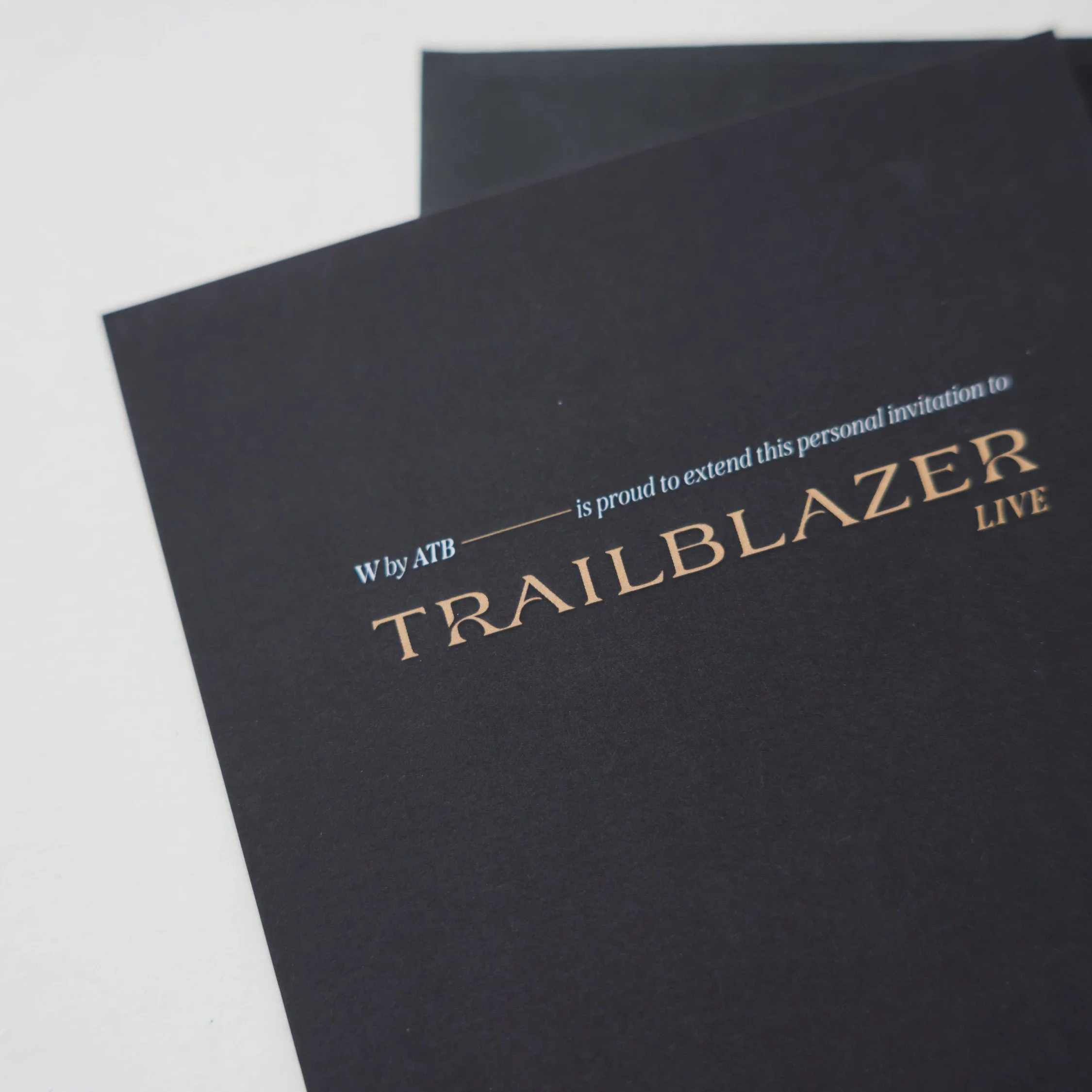
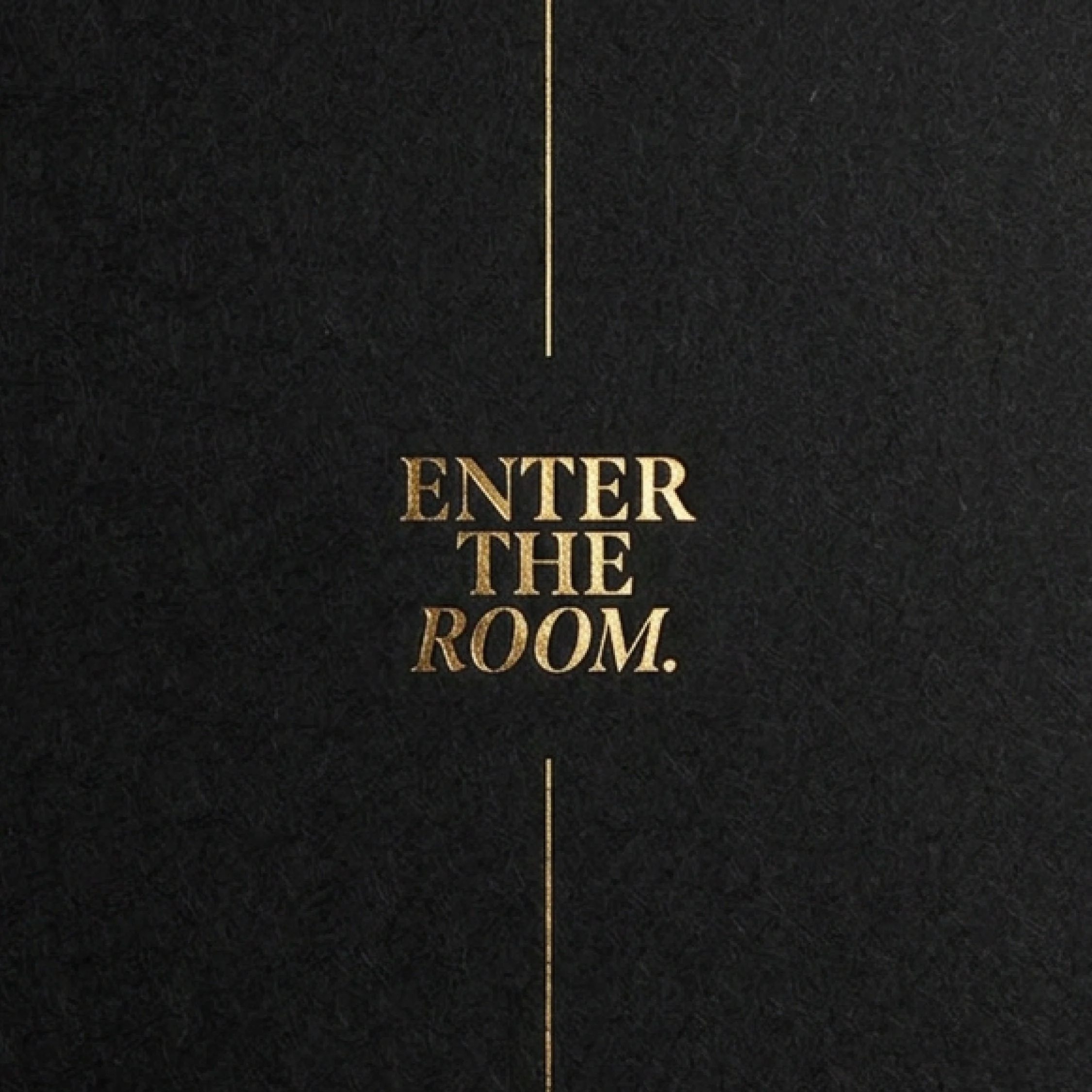
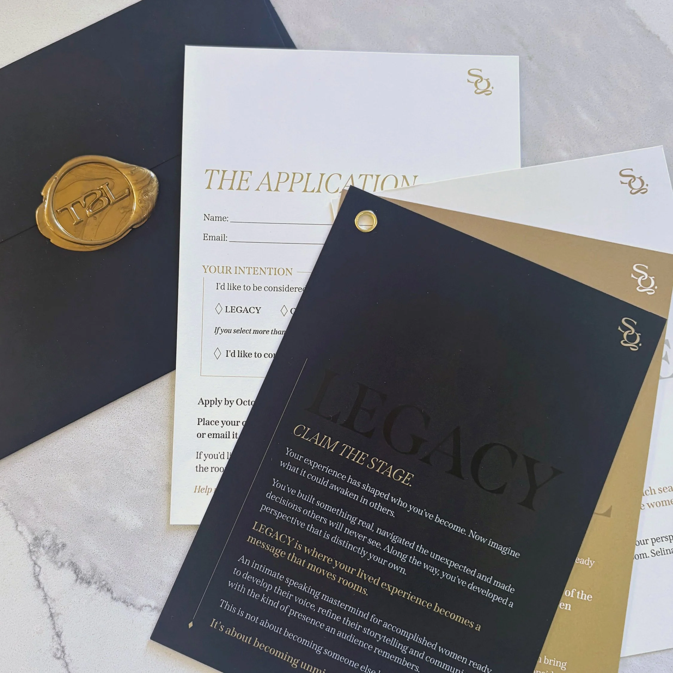
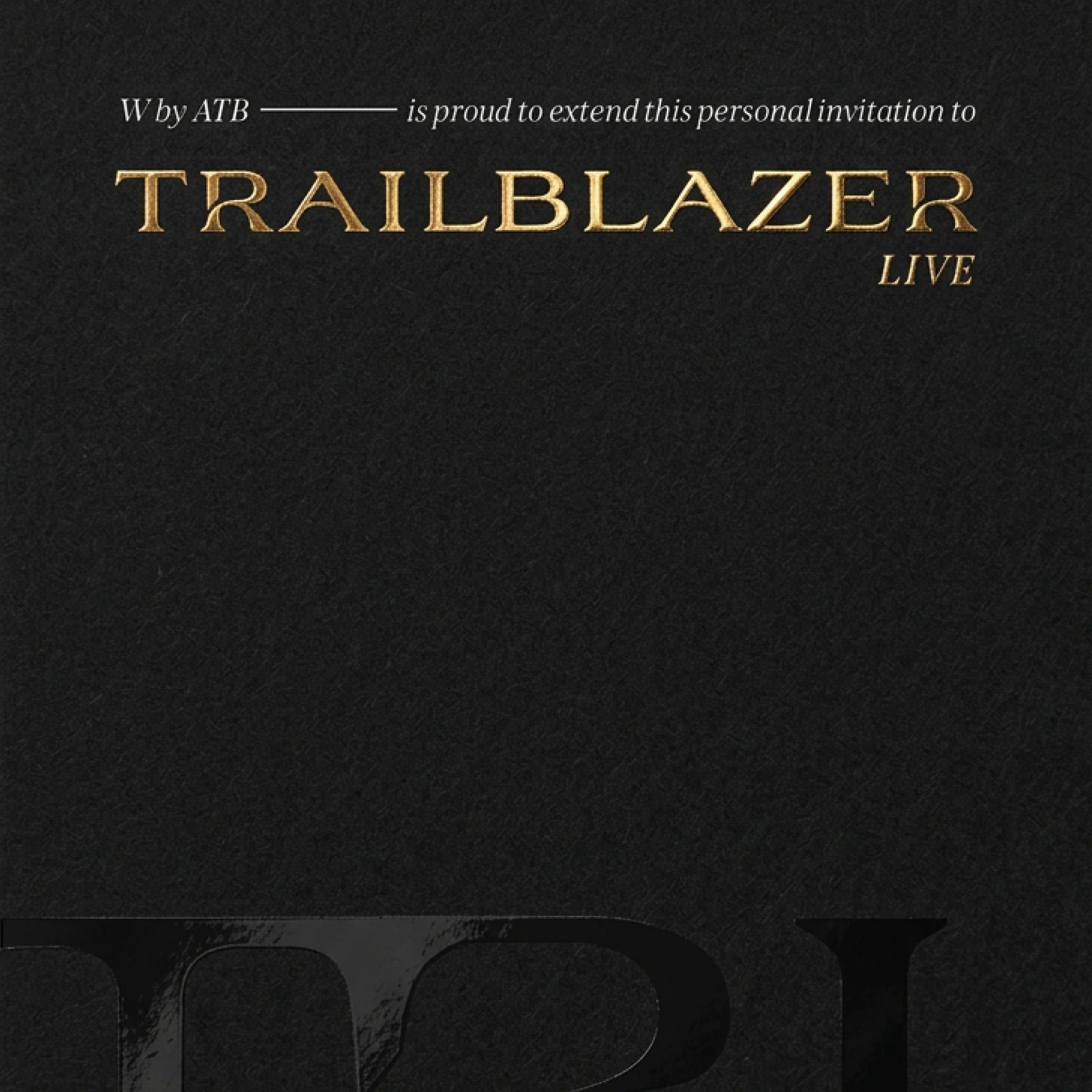
The Trailblazer experience begins long before guests enter the room. We designed a formal event invitation that introduced the brand's elevated aesthetic and established a sense of anticipation, exclusivity, and personal connection. Every element was considered to ensure the invitation felt as intentional and meaningful as the experience itself.
Specialty paper stocks and refined printing techniques were selected to bring depth, texture, and luxury to the physical piece. We also provided creative consultation on envelope selections and wax seal details, ensuring the presentation felt cohesive from the moment it was received. The result was more than an invitation. It was a tactile extension of the brand, designed to make recipients feel personally invited into something extraordinary.
-
Translating emotional depth into an immersive digital experience.
The Trailblazer Live website needed to communicate an experience that is difficult to fully understand until you've been part of it. Working with the copy provided by Selina's team, we translated the brand's creative direction into a digital environment that reflects the depth, emotion, and transcendent nature of the Trailblazer experience.
Rather than simply placing content onto a page, we thoughtfully structured and paced the messaging to create a natural narrative that draws visitors in. Through intentional typography, visual hierarchy, colour, composition, and moments of contrast, the design gives the copy room to breathe while emphasizing its most powerful messages. The result is an immersive and cohesive website that balances sophistication with emotional connection, allowing visitors to experience the essence of THIN AIR before ever stepping into the room.
-
Extending the brand beyond the visuals and into the experience itself.
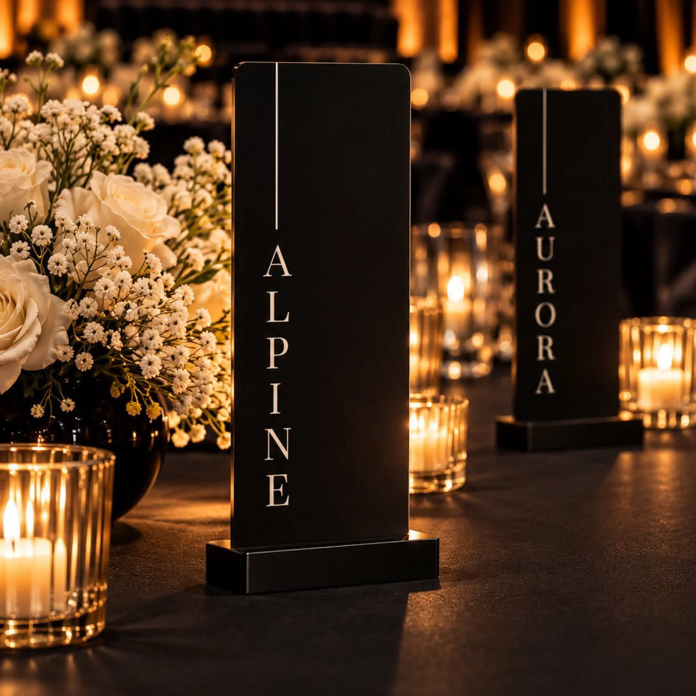
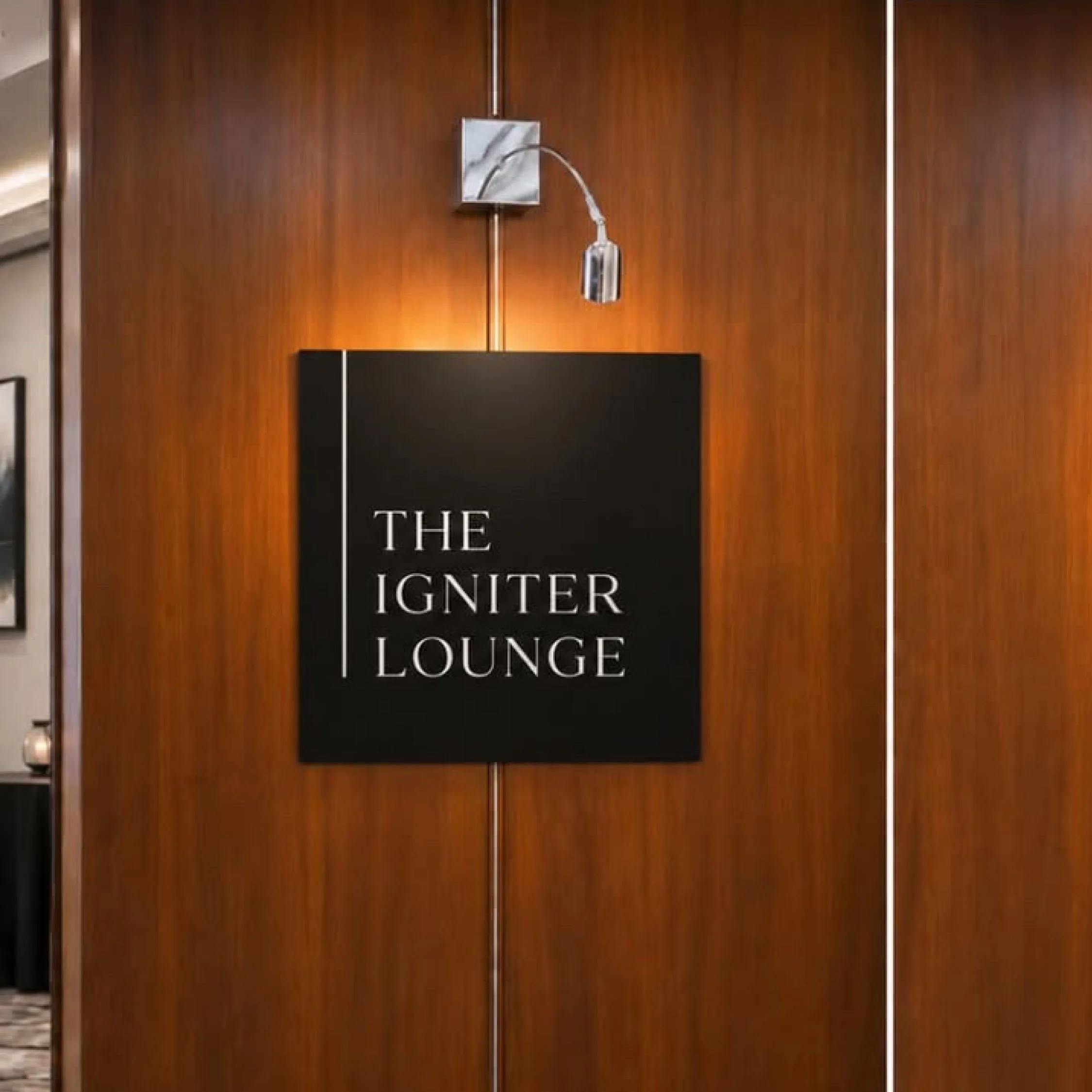
A brand is more than what an audience sees. It's what they feel, remember, and take away from every interaction. For Trailblazer Live, we provided creative consultation to ensure the newly established brand identity extended meaningfully into the physical event experience.
We guided the application of the visual identity across event signage, promotional materials, and branded keepsakes, providing recommendations that maintained consistency while elevating the overall atmosphere. Beyond individual touchpoints, we considered how the brand's defining attributes of Expansive, Transcendent, and Unfiltered could be expressed throughout the guest journey, reinforcing the intention behind THIN AIR.
Our role was to help connect the visual identity with the emotional experience Selina envisioned, creating a more cohesive relationship between the brand, the environment, and the women within it. The goal was not simply to create a beautifully branded event, but to ensure every detail contributed to a memorable experience of connection, transformation, and belonging.