

How we Refreshed an Existing Brand’s Visual Identity.
Branding
Web Design
Client: The Energy Project
Scope: Graphic Design, Illustration,
Website Design
Additional Credits: Collaboration with Monaco Consulting.
Description
The Energy Project came to us for a brand refresh that would better reflect their mission of helping individuals and organizations manage their energy more effectively. While it was important to retain their existing logo and primary brand colours, there was an opportunity to expand the visual identity in a way that felt more human-focused, engaging, and energetic. Through strategic exploration, we developed a cohesive system of supporting brand elements inspired by the principles of energy, renewal, and growth, resulting in a refreshed identity that feels both approachable and impactful.
Problem:
The Energy Project came to us for a brand refresh. As a company that teaches energy management, they needed a visual brand that felt human-focused and energetic.
They came to us for a brand refresh. It was important to keep the logo and two primary brand colours unchanged. We worked with them to develop an expanded visual identity that spoke to their core beliefs. The resulting refresh feels engaging, energetic and human-focussed.
Process
With the logo and primary brand colours established as key brand assets, our focus was on expanding the visual identity in a meaningful way. Through strategic exploration, we developed a cohesive system of supporting elements inspired by The Energy Project's principles of energy, renewal, and growth, creating a brand that feels both engaging and approachable.
Solution:
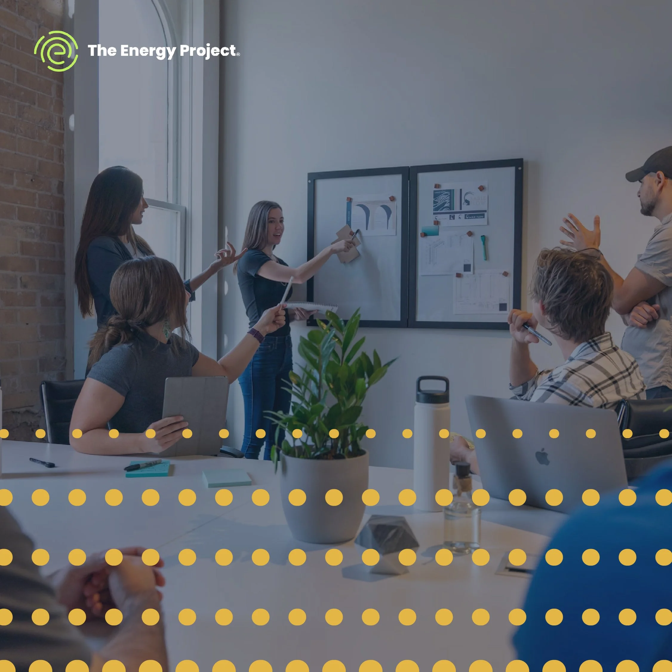
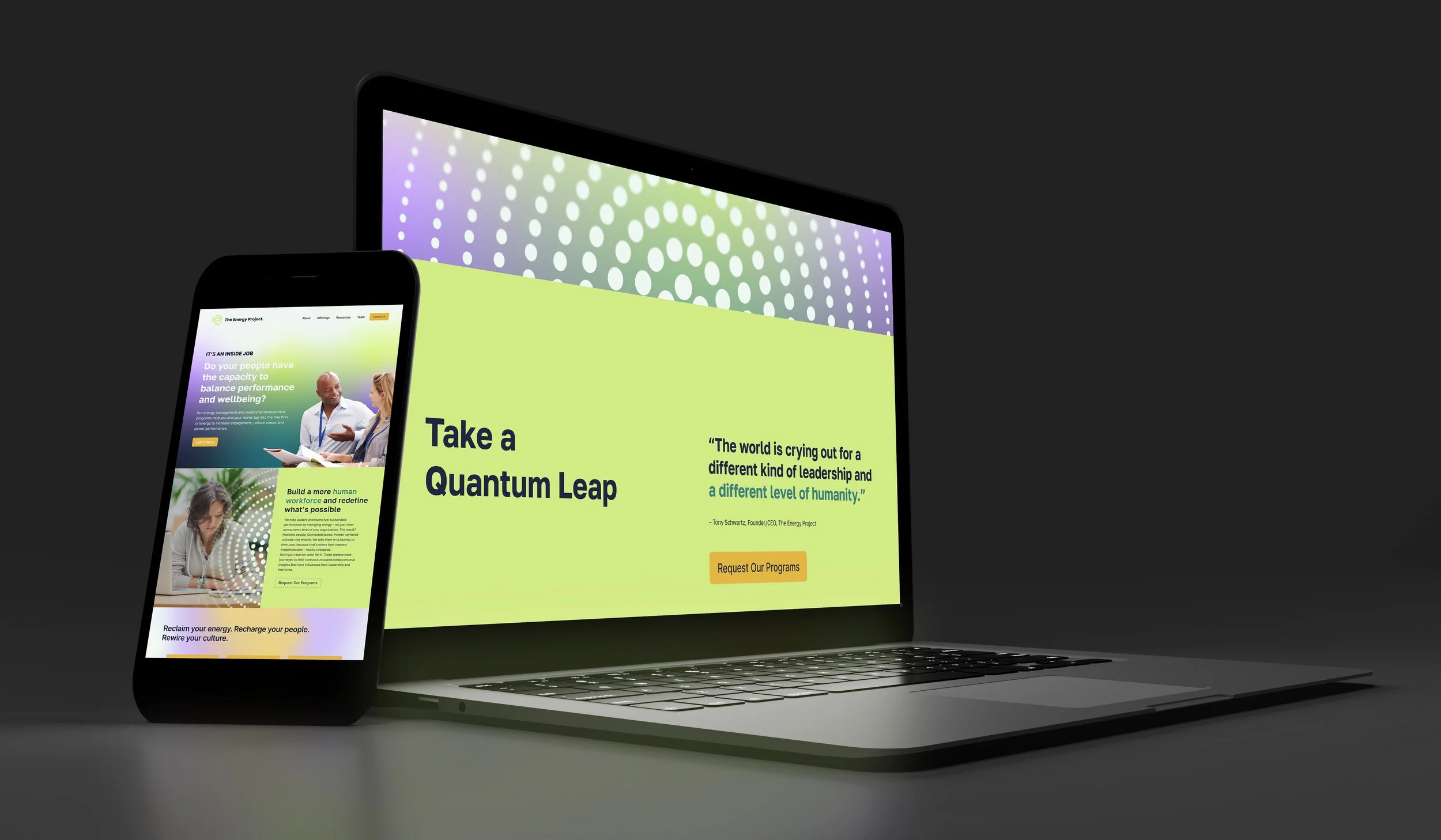
To build on their visual toolkit, we created a series of custom brand patterns consisting of repeating shapes expanding outwards. This pattern is a visualization of the free flow of energy allowed by removing barriers and blockers through The Energy Project’s training.
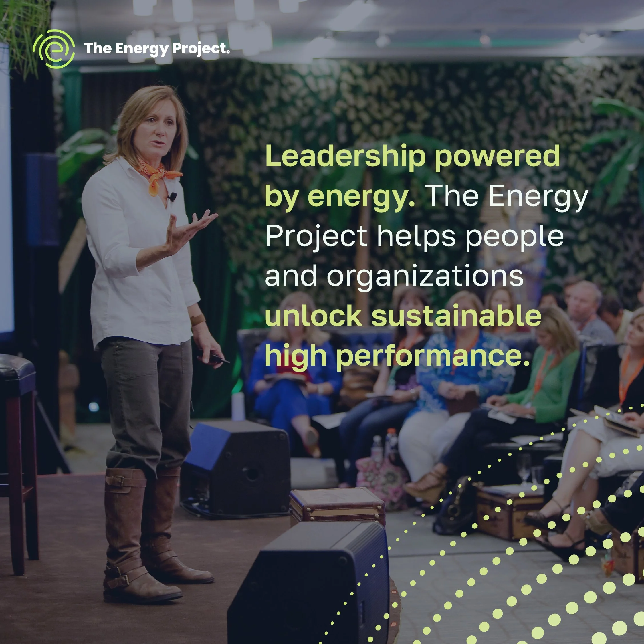
We also introduced a series of gradients that represent the cycle of renewal, rest, and recharge encouraged through The Energy Project's training. Building on their existing brand colours, we developed an expanded palette that feels both energetic and informative. The typography was refreshed with a clean, approachable sans-serif that enhances readability while reinforcing a sense of trust and professionalism.








-
The Energy Project needed a refreshed visual identity that reflected its human-centred approach to energy management. Retaining the existing logo and primary brand colours, we expanded the identity through a cohesive system of typography, colour, gradients, and custom patterns. Inspired by the principles of energy, renewal, and growth, each element was designed with intention. Repeating shapes represent the free flow of energy, while gradients symbolize the cycles of rest, renewal, and recharge. The result is a dynamic, approachable, and engaging brand that brings The Energy Project’s core beliefs to life.
-
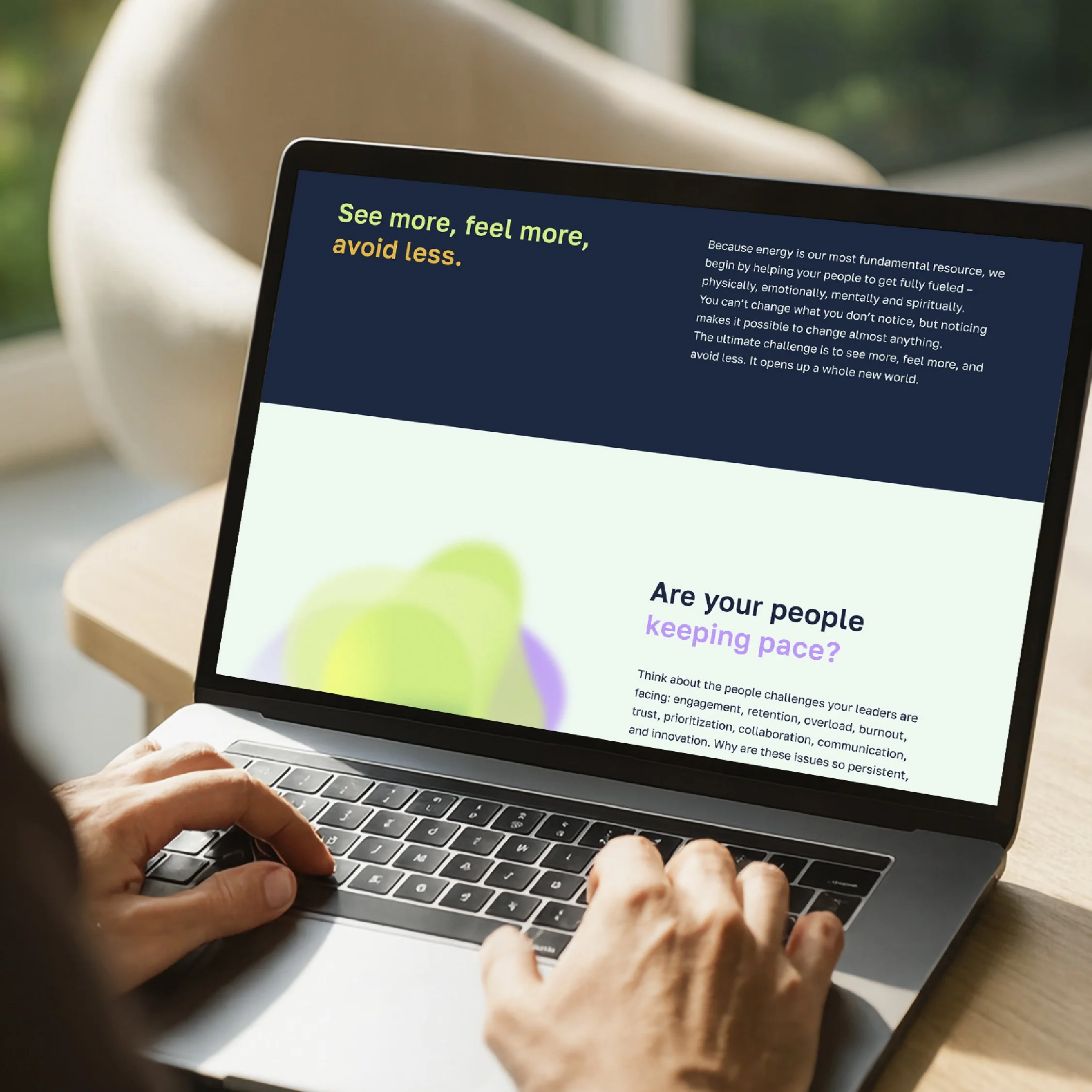
Building on the refreshed brand identity, we created a cohesive digital experience that brings The Energy Project’s philosophy of energy management to life. Through thoughtful layouts, engaging visual elements, and clear content hierarchy, the website balances energy and movement with clarity and ease of navigation. Custom patterns, gradients, and an expanded colour palette create a dynamic yet approachable experience, reinforcing the brand’s human-centred philosophy while making its programs and expertise accessible to its audience.