

Creating a holistic safety culture amongst the construction industry.
Branding
Campaign
Illustration
Strategy
Client: Alberta Construction Safety Association
Scope: Brand identity and campaign materials for their 35th anniversary conference and tradeshow.
Additional Credits: Printing provided by Burke Group and NexGen Graphix
Your Alberta Construction Safety Association (ACSA) is a uniquely member-centric, industry-funded not-for-profit organization and the largest certifying partner in Alberta, driving safety and business excellence in a high-risk industry, where passion for safety meets expertise.
Their annual conference brings together safety leaders, business owners, workers, and partners to collaborate on improving safety in Alberta’s construction industry. The 2023 theme, Healthy Minds, Safe Workplaces, emphasized mental and physical well-being, offering actionable strategies, checklists, and guidelines to support a holistic safety culture.
The event featured keynote speaker Allan Kehler, who opened with a personal perspective on trauma. Other sessions included presentations by St. John’s Ambulance on safety culture, Liz Horvath on integrating psychological safety into safety management programs, and WCB on the top three mental health issues leading to workplace injuries.
In addition to speaker sessions, the event included a tradeshow spotlighting local businesses and a gala awards night celebrating industry leaders and ACSA’s 35-year legacy. This was the first time the conference had a dedicated visual identity, previously relying solely on the core ACSA brand.
Description:
Problem:
Previous conference branding relied entirely on the ACSA primary brand, but as the event grew, it became clear that it needed its own distinct identity. The challenge was to create a visually engaging brand that resonated with a blue-collar audience while also emphasizing holistic safety culture and mental health awareness.
Process
We began by assessing ACSA’s existing brand identity to identify opportunities for expanding it into a distinct conference brand. This included exploring their secondary colour palette and previously used brand elements.
Following this research, we developed a brand strategy and explored visual directions centered on mental wellness and the human mind. These were presented as vision boards for client feedback before design development began.
Solution:
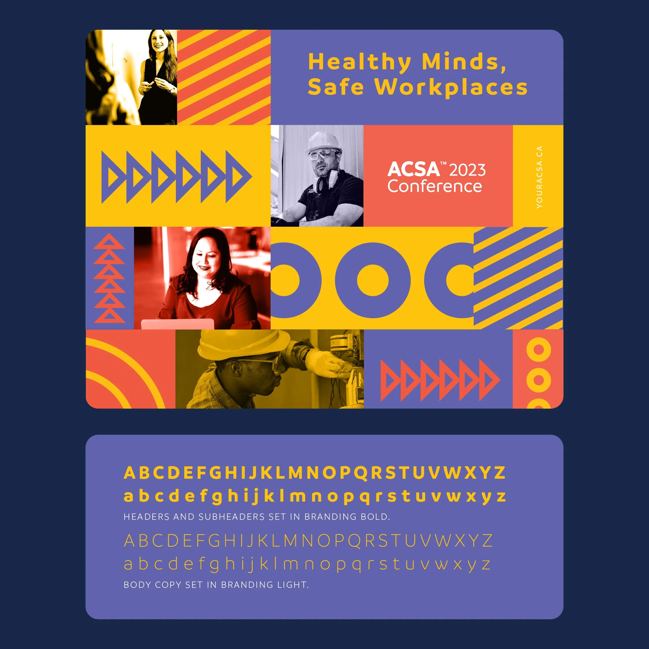
The final result is a conference and awards brand identity that highlights the human side of construction. We developed a bold, colorful visual system that sets the event apart from competitors while still honoring key elements of the ACSA core brand.
We have had the opportunity to work with ACSA for a few years, slowly modifying and adapting the conference graphics each year.


-
Through a brand discovery process, we analyzed competitor conferences, audience demographics, ACSA’s internal culture, and company history. Our research revealed key insights:
Competing conferences felt overly masculine and lacked warmth and creativity.
The 2023 theme, Healthy Minds, Safe Workplaces, called for a softer, more inclusive aesthetic, moving away from ACSA’s cold navy-dominated palette.
Their vibrant secondary colours (indigo, red/orange, yellow) were underutilized in past materials.
Brand graphics were inconsistently applied, with no clear guidelines beyond watermark usage of the ACSA brand mark.
As the construction industry diversifies, with more women and a growing focus on mental health, the brand needed to resonate with a broader audience.
Following this research, we developed a brand strategy and explored visual directions centered on mental wellness and the human mind. These were presented as vision boards for client feedback before design development began.
-
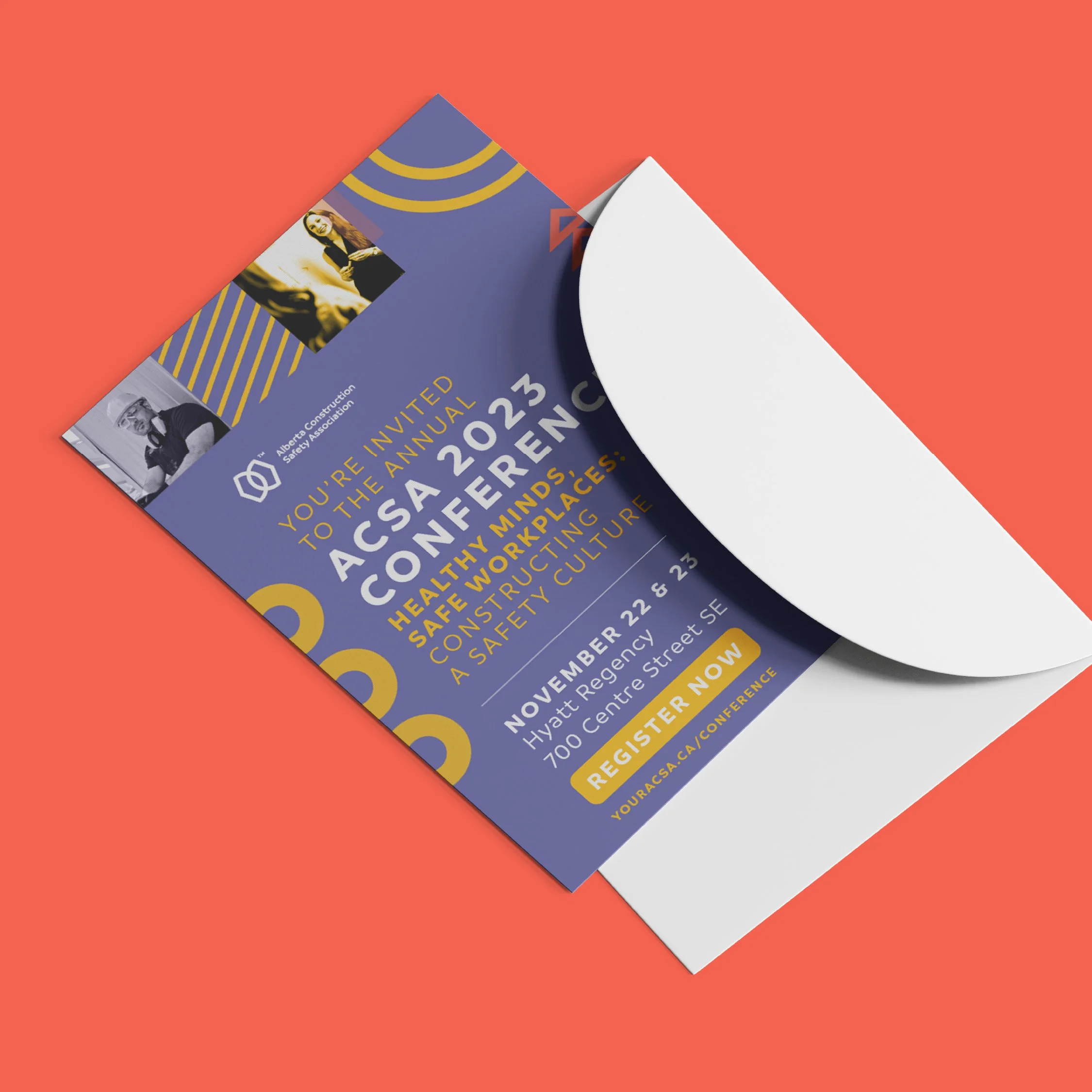
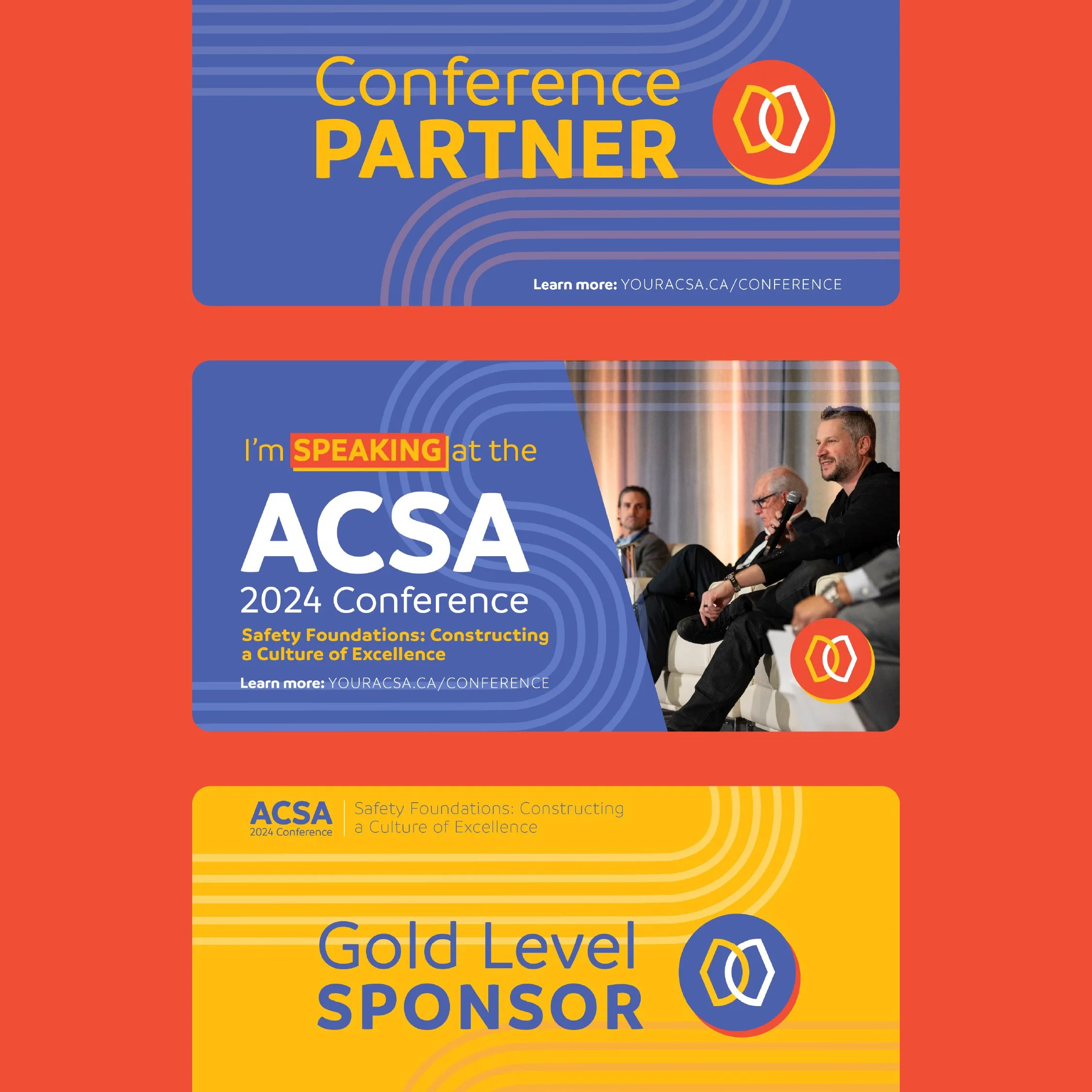
The brand identity began with a conference logo that incorporated the wordmark from the existing ACSA brand. We brought the identity to life using both the primary and secondary color palettes, complemented by imagery of healthcare and construction professionals to emphasize the human side of the conference. These visuals were paired with geometric graphics representing the construction industry, while transparent overlays subtly communicated organizational transparency.
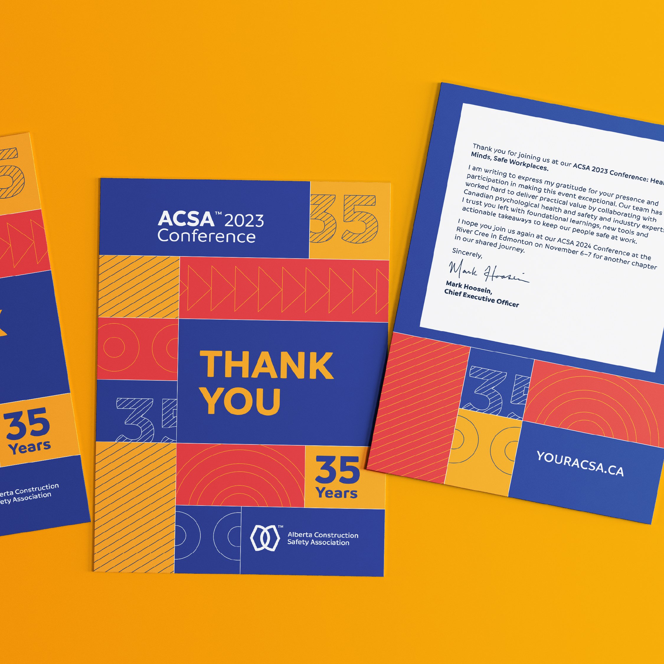
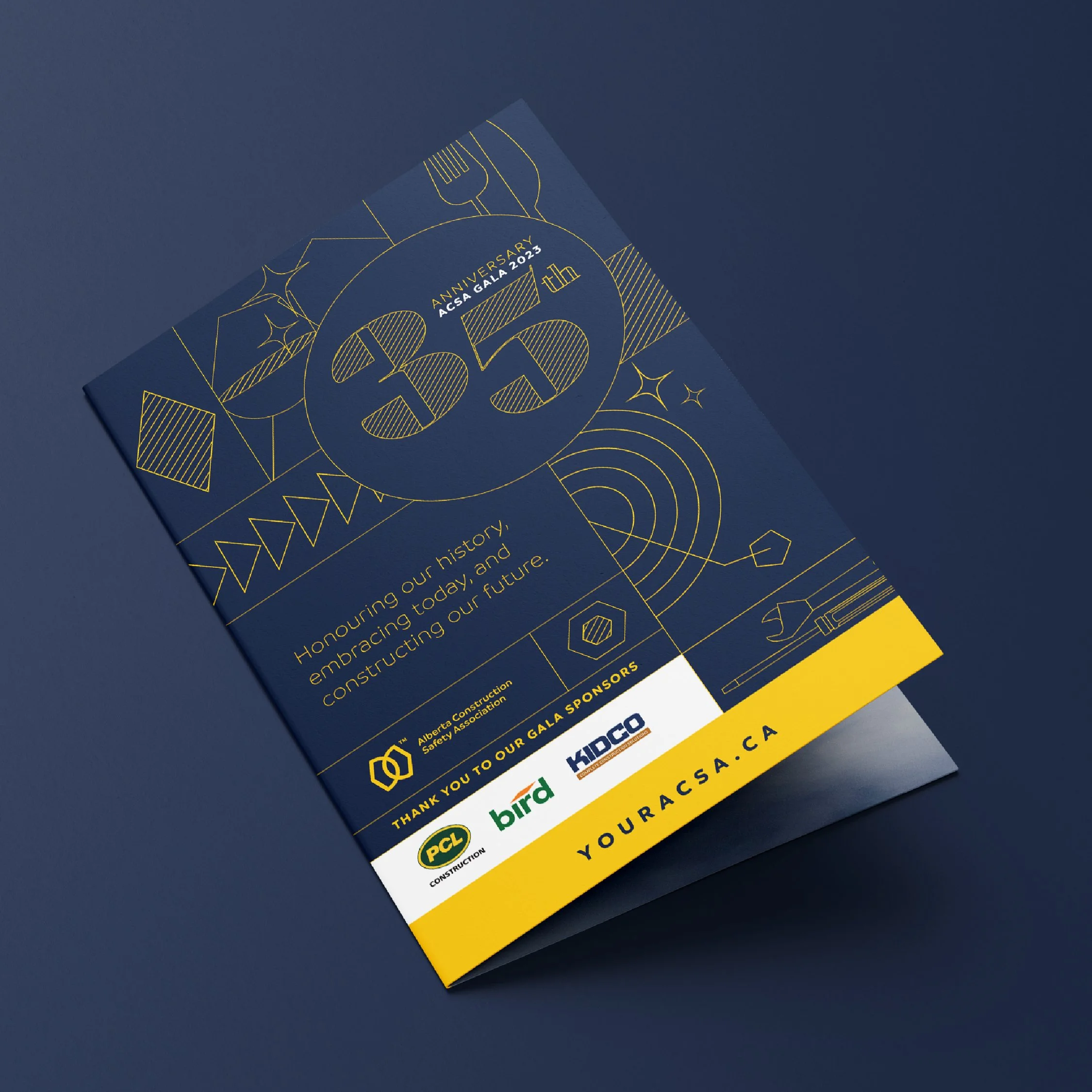
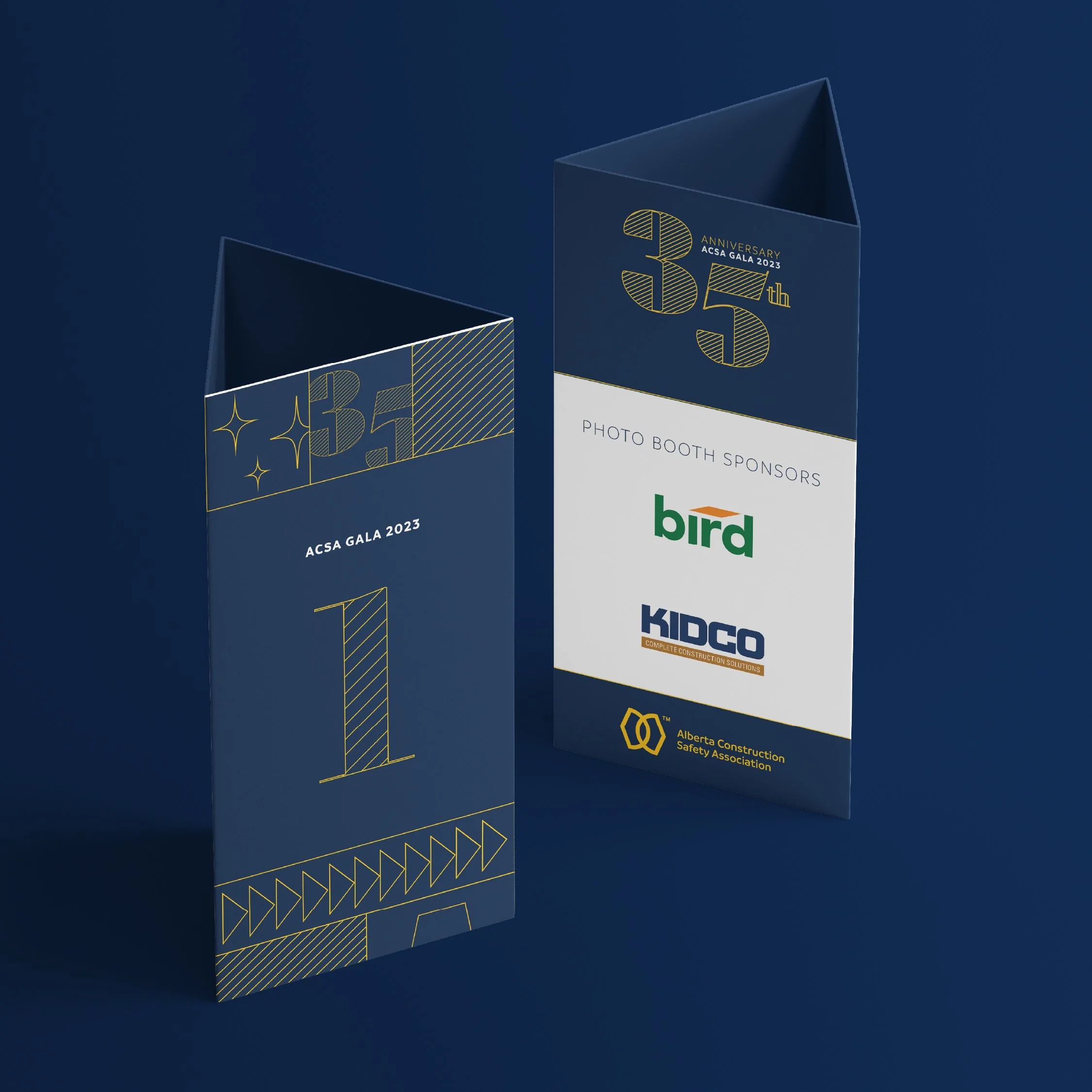
We also had the opportunity to brand the 35th anniversary awards dinner, elevating the conference branding with a refined navy-and-gold palette and outlined graphics for a more elegant feel. For the 2024 conference and dinner, we adapted the 2023 branding by simplifying the graphics into a clean pathway pattern, creating a cohesive system across all materials.
-
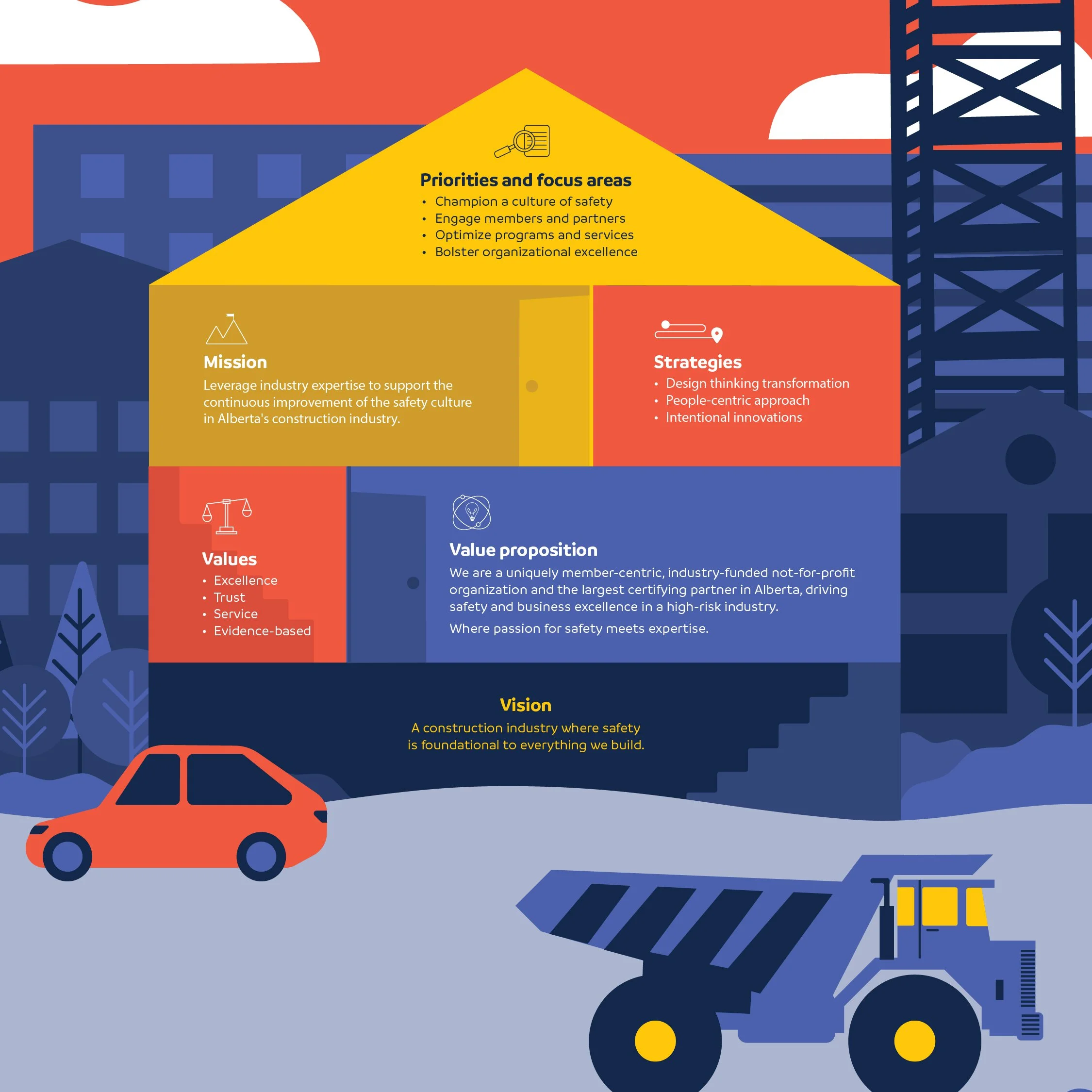
As part of the conference graphics, we illustrated a display celebrating 35 years of ACSA’s history. The design features a vibrant cityscape representing Alberta, with each panel highlighting a milestone in the organization’s journey. The double-sided panels were mounted on moonfeet, allowing them to be stacked or arranged side by side for flexible display.
These custom illustrations were also adapted for presentations and reports, extending the visual storytelling across multiple touchpoints.
-
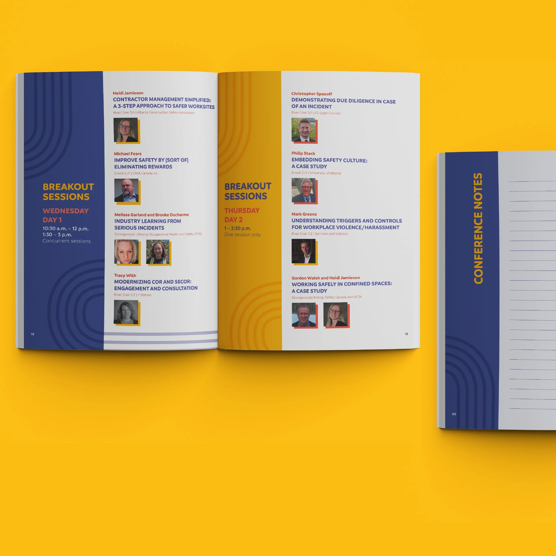
Building on the conference and awards brand identities, we developed campaign elements across every medium, including social graphics, program guides, wayfinding and sponsor signage, photo booth backdrops, pull-up banners, invitations, tent cards, thank-you notes, and table toppers. This comprehensive approach ensured a consistent and engaging brand experience at every touchpoint.