

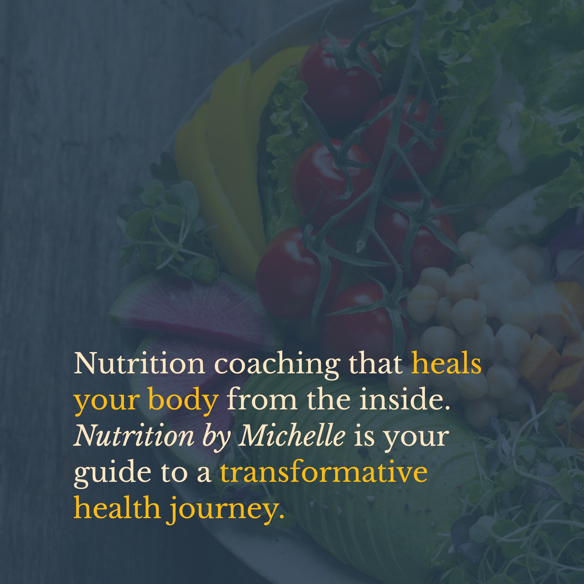
Nutrition Coaching that Heals your Body from the Inside.
Brand Strategy
Brand Identity
Client: Nutrition By Michelle
Scope: Brand Strategy and Visual Brand Identity
Additional Credits: N/A
Description
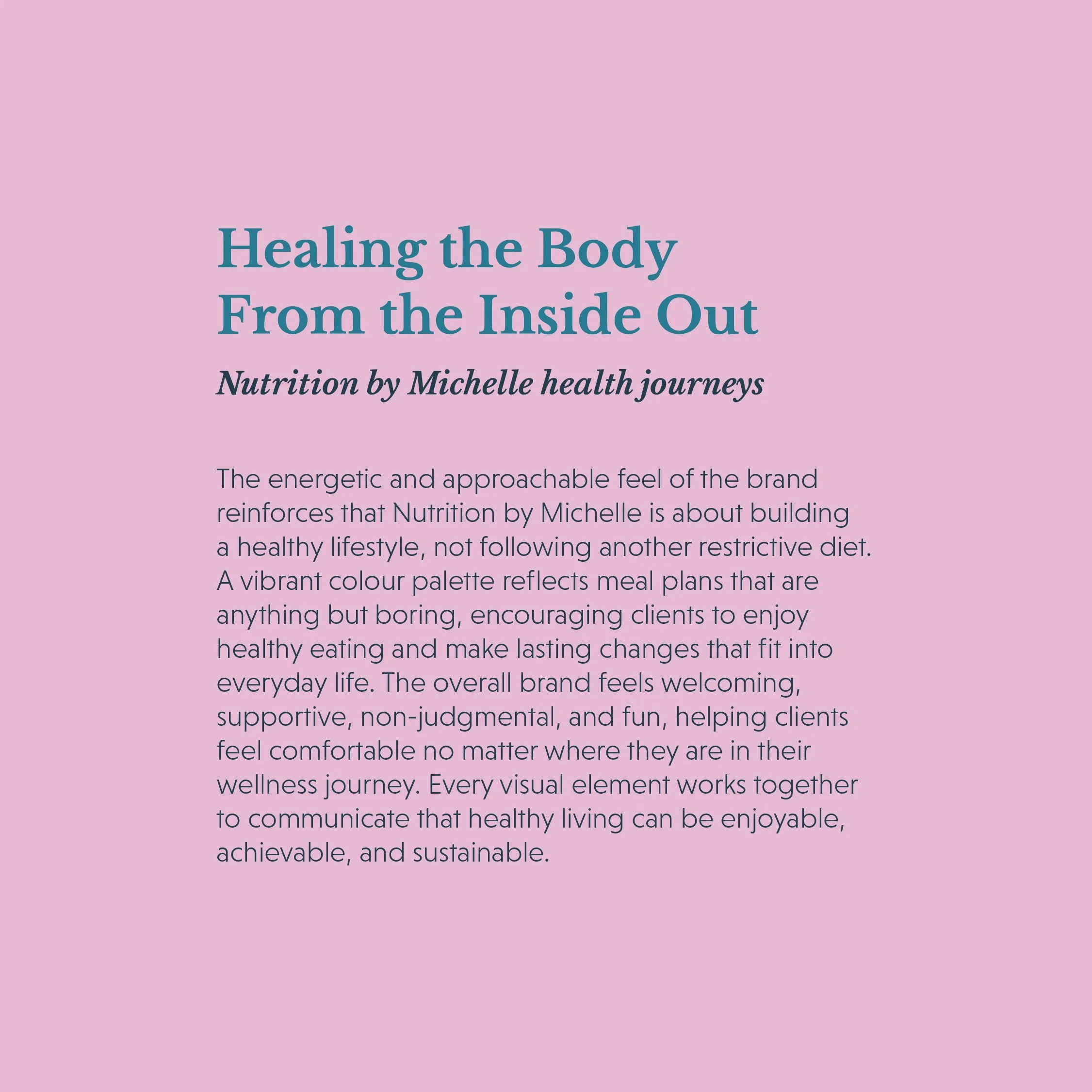
Nutrition by Michelle is a supportive online nutrition coaching company helping clients create the healthiest version of themselves through approachable meal plans, expert guidance, and consistent accountability. We worked with the team to create a refreshed visual brand identity designed to shape the future of their business, supporting their growth across digital platforms, app development, merchandise, and national brand awareness. Built around community, education, and non-judgmental support, the brand serves thousands of clients across Canada and the U.S. with original weekly menus, practical health tools, and a welcoming approach to sustainable lifestyle change.
Problem:
Nutrition by Michelle had already grown into a highly successful nutrition coaching business, supporting between 3,500 and 4,000 clients at a time. The company had built its reputation through results, community, and word of mouth, but its visual identity no longer reflected the scale, purpose, or future of the business.
They came to us with strong foundational values, a clear mission, and an established logo rooted in their beginnings: nourishing the body with real food, represented through a leaf. While that symbol still held meaning, the brand had evolved far beyond its original identity. Nutrition by Michelle needed a visual system that could tell a deeper story about who they are, what they believe in, and where the business is headed next.
Process
The creative process was not linear, much like the health journeys Nutrition by Michelle guides its clients through. We began by exploring a simple wordmark with symbolic elements, including a spark to represent the energy, motivation, and transformation the business ignites within its clients.
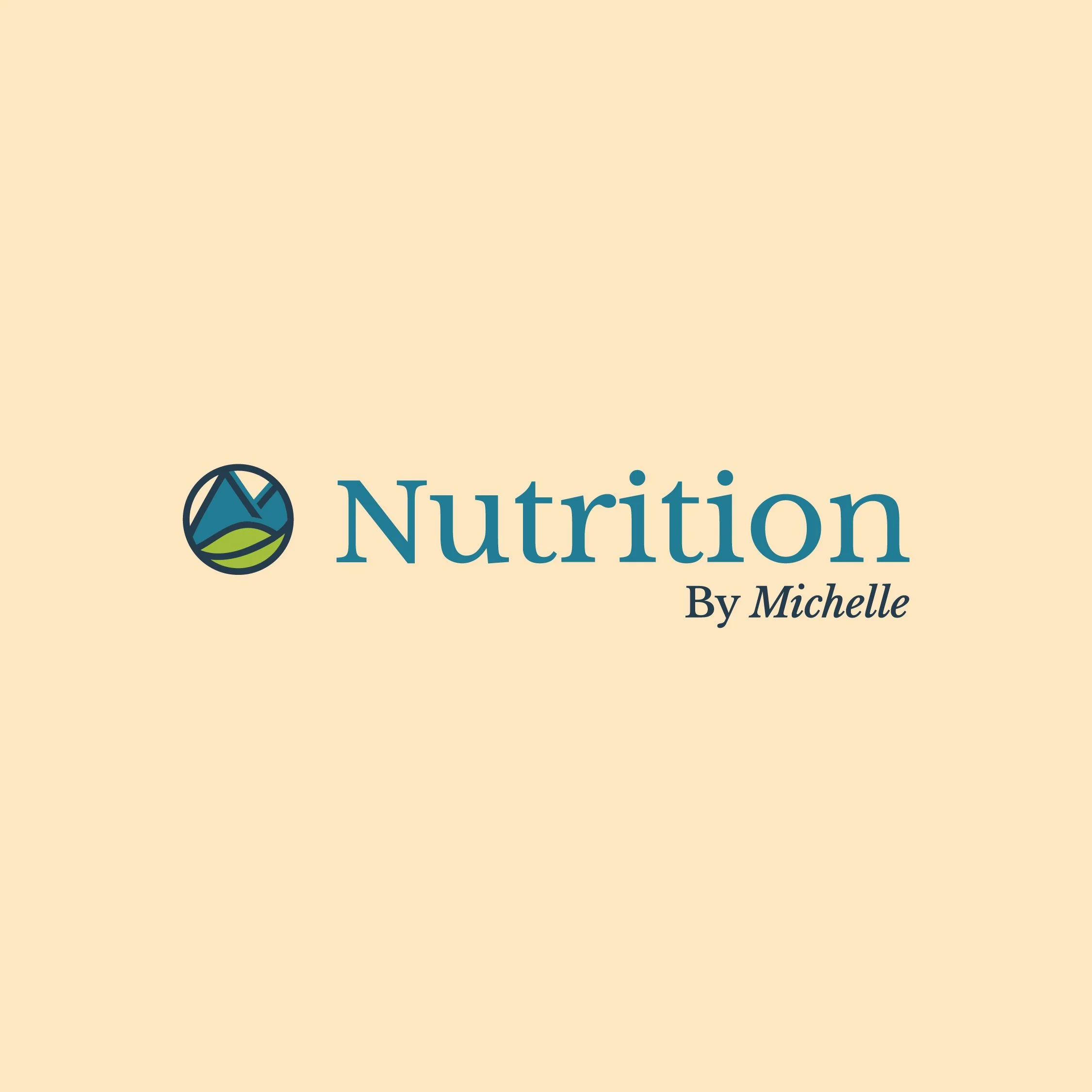
Through deeper discovery, we redirected the creative toward a more symbolic identity that better reflected the journey through health, life, confidence, mindset, and business growth. The final direction incorporated mountains, a subtle “M” for Michelle, and the original leaf as a nod to the company’s roots.
This approach allowed us to honour the founder’s story and her belief that true healing begins from the inside out, while creating a brand that feels established, approachable, and ready for the company’s next stage of growth.
Solution:
We created a refreshed visual identity that positions Nutrition by Michelle as a friendly, knowledgeable, and welcoming partner in each client’s health journey. The final brand reflects the belief that nutrition is not about restriction or quick fixes, but about building a healthy lifestyle that feels realistic, enjoyable, and sustainable.
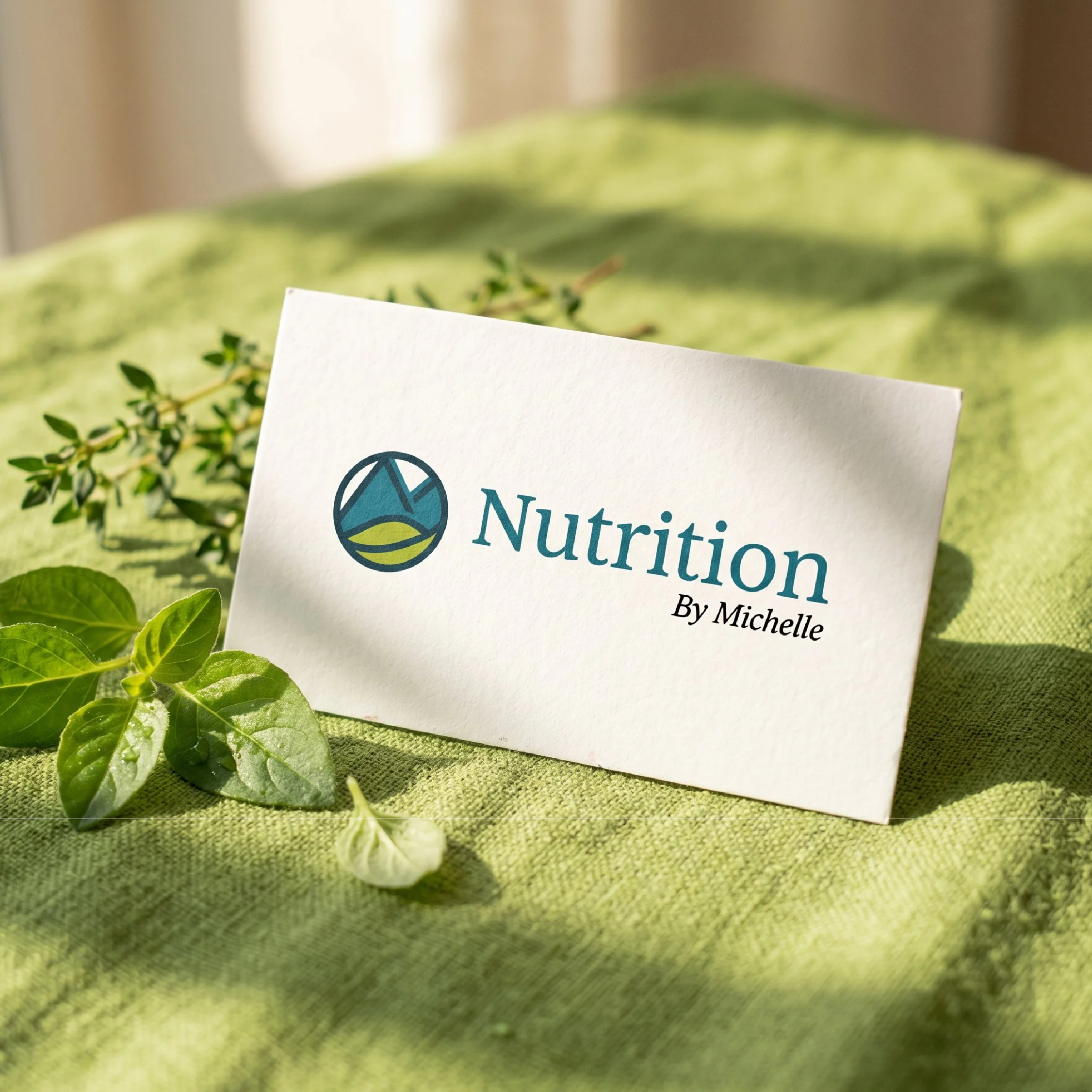
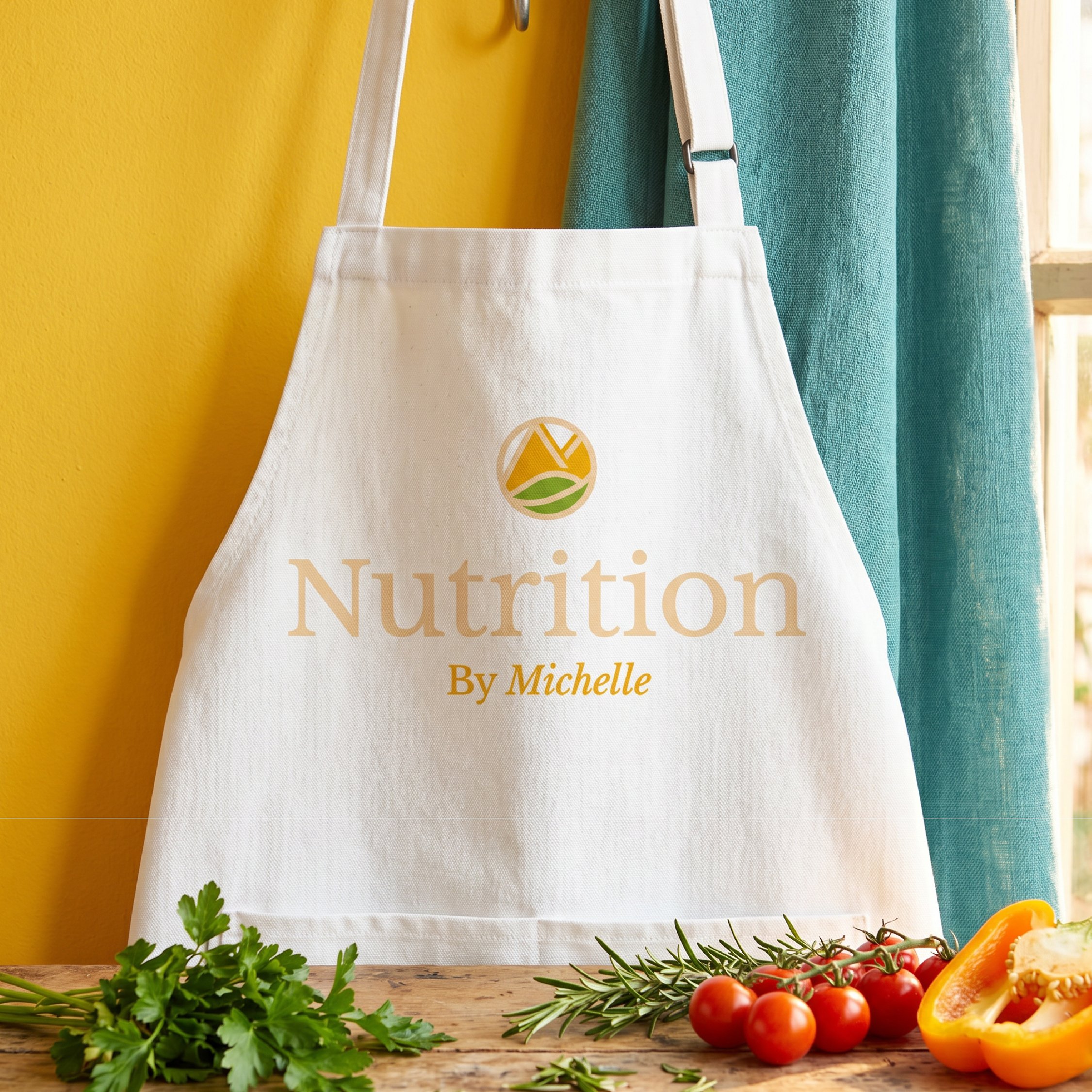
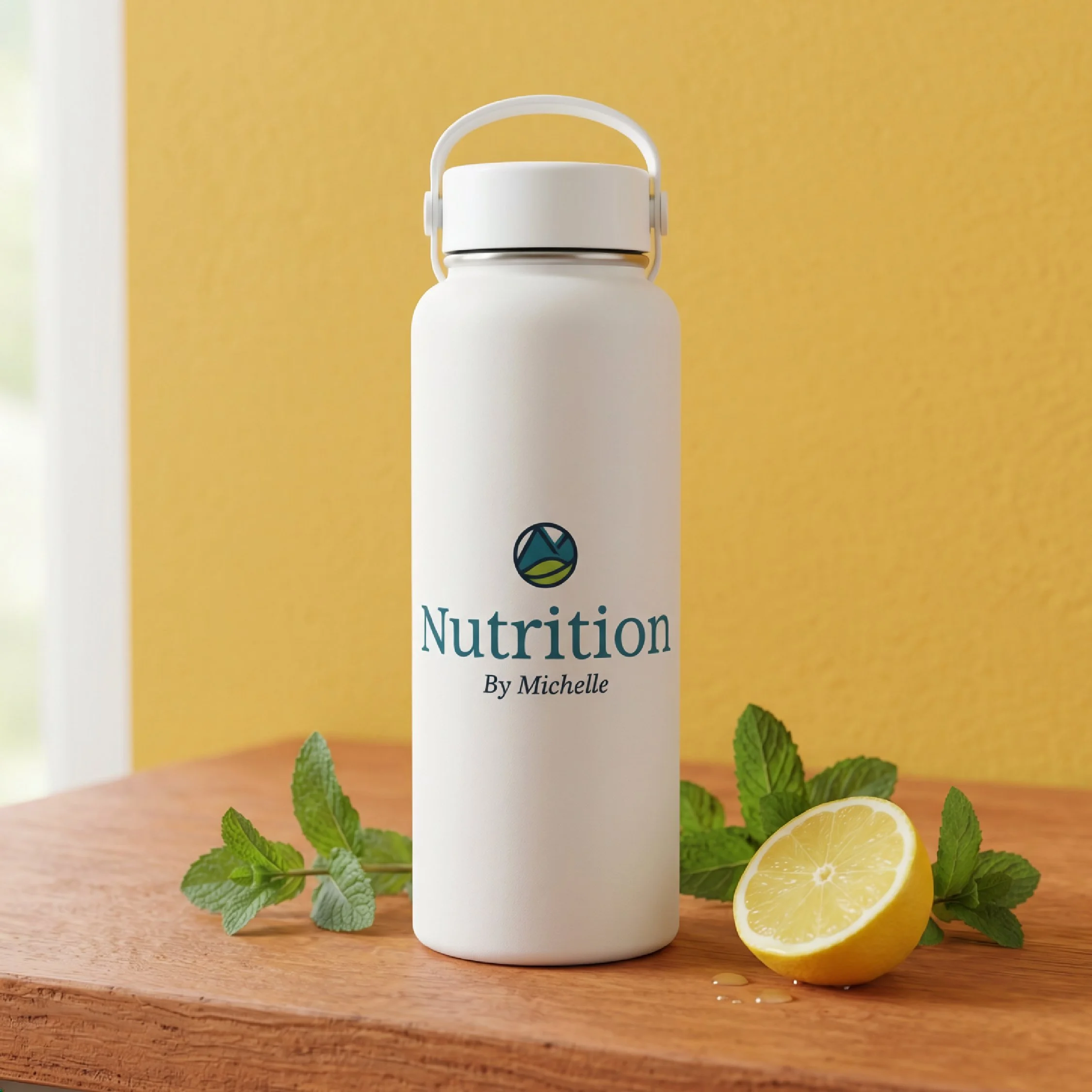
The logo brings together meaningful elements from the business: mountains to represent progress, resilience, and the non-linear path of personal growth; a subtle “M” for Michelle as a personal touch; and the leaf as a nod to whole foods and nourishing the body with real food.
The colour palette was expanded beyond teal to include vibrant, food-inspired tones that bring energy, variety, and warmth to the identity. More than a new look, the brand captures the growth of Nutrition by Michelle, the strength of its community, and its mission to help clients create the healthiest version of themselves.


-
Brand Strategy & Final Identity
For Nutrition by Michelle, the goal was to create a visual identity that could support the next chapter of an already thriving business. With thousands of clients participating in their programs at any given time, a growing online presence, a new app in development, and future plans focused on preventative medicine, the brand needed to feel more established, more ownable, and more aligned with the depth of the work they do.
The strategy centred around the idea of transformation from the inside out. Nutrition by Michelle is not a diet brand. It is a supportive, educational, and community-driven health brand that helps clients understand what makes them feel good while building habits that are sustainable in real life. The identity needed to communicate that sense of support without feeling clinical, and that sense of expertise without feeling intimidating.
The final logo brings together several meaningful symbols. The mountains represent the journey we are all on; through health, growth, mindset, confidence, and personal change. Progress is rarely a straight path. Some days clients feel strong, some days they struggle, but the goal is to keep moving forward. This symbolism reflects the supportive role Nutrition by Michelle plays in helping clients continue to climb.
Within the mountain shape is a subtle “M” for Michelle, representing the founder’s personal story, passion, and leadership. It adds a meaningful connection to the person behind the brand while allowing the identity to feel polished and scalable. The leaf, a symbol from the original logo, was brought back as a nod to the company’s roots. It represents whole foods, natural living, and the foundational belief that nourishing the body with real food can create lasting change.
The typography was selected to feel both confident and approachable. A bold, soft serif gives the brand a sense of trust, warmth, and professionalism, while still feeling friendly and modern. This balance was important for a business that needs to speak to a wide audience, from women navigating postpartum health to clients seeking support through menopause, weight maintenance, or long-term wellness.
Colour also became a key part of the final identity. While teal remained an important brand colour, we expanded the palette with warm, vibrant tones inspired by variety, energy, and whole foods. The result is a brand that feels fresh, welcoming, and full of life. These colours help communicate that Nutrition by Michelle’s programs are not boring or restrictive. They are built around enjoyable meals, practical tools, and a lifestyle clients can actually maintain.
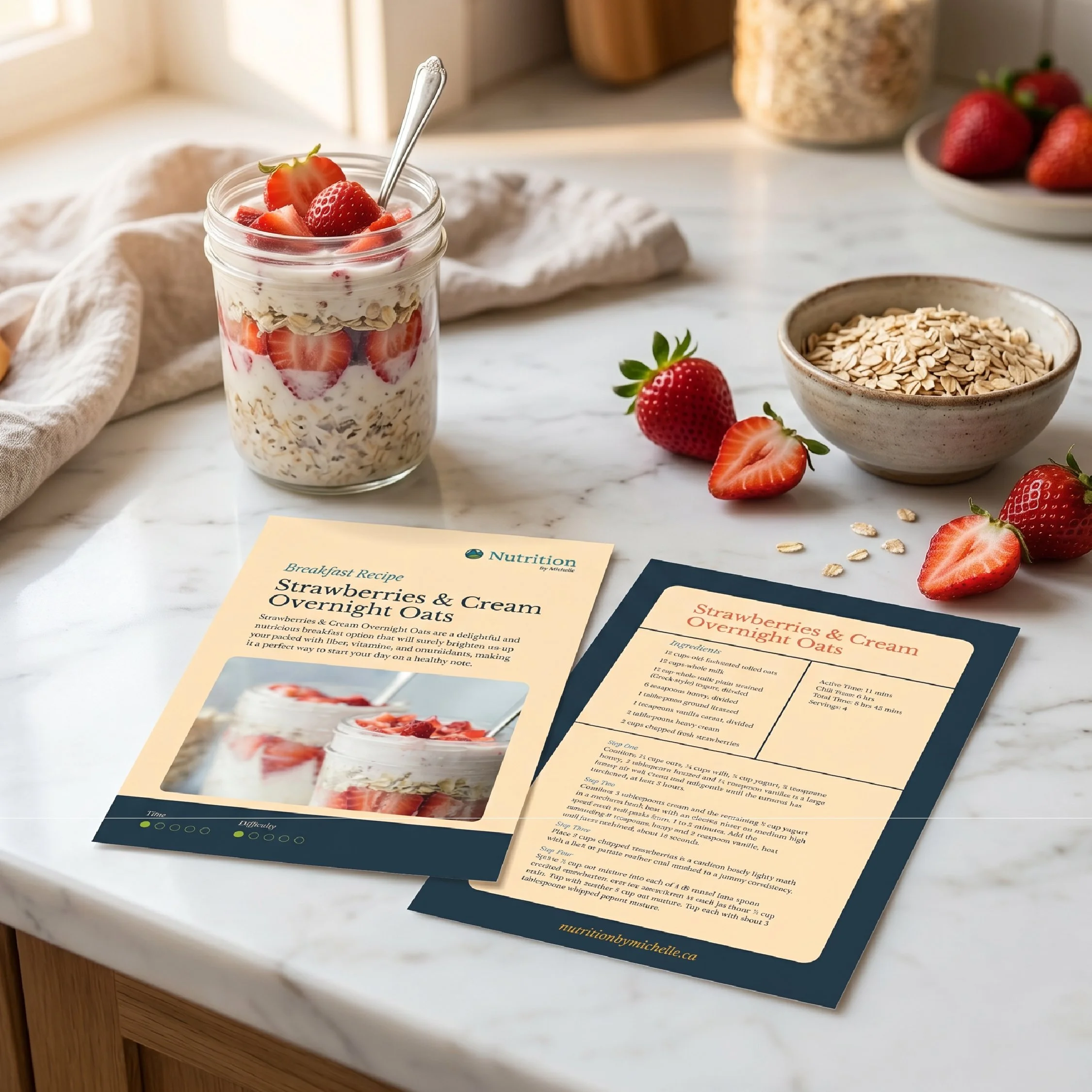
Together, the final identity gives Nutrition by Michelle a flexible and recognizable brand system that can grow across digital platforms, social media, app design, merchandise, receipe materials, and future campaigns or challenges. It honours where the business began while creating a confident visual foundation for where it is going next.